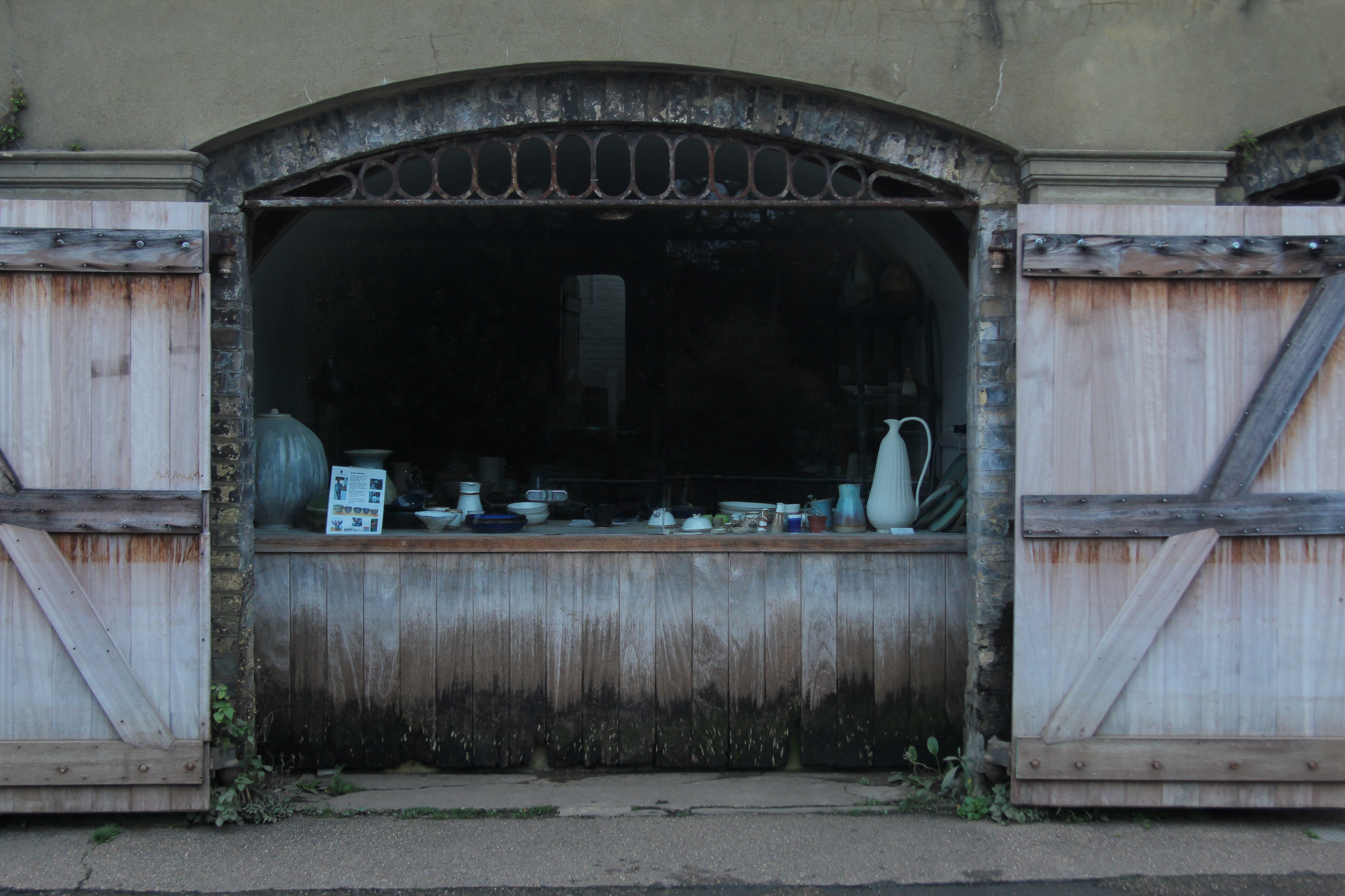
Still Life – Week 1
Task 1 – Exploring Genre in Photography, analyse the work of contemporary Pat Flynn – Still Life. Using Aperture controls, Angle, perspective and lighting equipment.
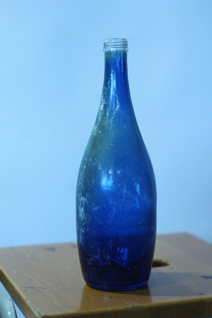
Working in the studio and using a blue glass bottle with the white background, I played with the white balance and moved towards a very blue tone, influenced by Paul Cezane.
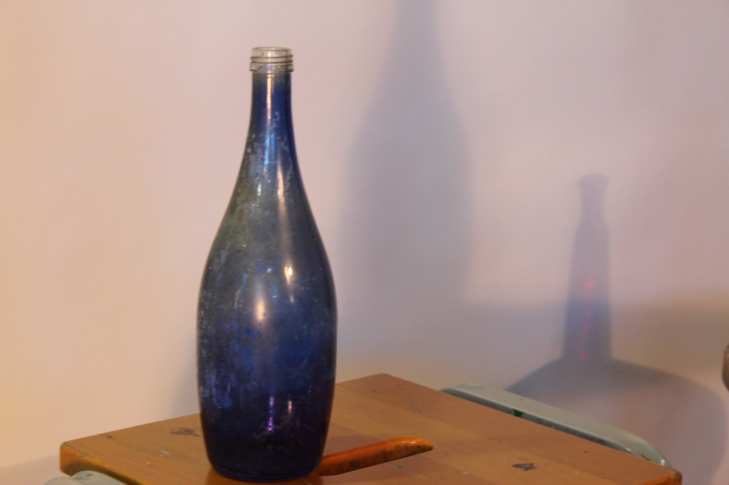
Here I played with the lighting and creating shadows. I like the mysterious red bottle shadow in the background.
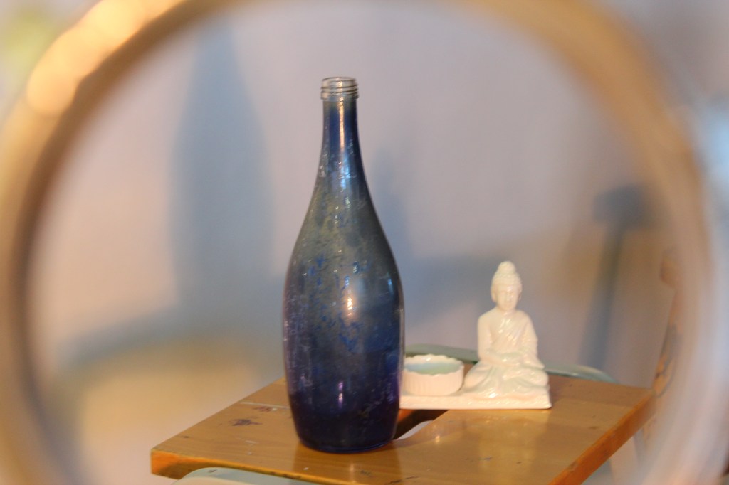
Using the same bottle and another ornament I played with perspective and angle by taking the photo through a metal cylinder. The camera settings for these pictures was set to shutter speed 1/25 Fstop 3.5 and ISO 100.
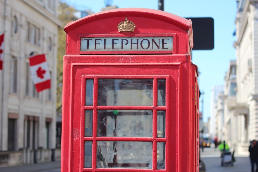
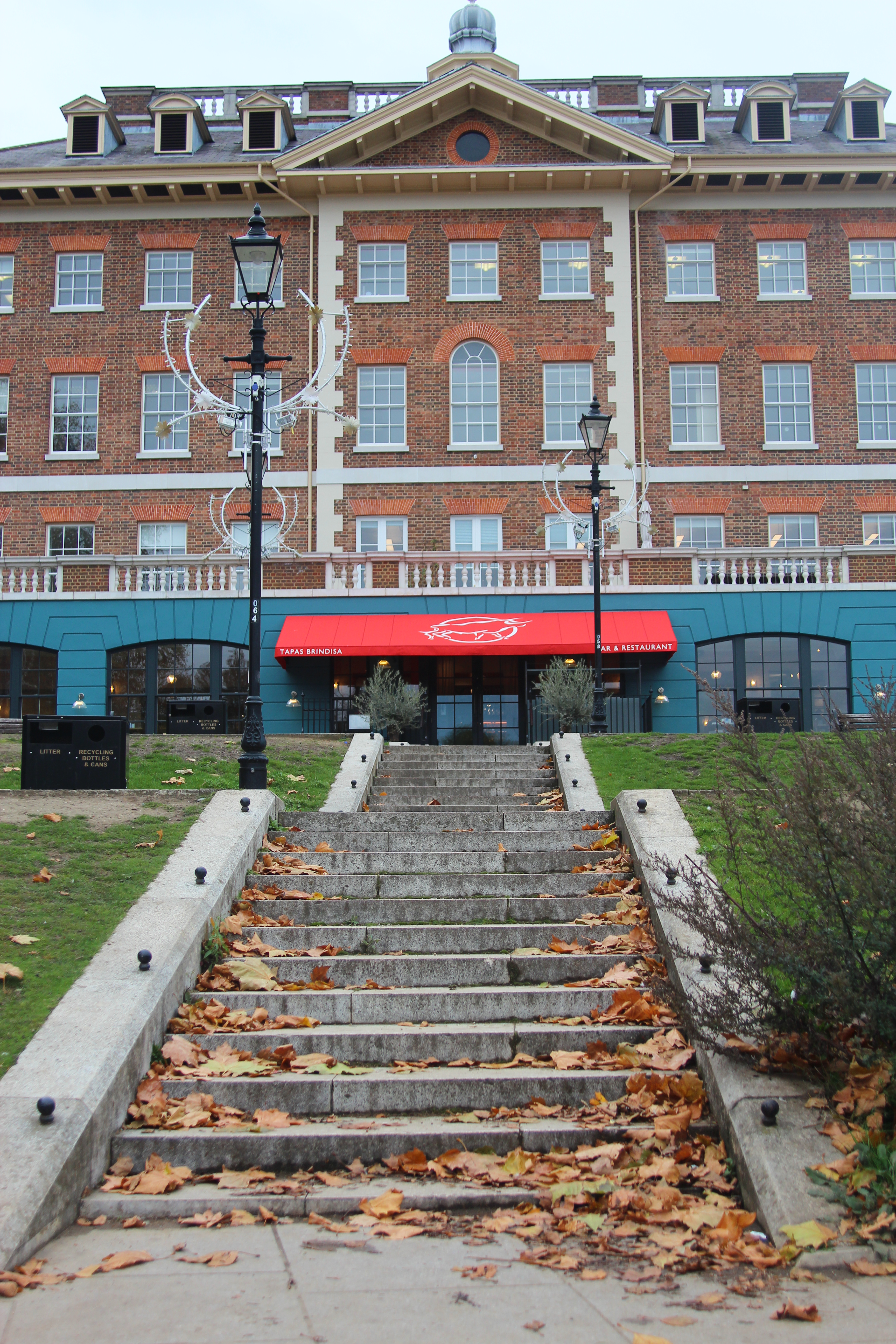
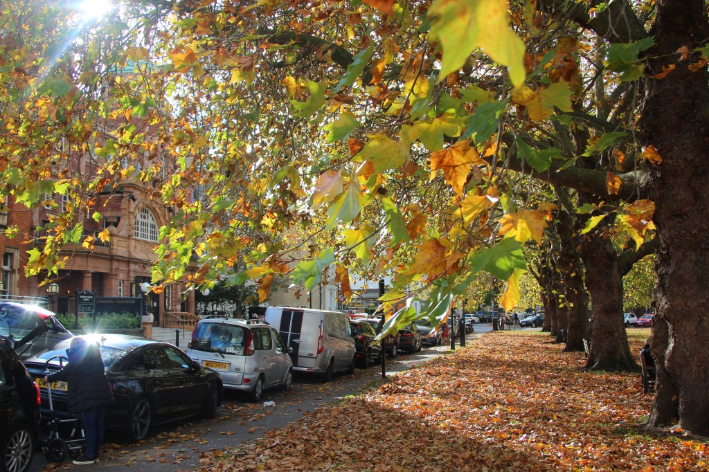
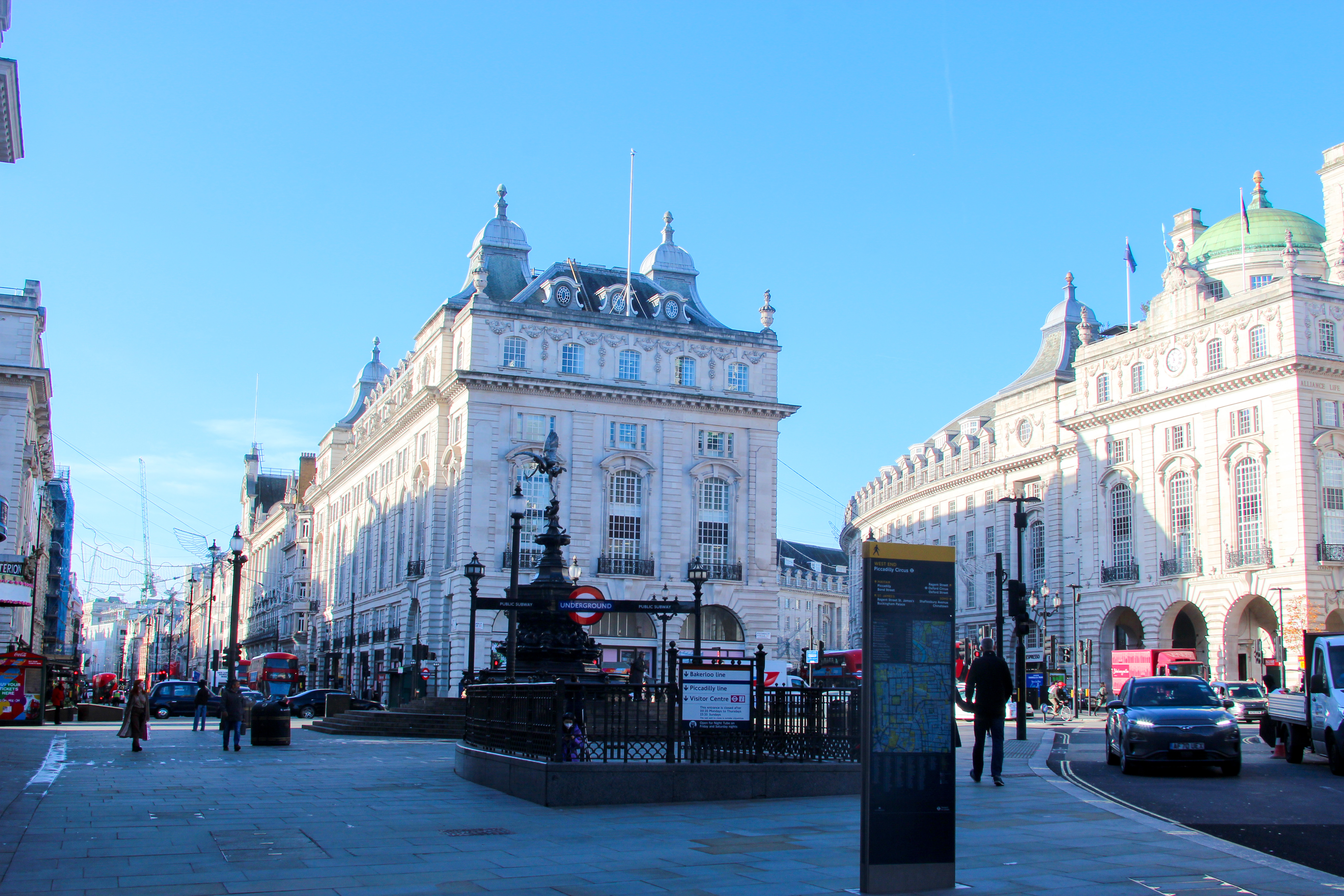
Whilst out and about in London, I played with the aperture. Here using a low F2.5 aperture, the focus is very much on just the phonebox.
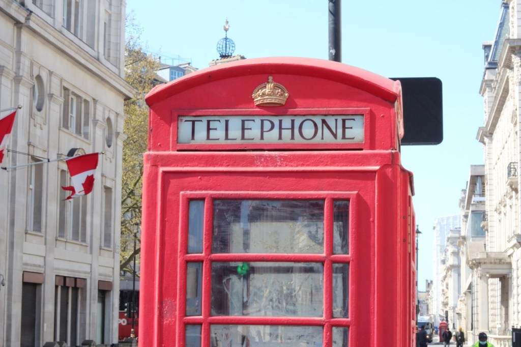
And here at a high aperture of F22, the picture is detailed with a clearer image of the London buildings too.

Here on the Embankment the flag at a low aperture of F2.5. It gives a feeling of the wind blowing the flag, as we are drawn to the focus of the flag.
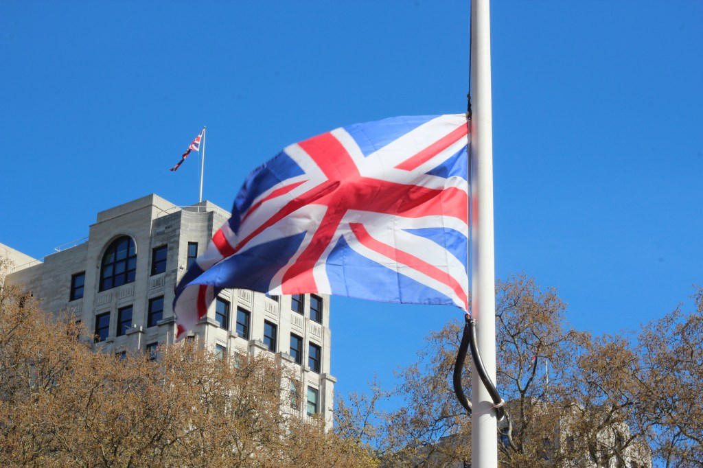
Here the aperture is high at F22 and the building and trees are more detailed with less emphasis on the flag.
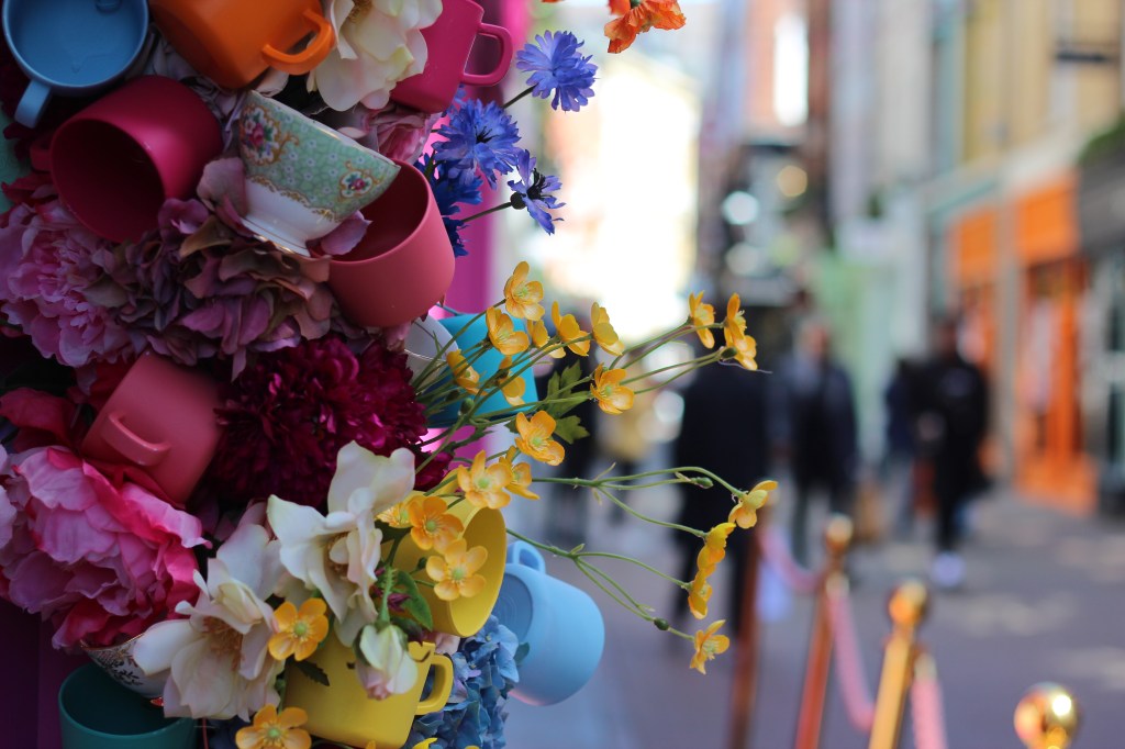
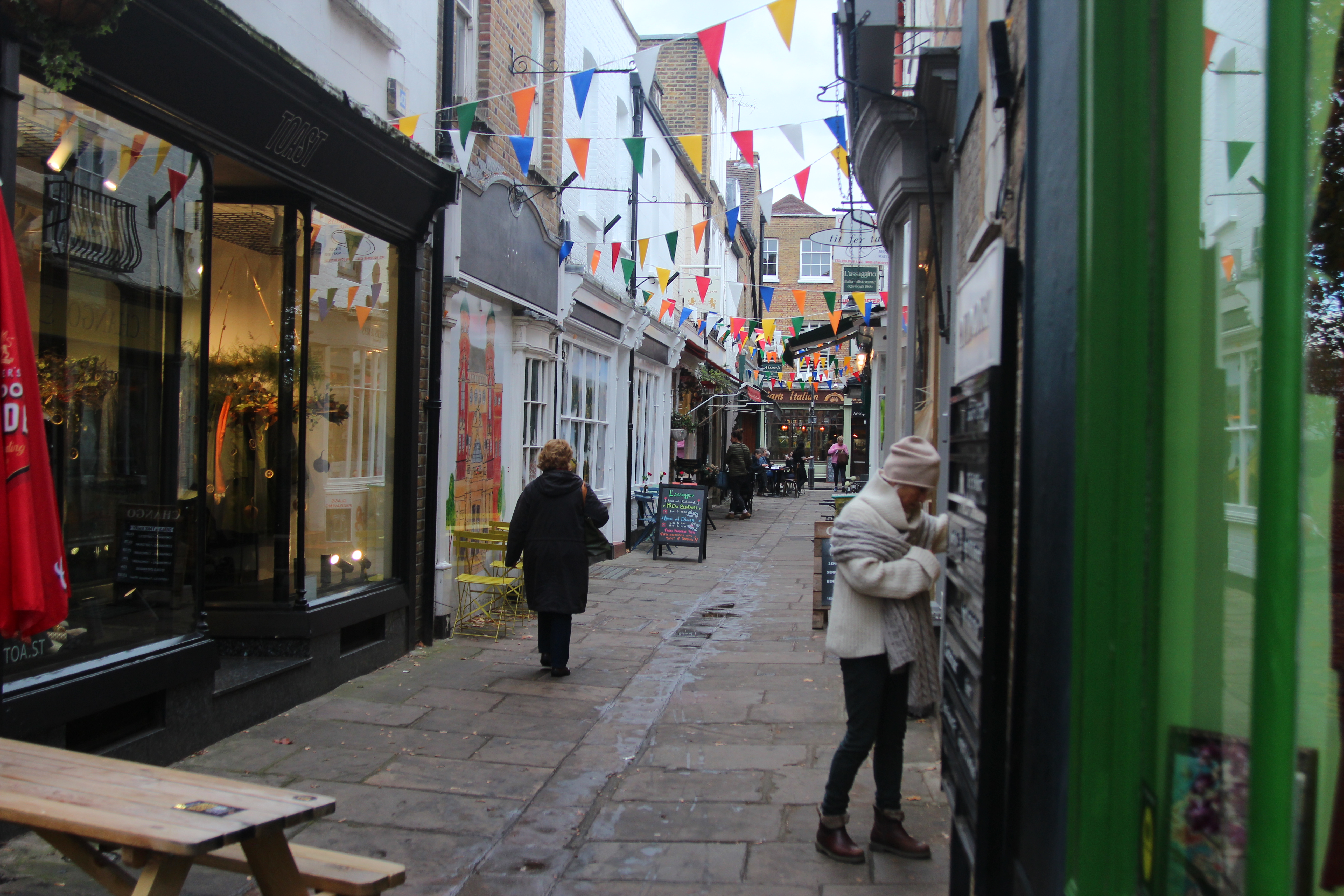
In Carnaby Street using a low aperture if F2.5, the focus is all on the flowers and its vibrant colours.
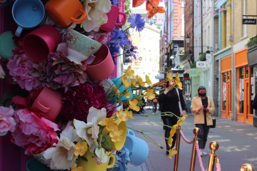
The aperture is high at F22 and Carnaby street is now vision.
Still Life – Week 2
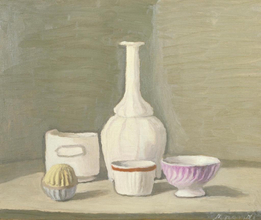
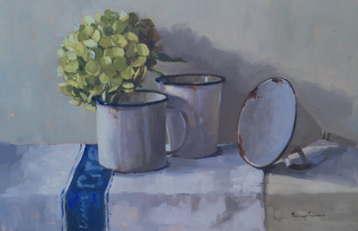
I looked at still life artists and who particularly inspired me for a photo using objects that were meaningful to me. I was drawn to four still life artists and the use of colour and light, I liked the pastel blue colours and the feel of daylight. The artist here is Giorgio Morandi.
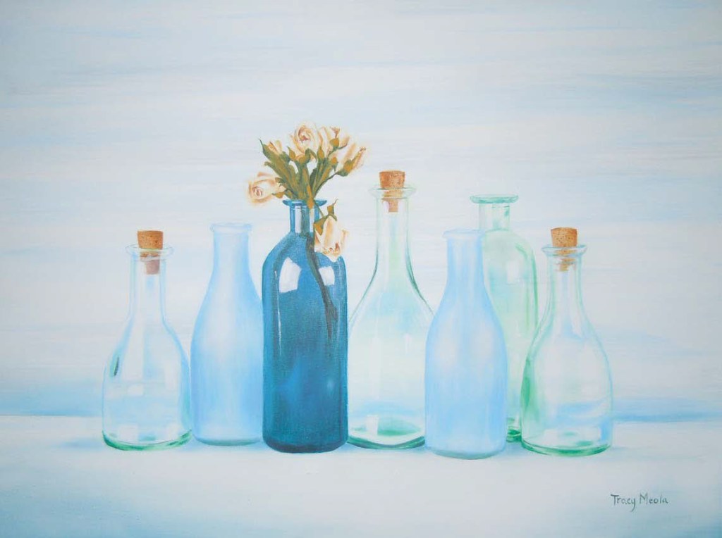
Tracy Meola
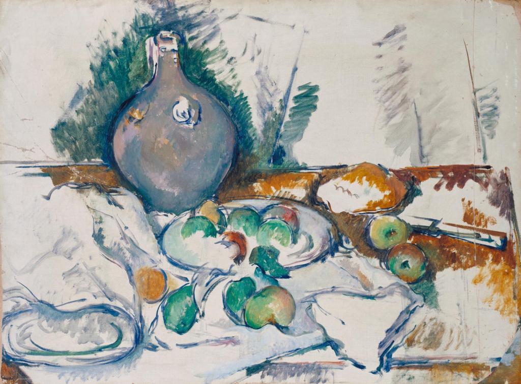
Paul Cezane
Penny German
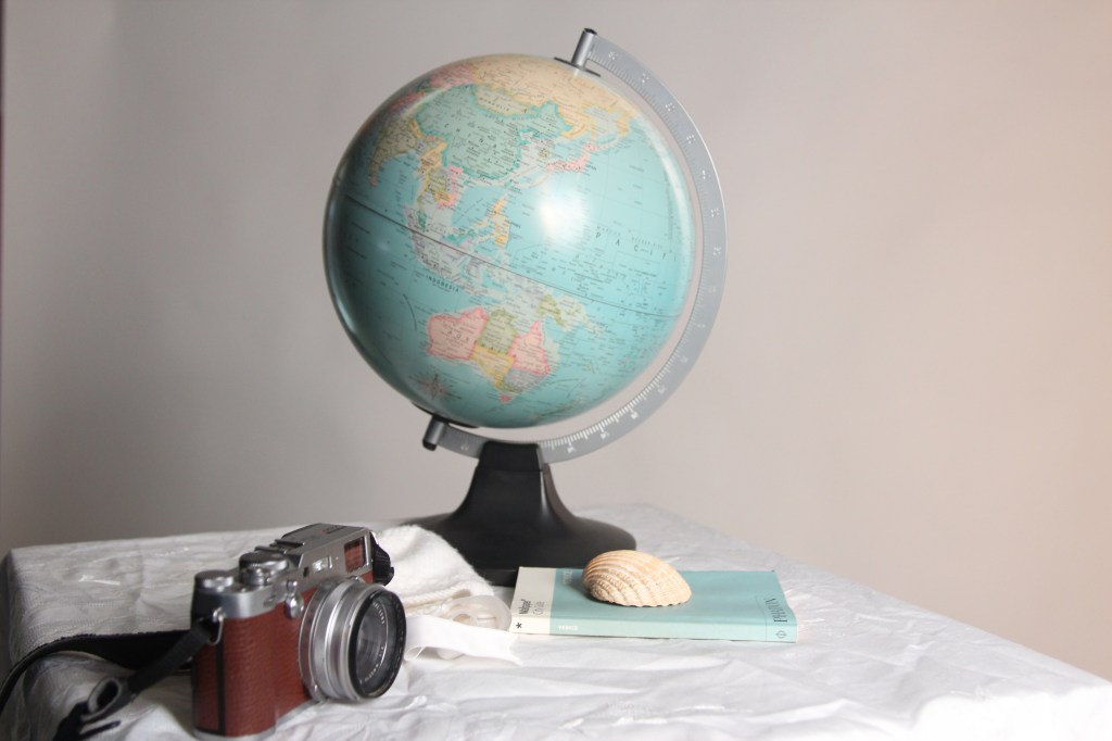
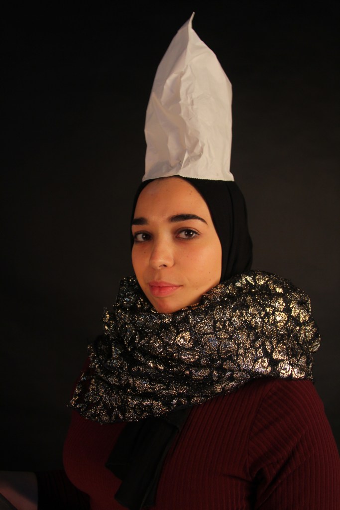
Using objects from home I grouped them together in the studio and played with the lighting and angles to create a similar image to the artists above. I wanted to portray in the image ‘capturing my memories’ by having my babies bonnet, a globe for travelling, a book on Venice where I got engaged and a sea shell, as I adore being by the sea and lastly my camera to capture the memories. The image was dark to begin with so I moved the objects closer to the white background.
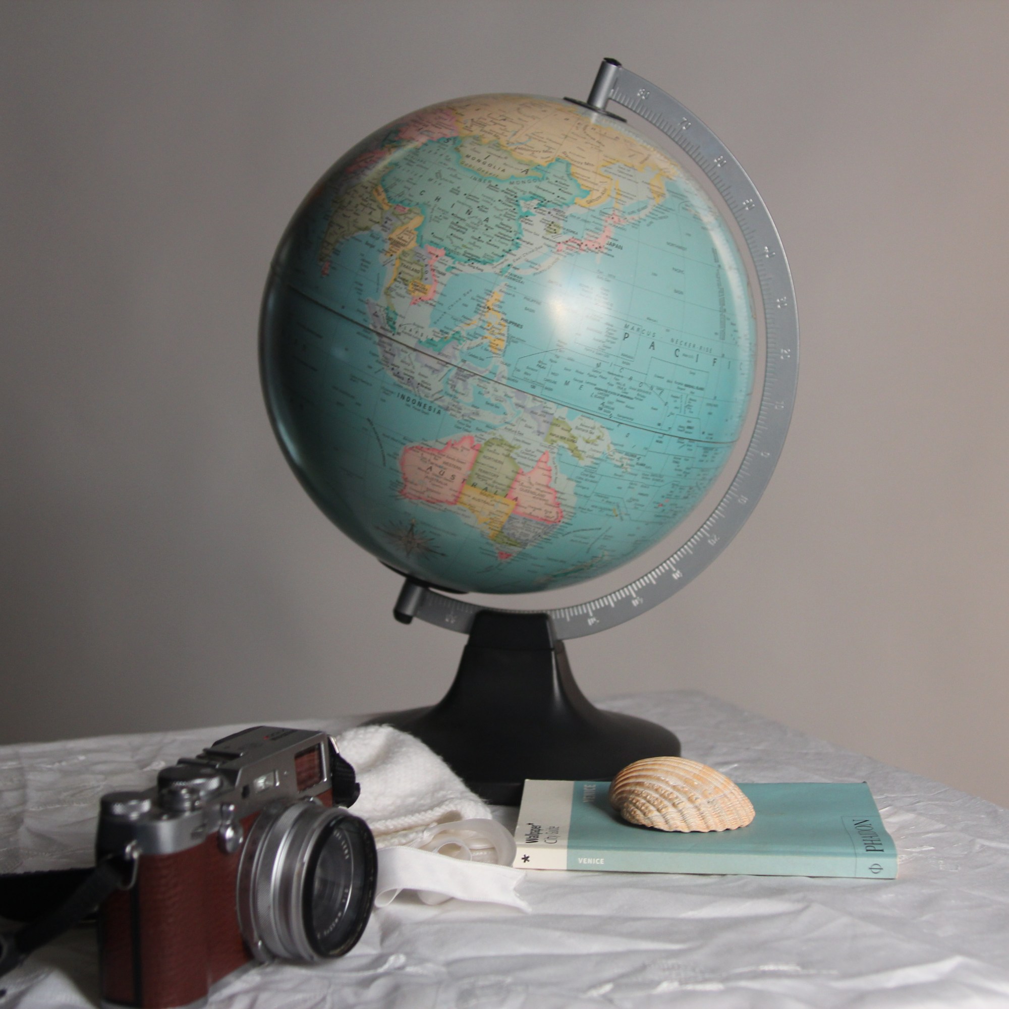
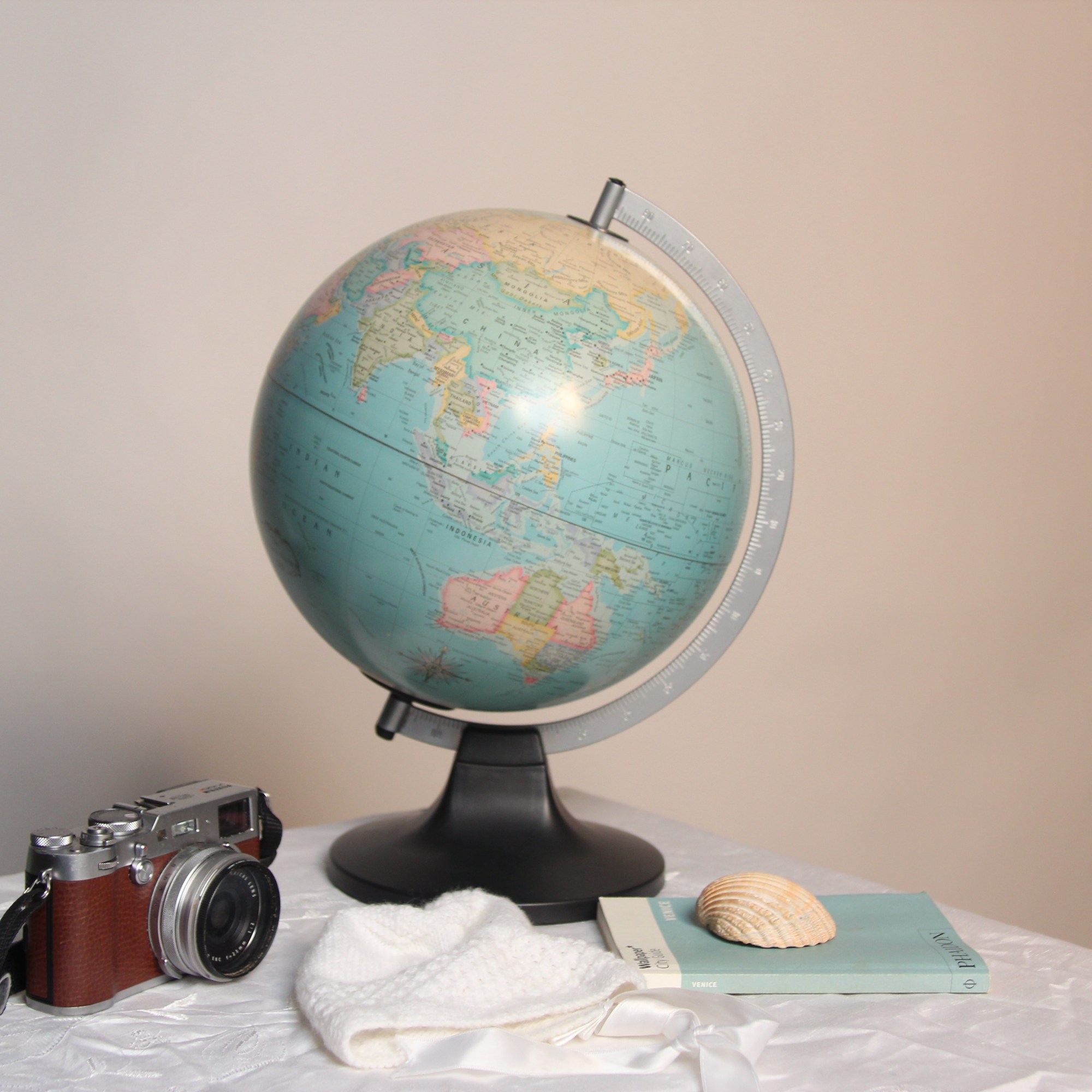
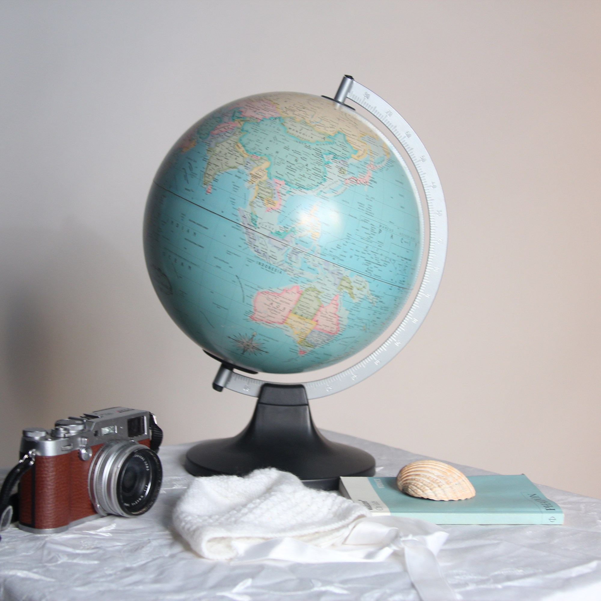
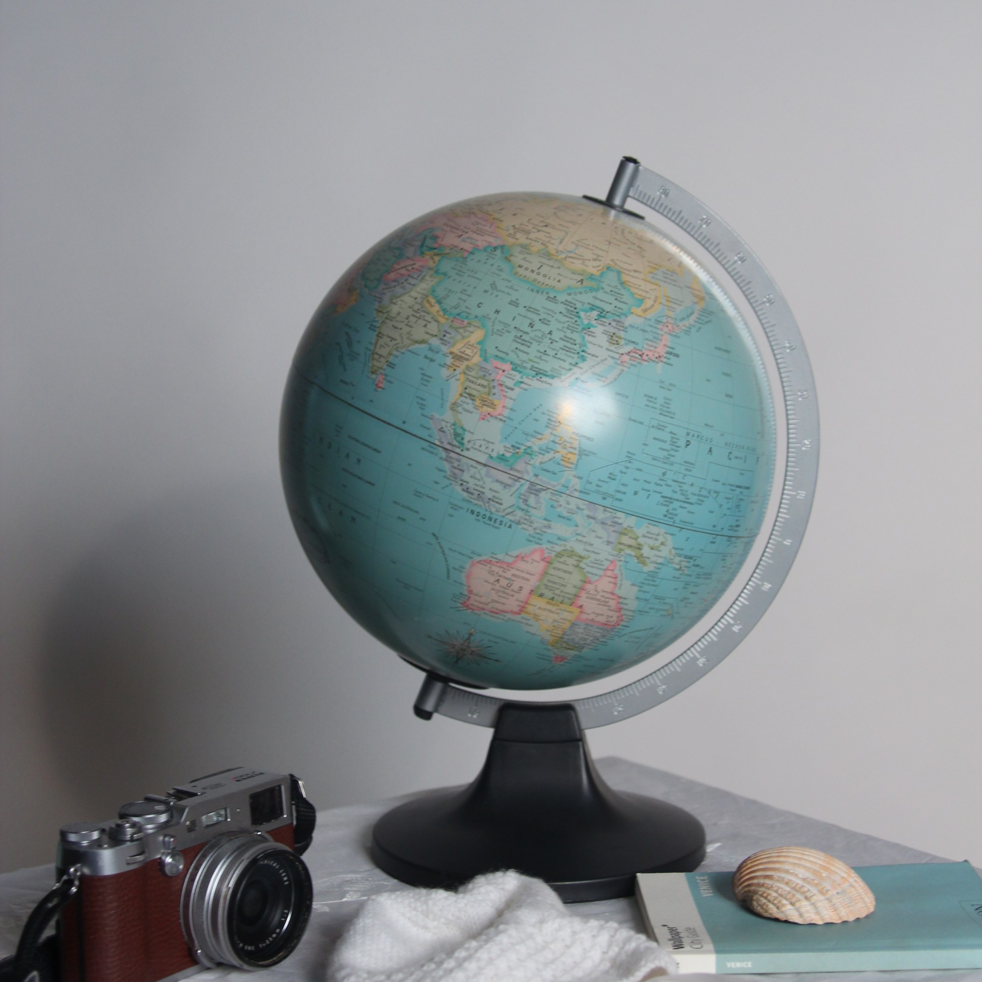
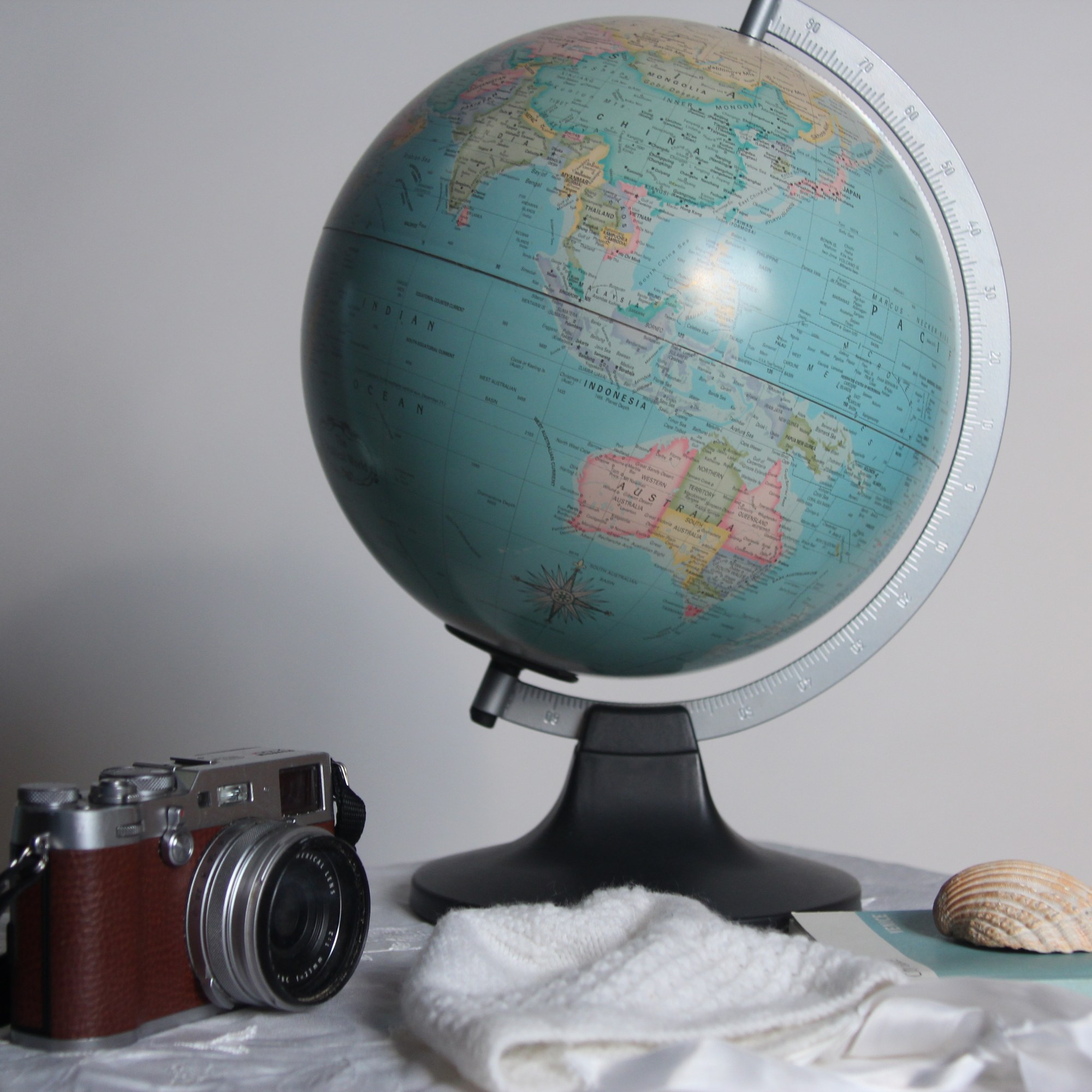

To begin with to add more pastel blue tones we used a colour blue gel on the spotlight, this created too much shadow and a colder look. To create a softer warmer tone, the gel was taken off and then put on the soft box. I lastly played with the white balance and moving to a blue colour. It didn’t quite achieve the look I was hoping for so will try a flash meter next time.
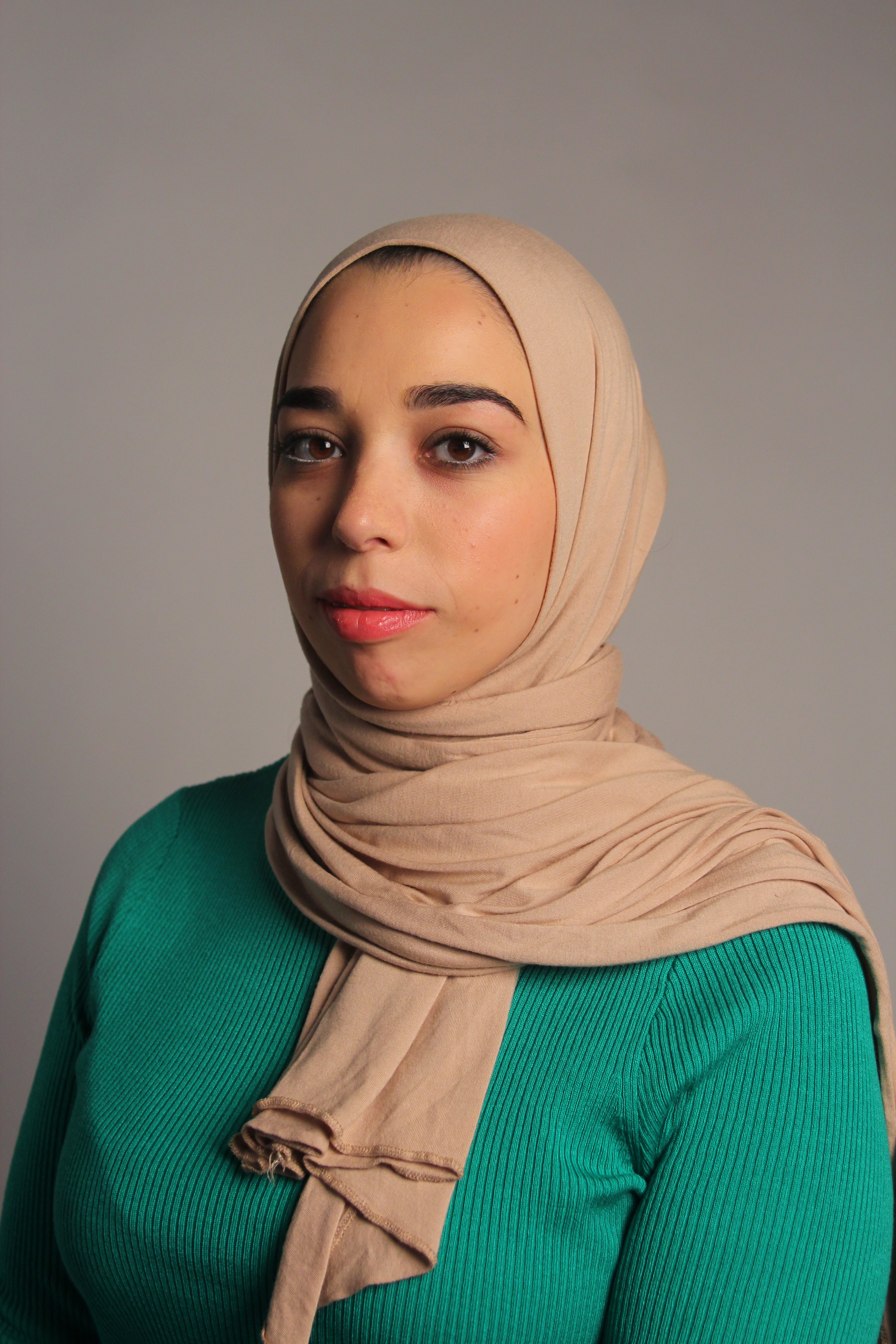
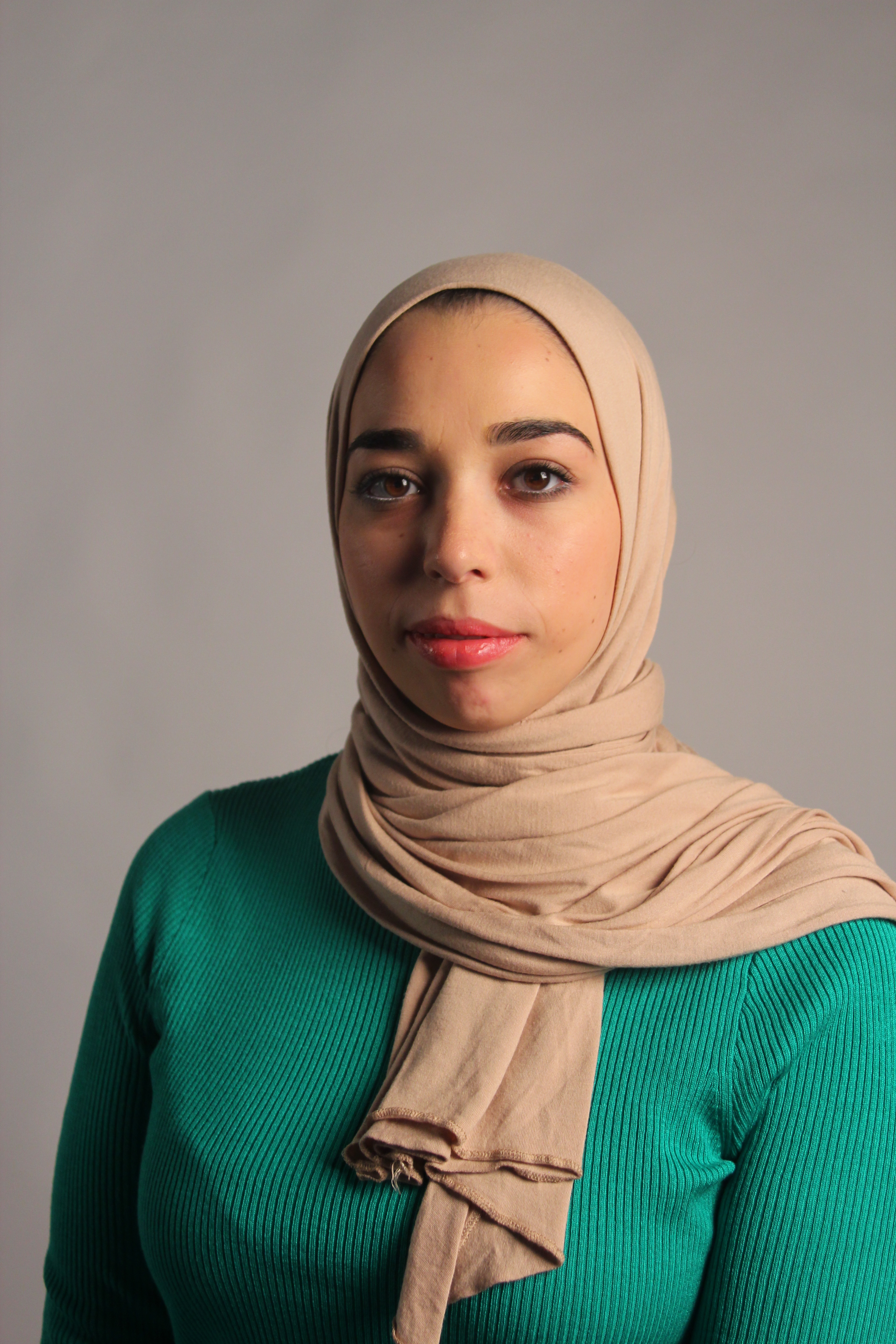
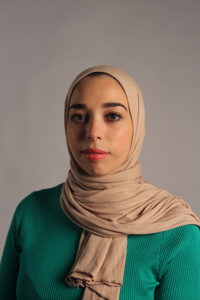
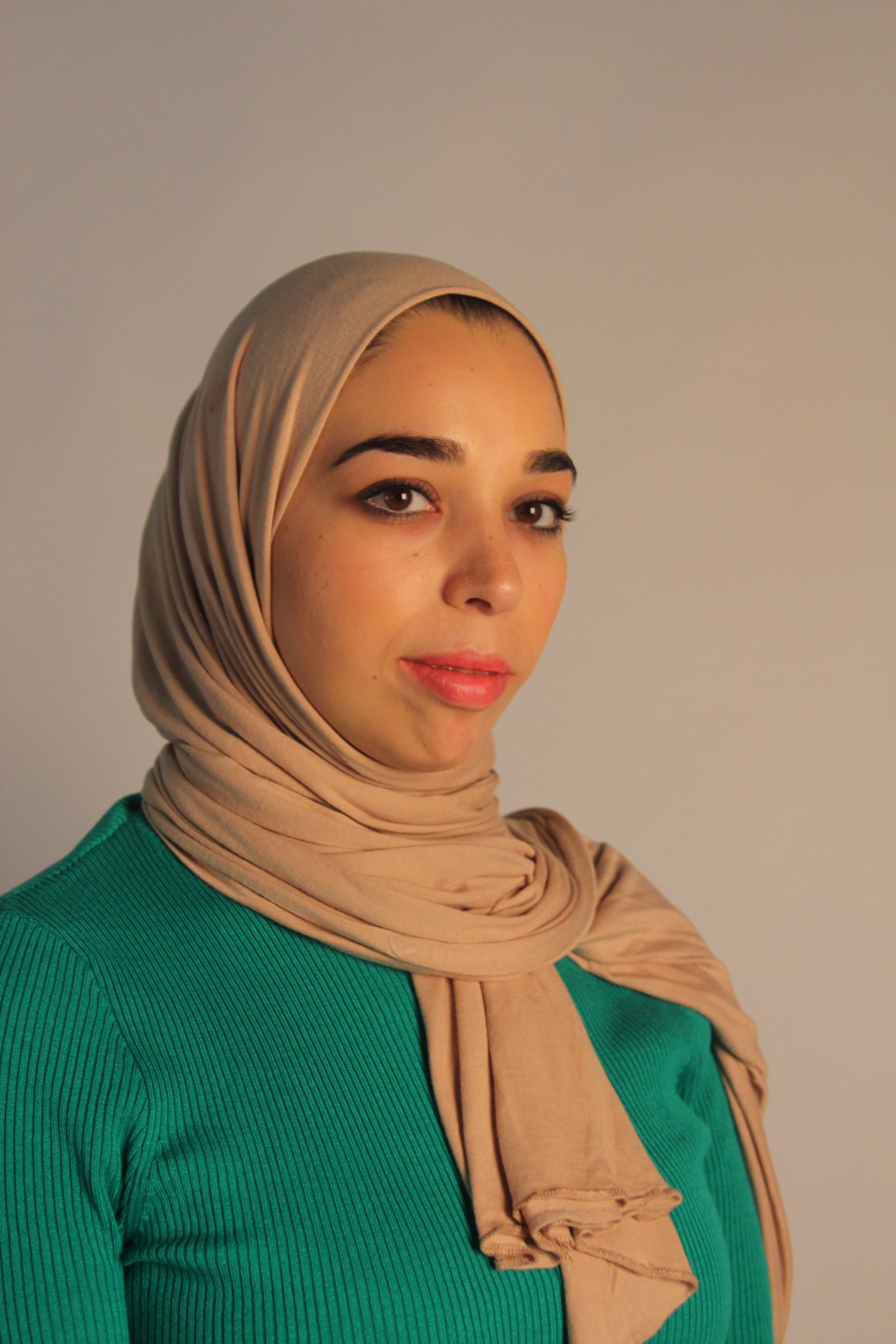
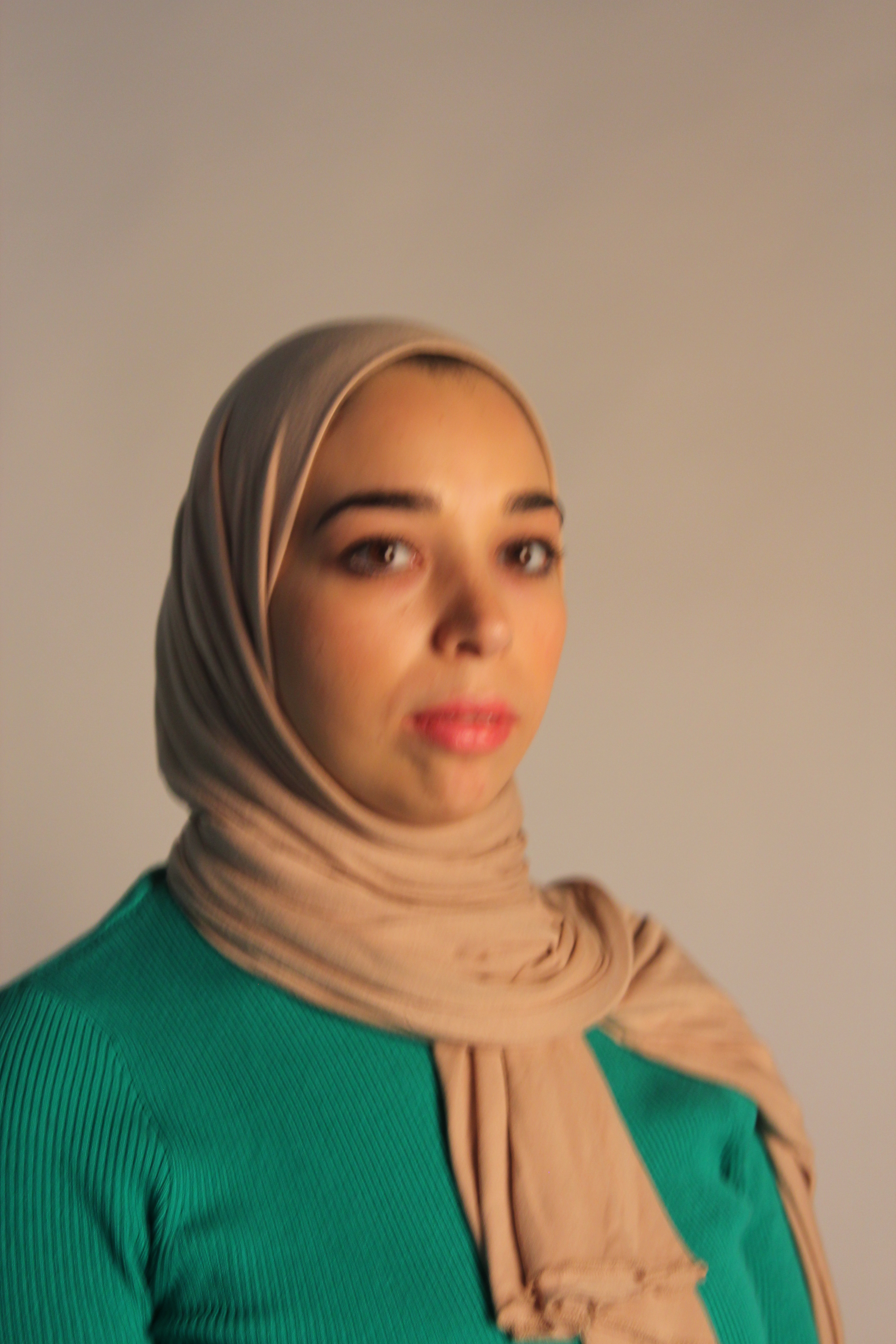
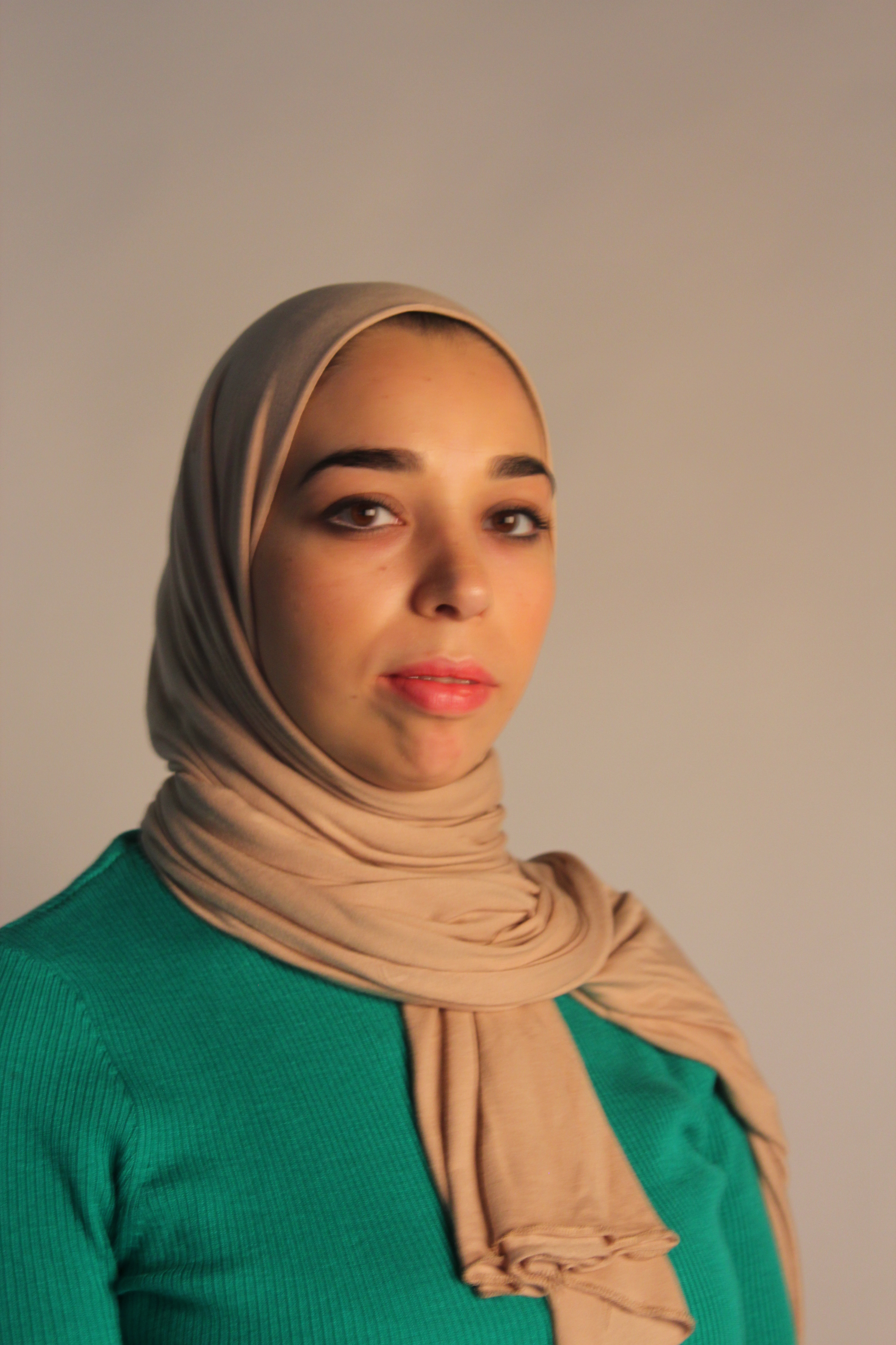
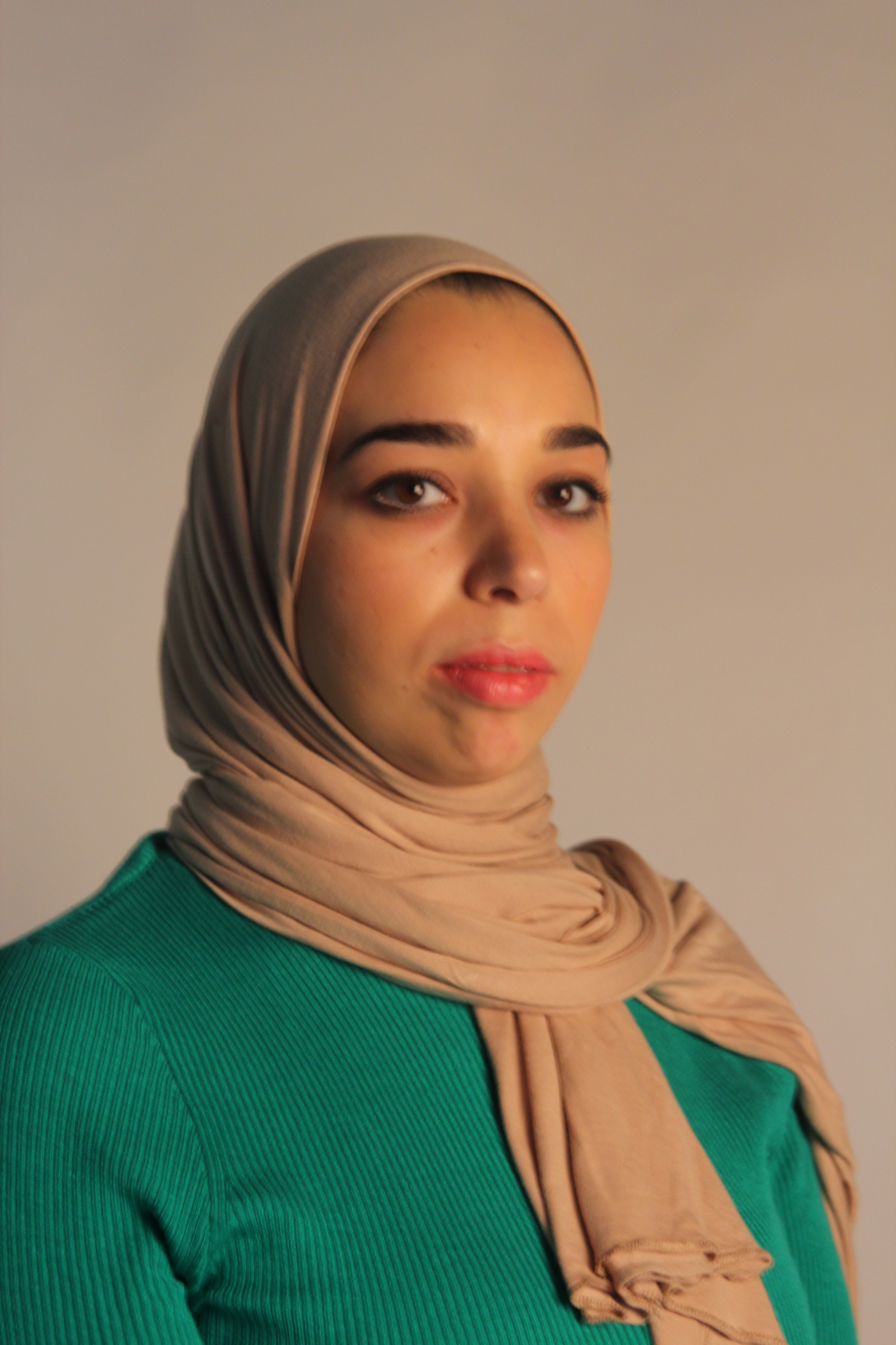
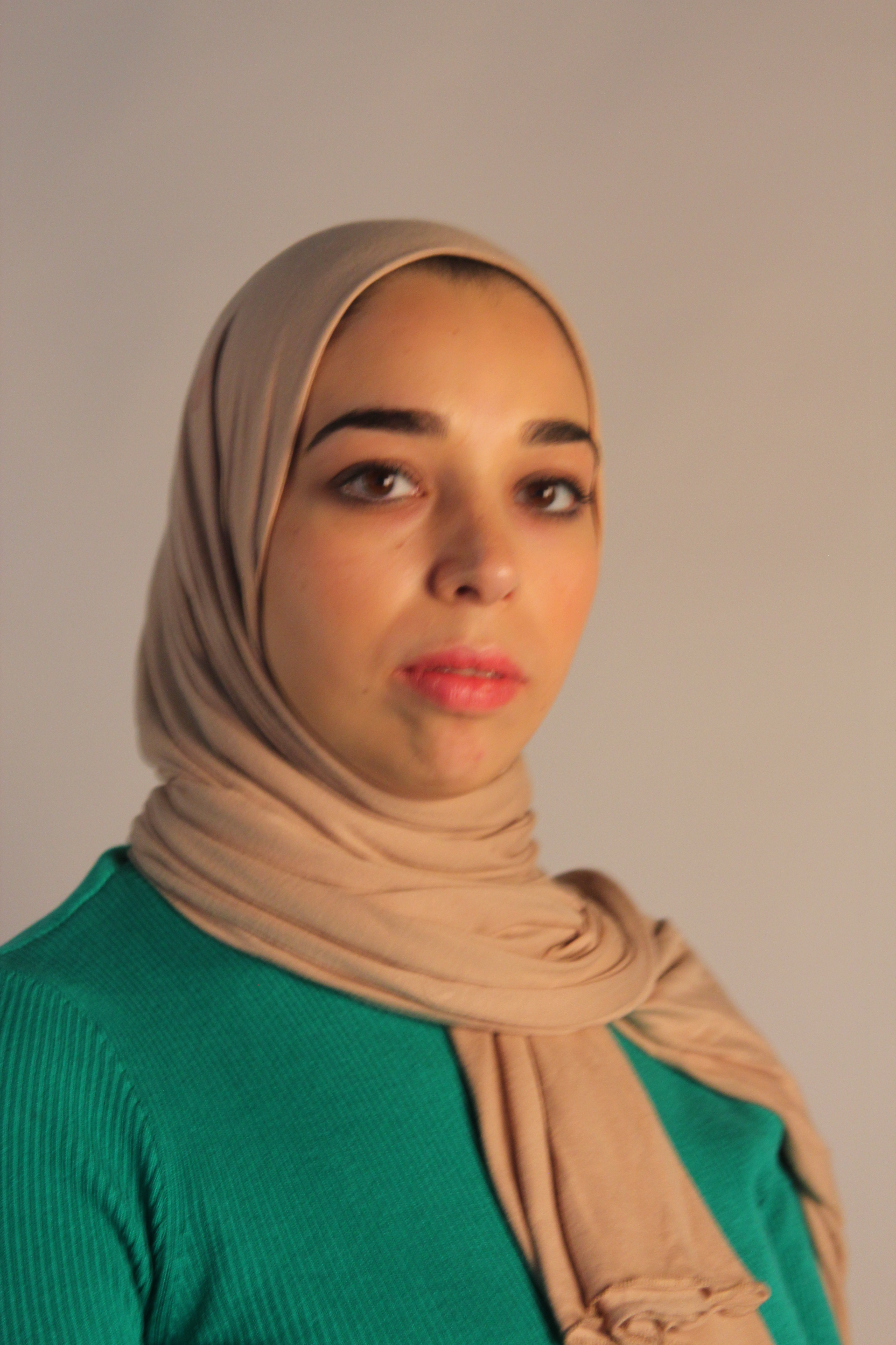
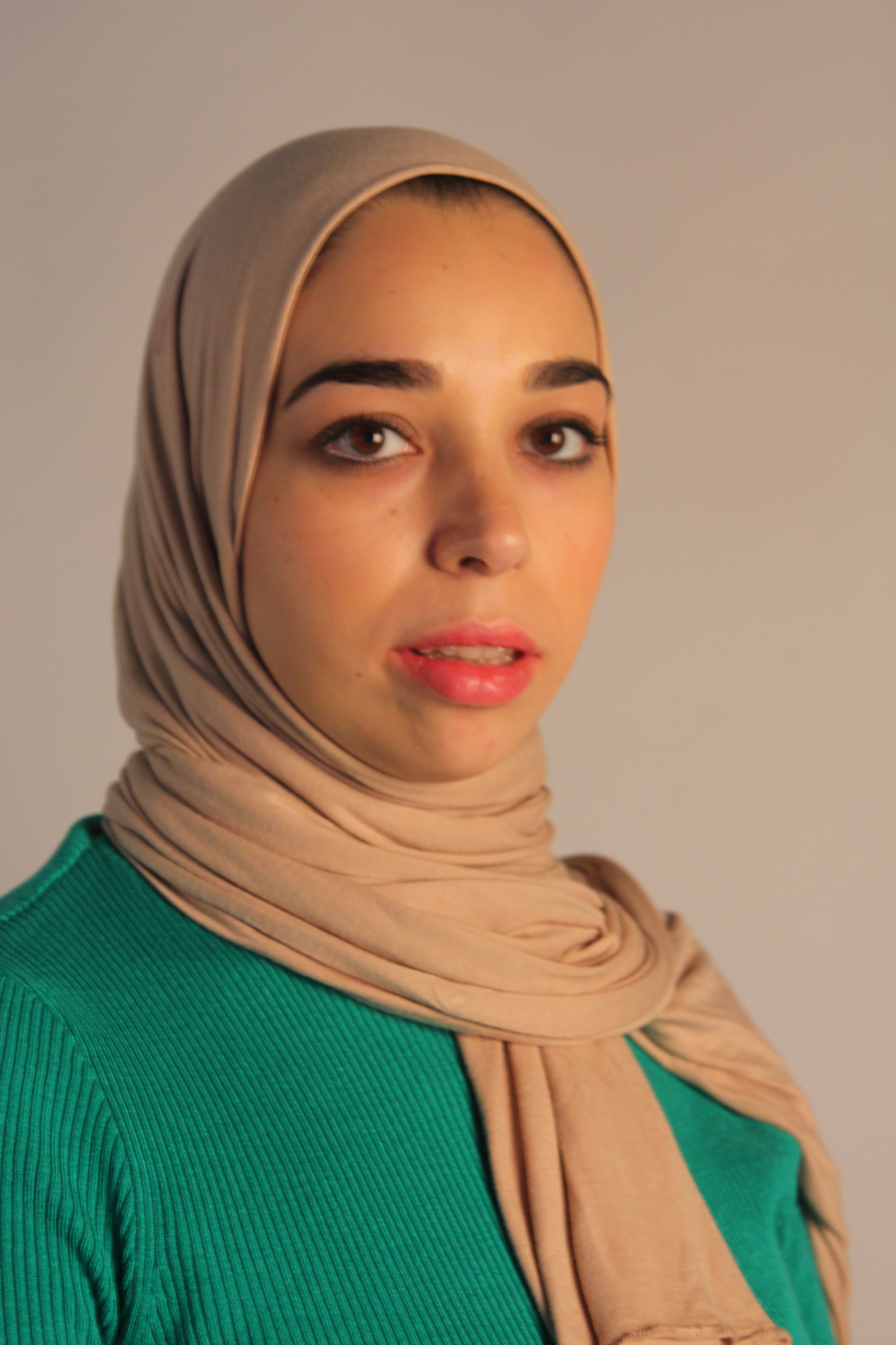
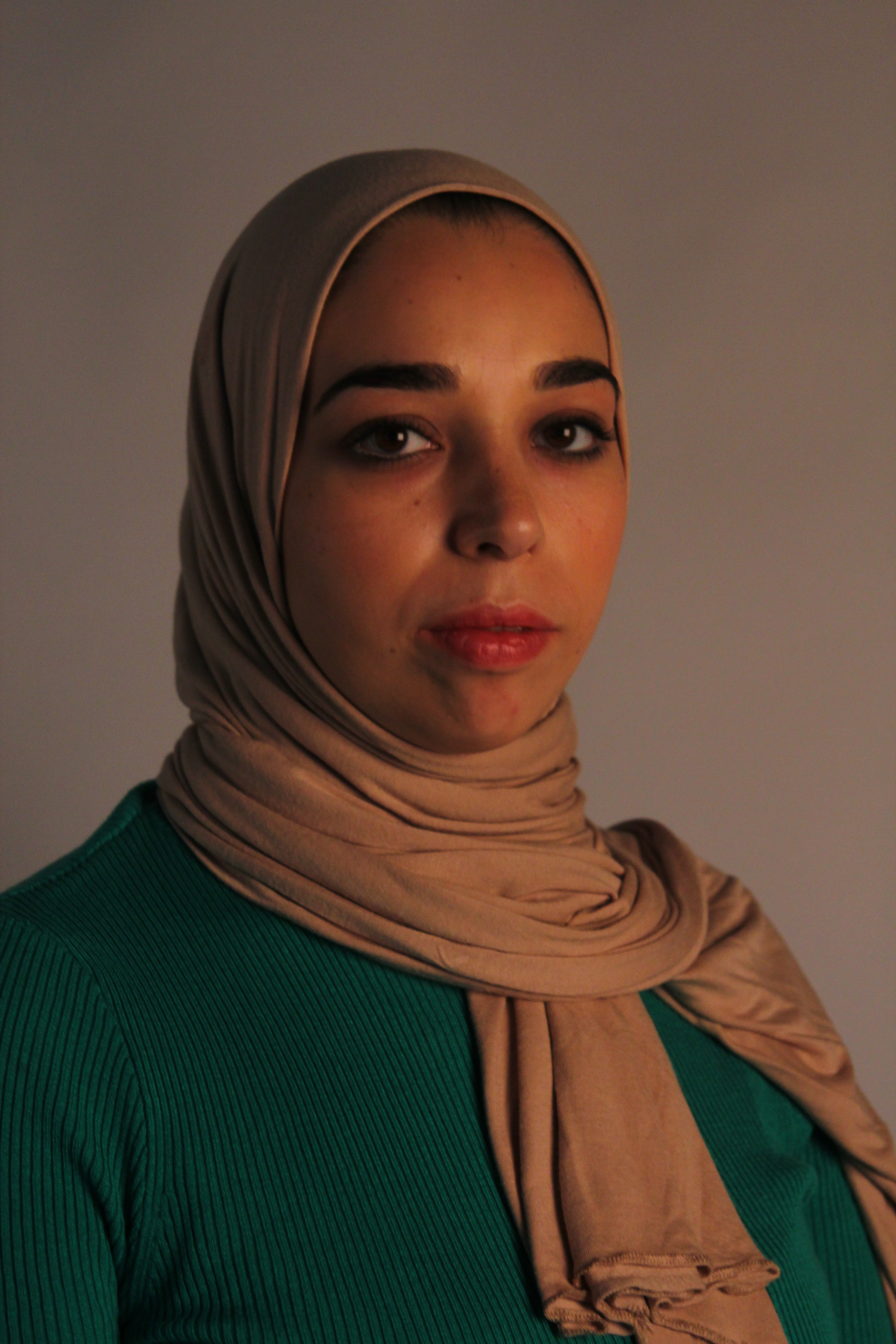
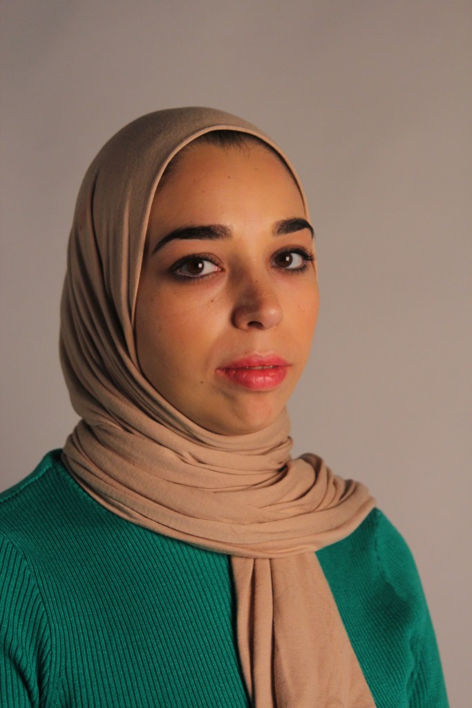
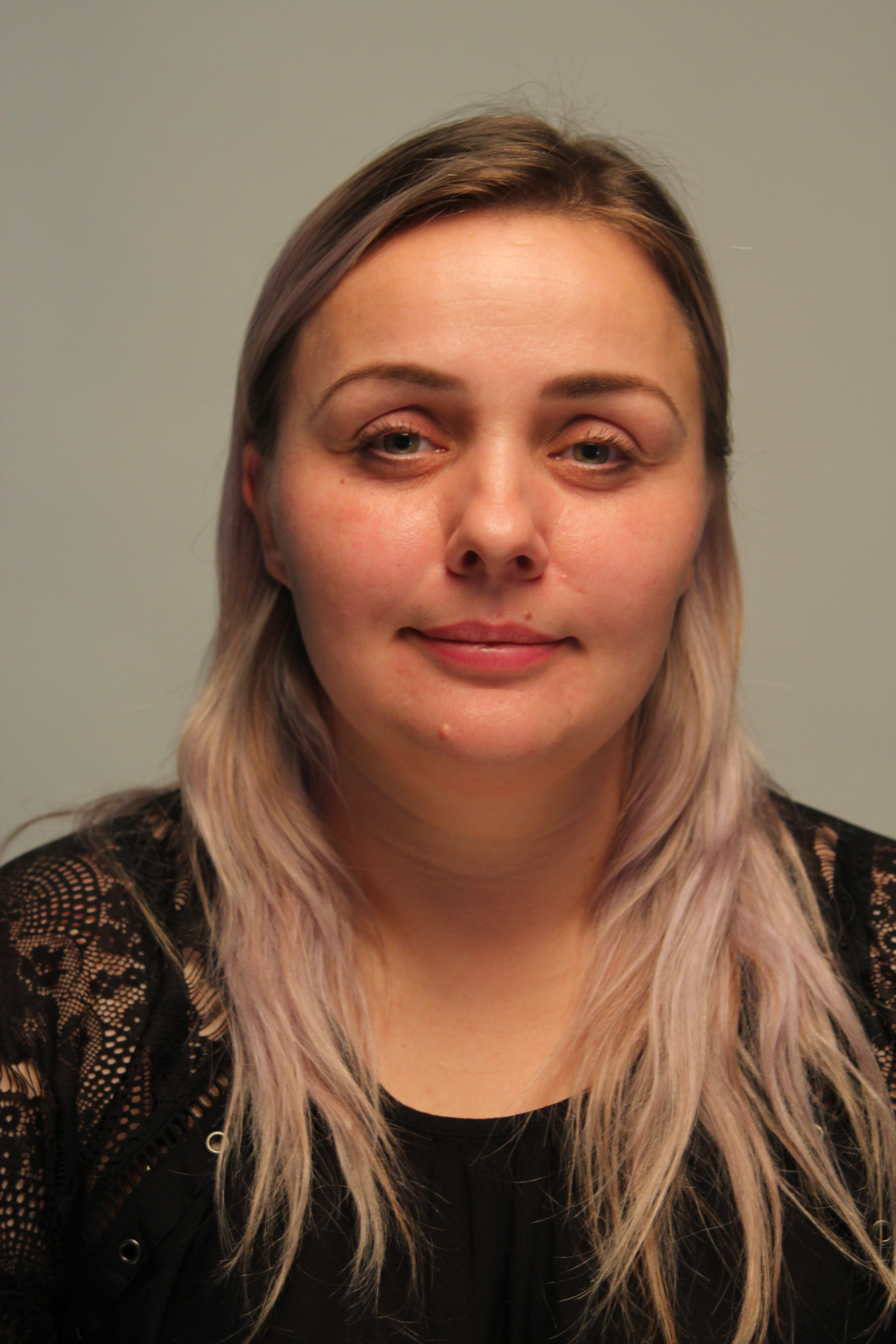
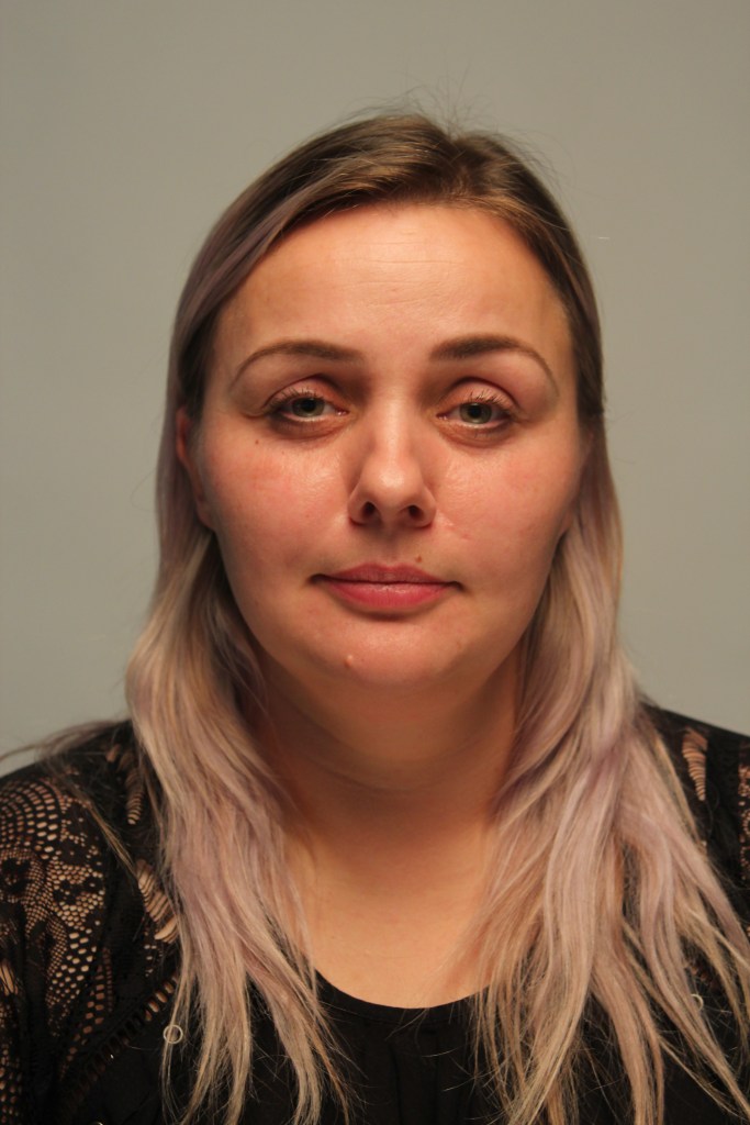
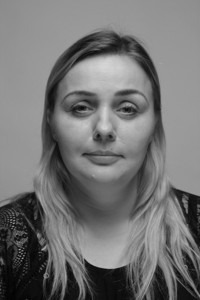
Portraiture – Week 3
Analyse the work of Hendrik Kerstens and Dutch Portrait Artists. Use these artists/photographers to inspire your creative development.
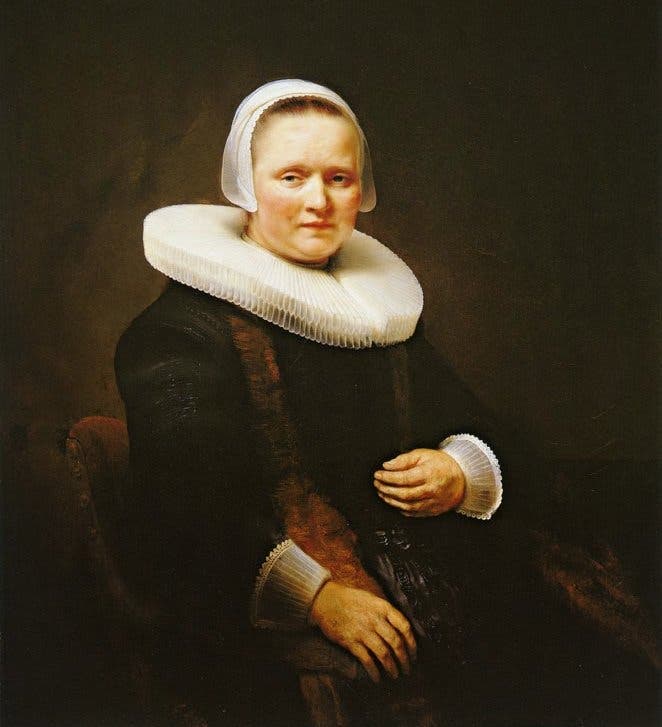
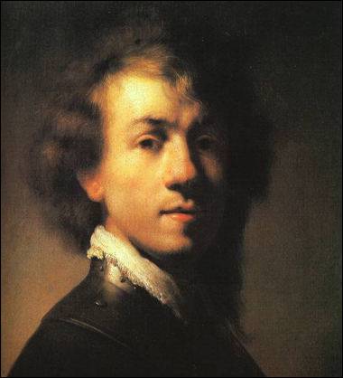
Famous for his master of light and shadow and serious fine art portrait was the dutch portrait artist Rembrandt. His paintings would have a very dark backdrop and he was very clever at adding reflection in the eyes as well as a shadow to the side of the face. The clothes of the time were very bold and grand with big collars and hats which of course we then see influenced in contemporary photographer Henrik Kerstens and Sacha Goldberger with his popular cultural reference of modern day characters.
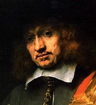
Rembrandt
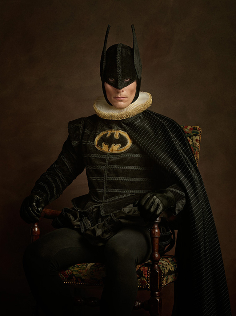
Sacha Goldberger
In this picture Sacha has used the dark backdrop and the white frill collar with the modern twist of the super hero Batman sitting in the chair.

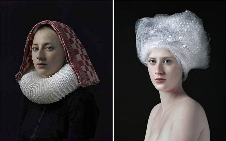
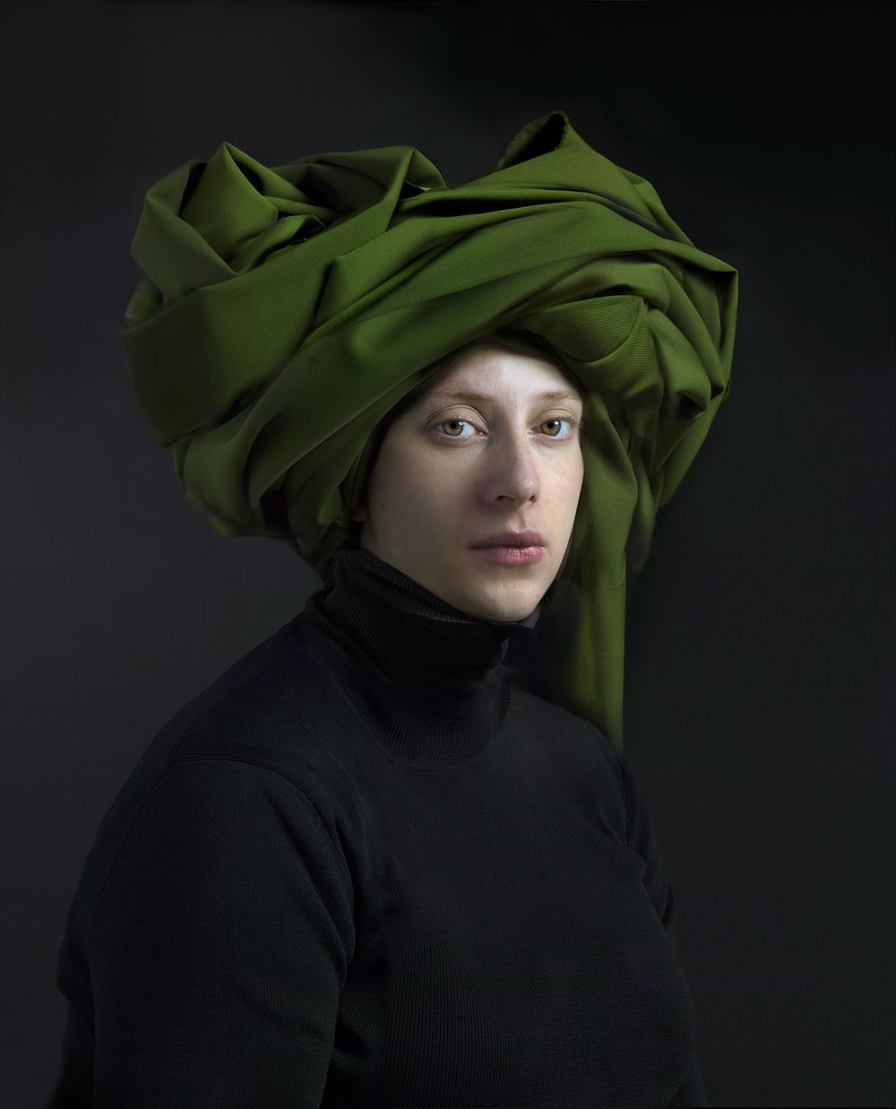
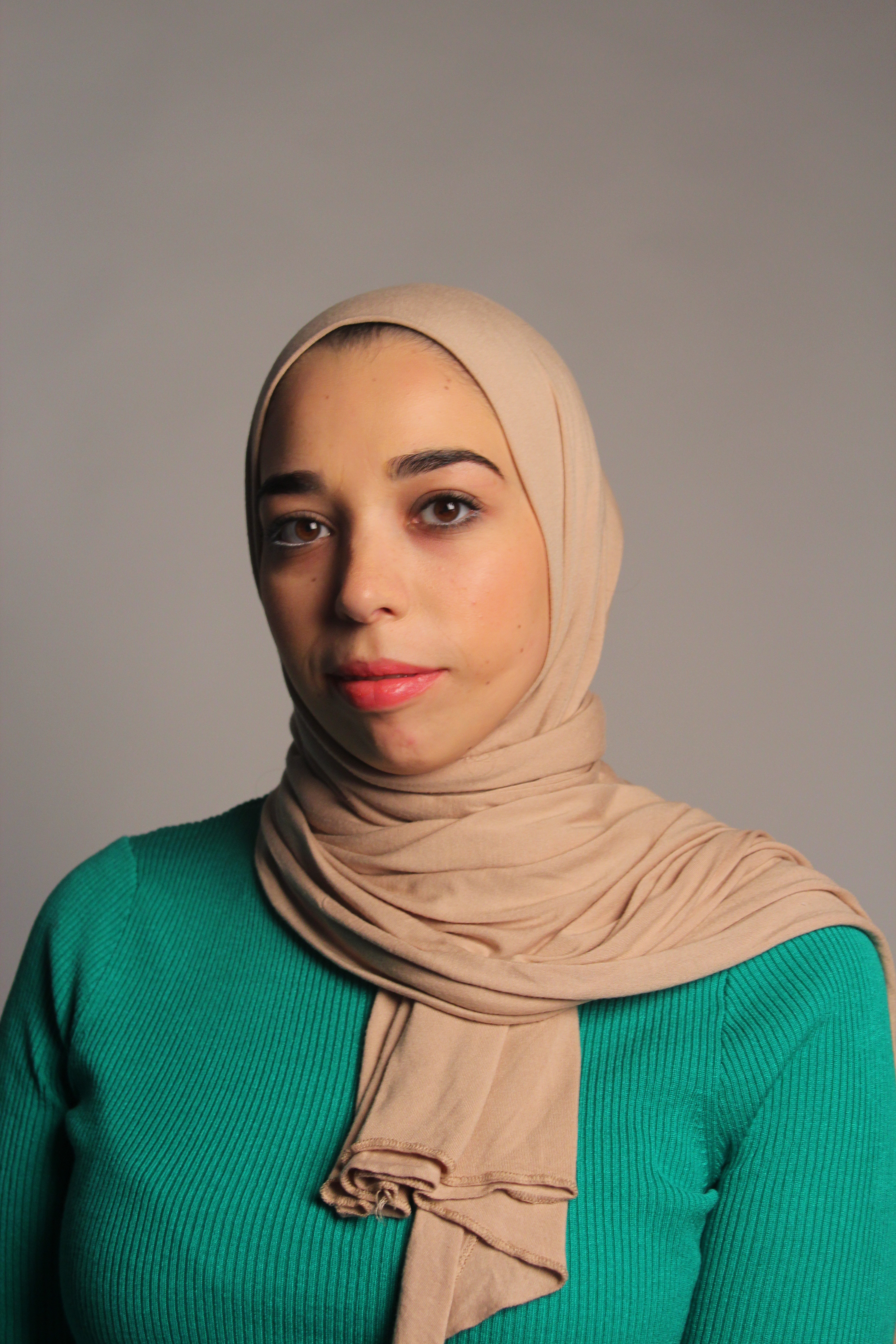
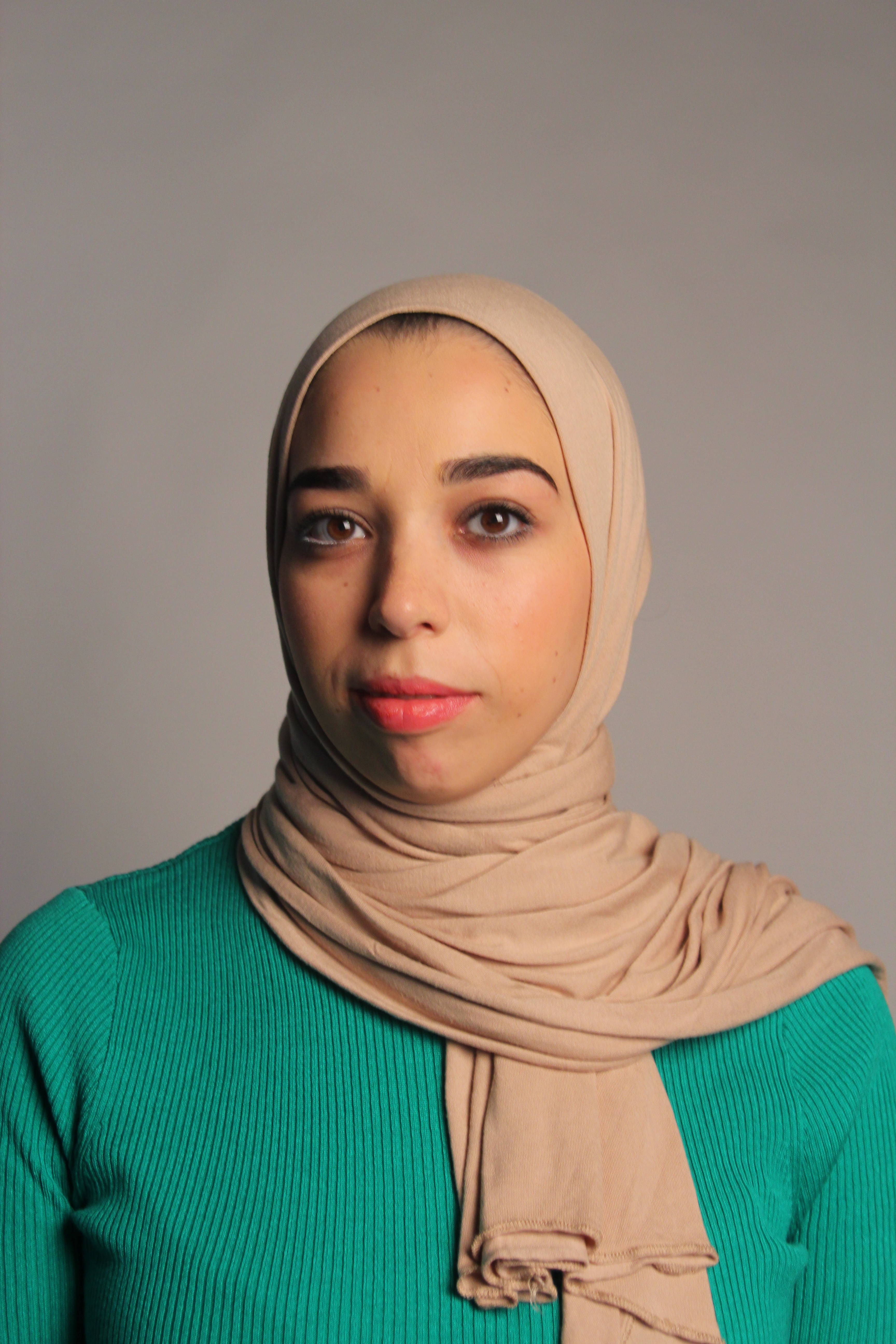
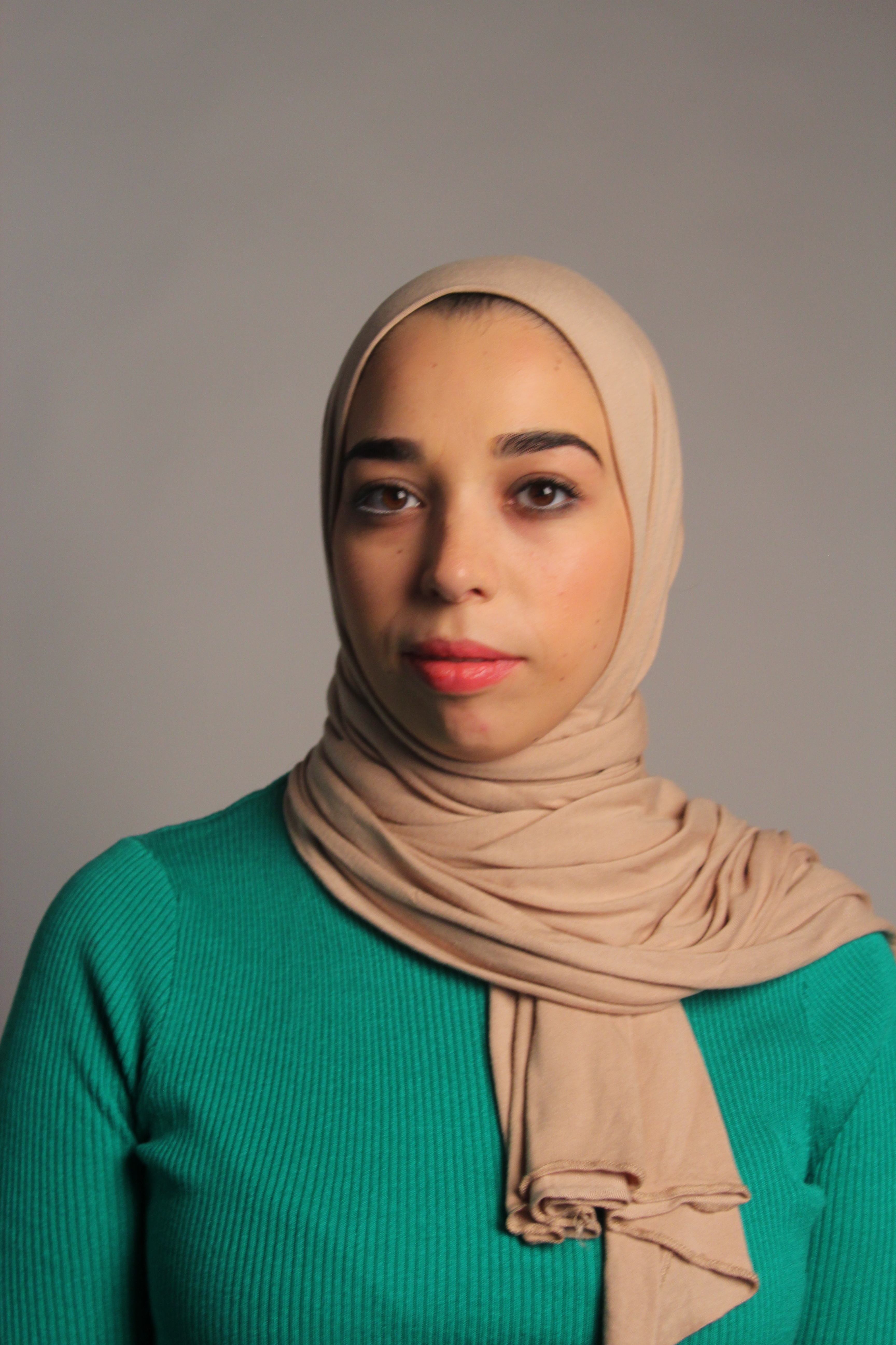
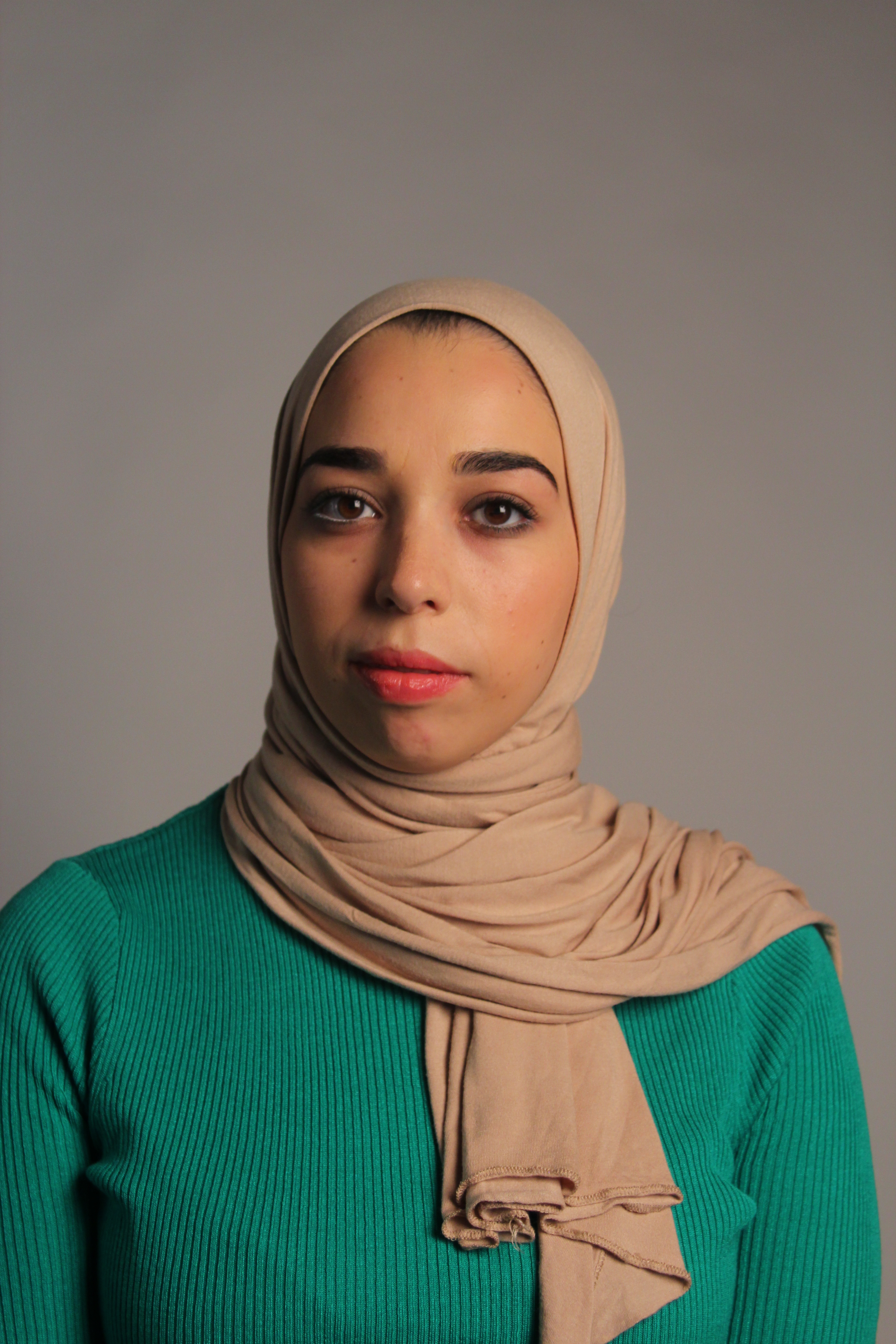
Hendrik Kersten uses a black back drop and the face is brighter with the use of shadow and reflection in the eye. He is inspired by the great looks of the time with the hats and collars which give a powerful and elegant perspective. The use of plastic bags and a towel on the head draws you in with interest. He really captures the Rembrandt and Johannes Vermeer influence with the serious expression on the girls face as well as her complexion and slight angle of the face to the camera, like in the painting The Girl With The Pearl Earring by Johannes Vermeer.
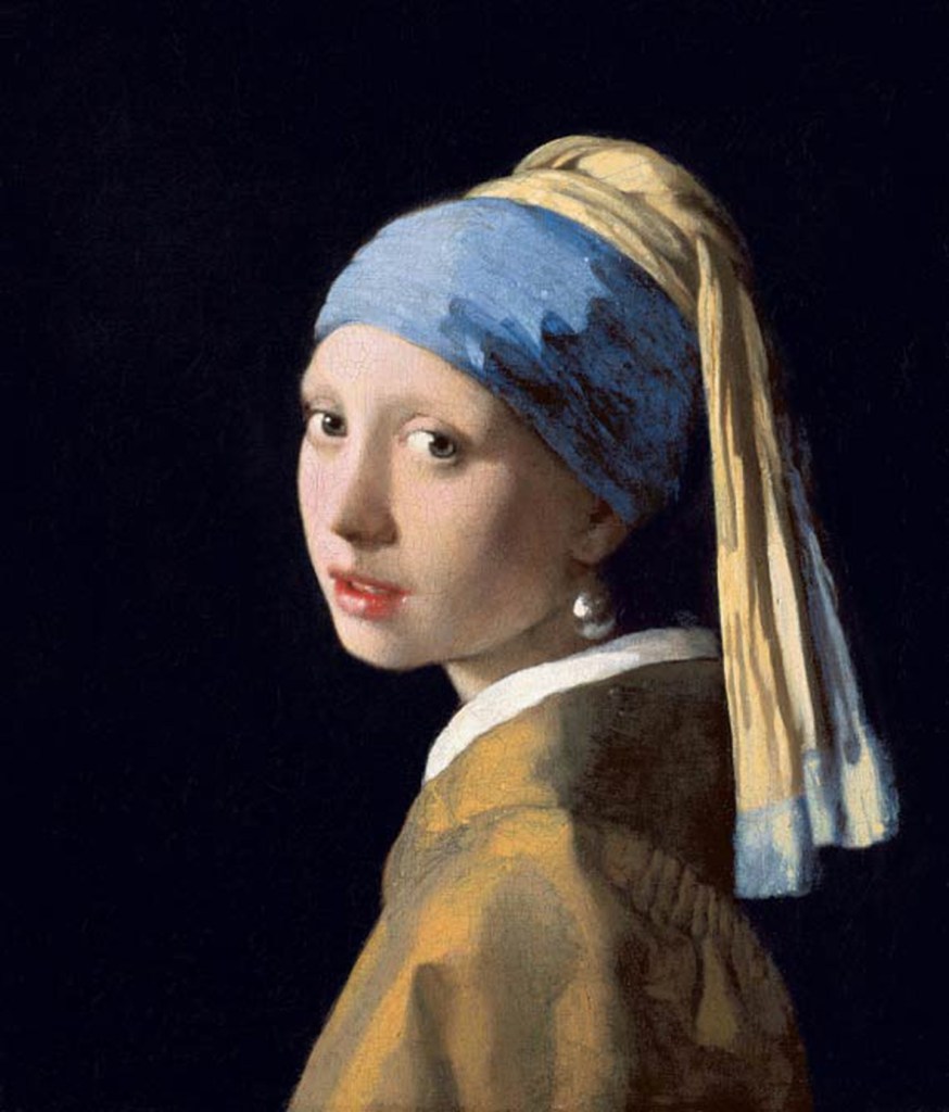
Johannes Vermeer
All these artists and photographers have in common is when shooting/drawing the person, it is at eye level with reflection of light in the eye which adds life to the subject.
The Photo Process:
In order to create a look and feel that Henrik uses as well as an influence of Rembrandt with the triangle shadow on one side of the face and a reflection of light in the eye I would have to experiment with the equipment in the studio as well as my camera.
In the studio I need:
- A black backdrop
- Main light – soft box(most dominant)
- Hair light (soften features)
- Camera
- Reflector (add cooler tones)
- Model
On my DSLR I need a low shutter speed and possibly a tripod if blur occurs. My settings were 1/15 shutter speed ISO 400 F stop 5.0.
Firstly I played with Rembrandt lighting and trying to create the shadow on one side of the face, as well as reflection in the eye. I needed the soft box light with the reflector opposite.
This first picture was not blurred as my ISO was quite high I didn’t need a tripod however it was too bright and needed to be slightly darker to create a bit more shadow.

The final picture managed to get the shadow on one side of the face by changing the positioning of the light closer and and the reflection in the eye too. I was really happy with this.
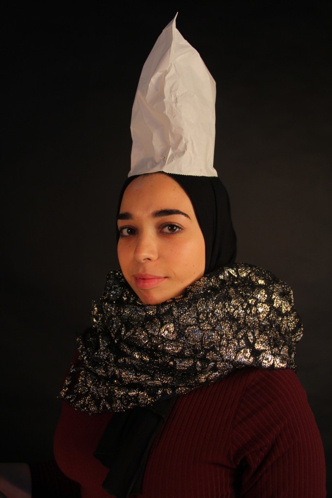
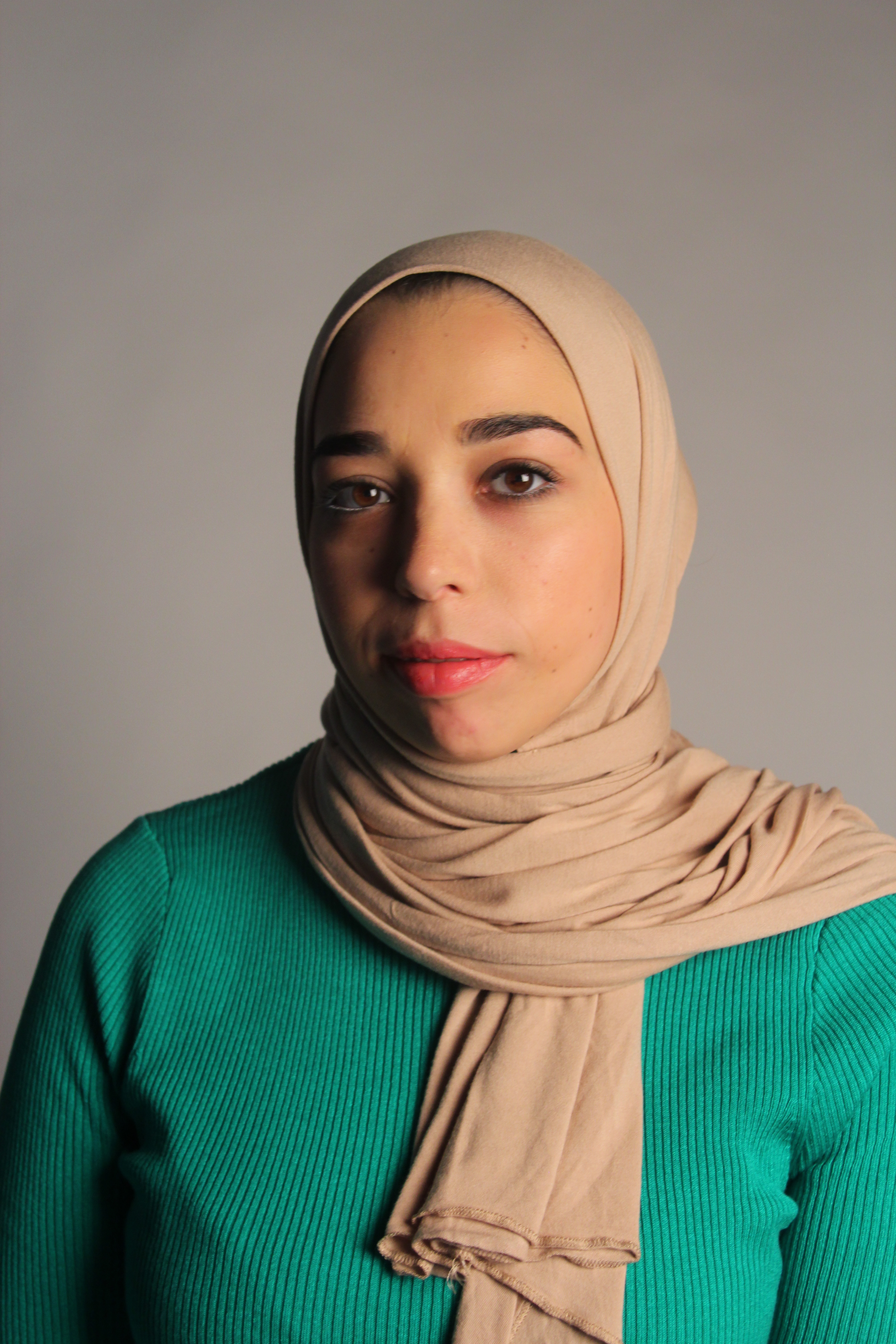
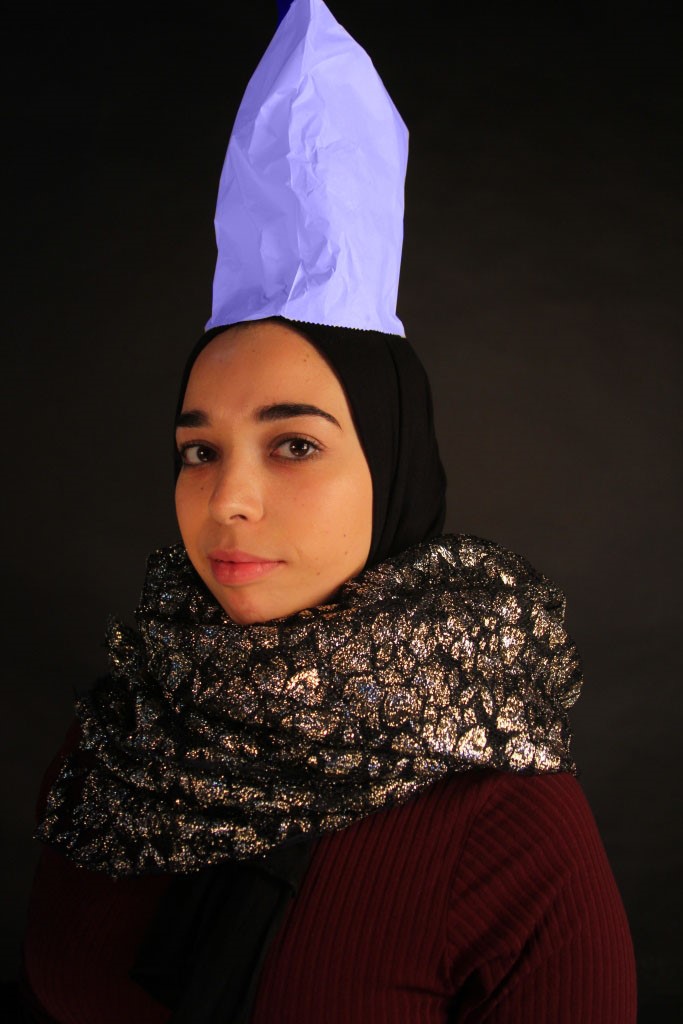
I then took inspiration from Hendrik Kerstens with using props that were similar to the dutch portrait era with a modern twist. The pictures below have the big collar effect with glitter and a paper bag on the head similar to grand hat. In the first three pictures it was difficult to get the reflection in the eye due to the model’s glasses and the light bouncing off.
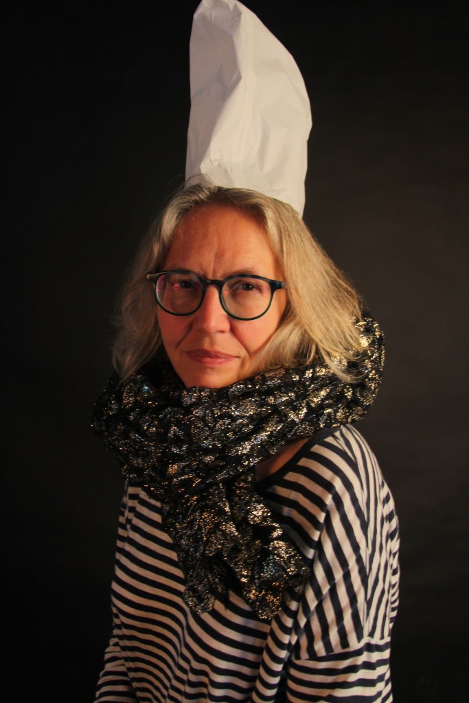
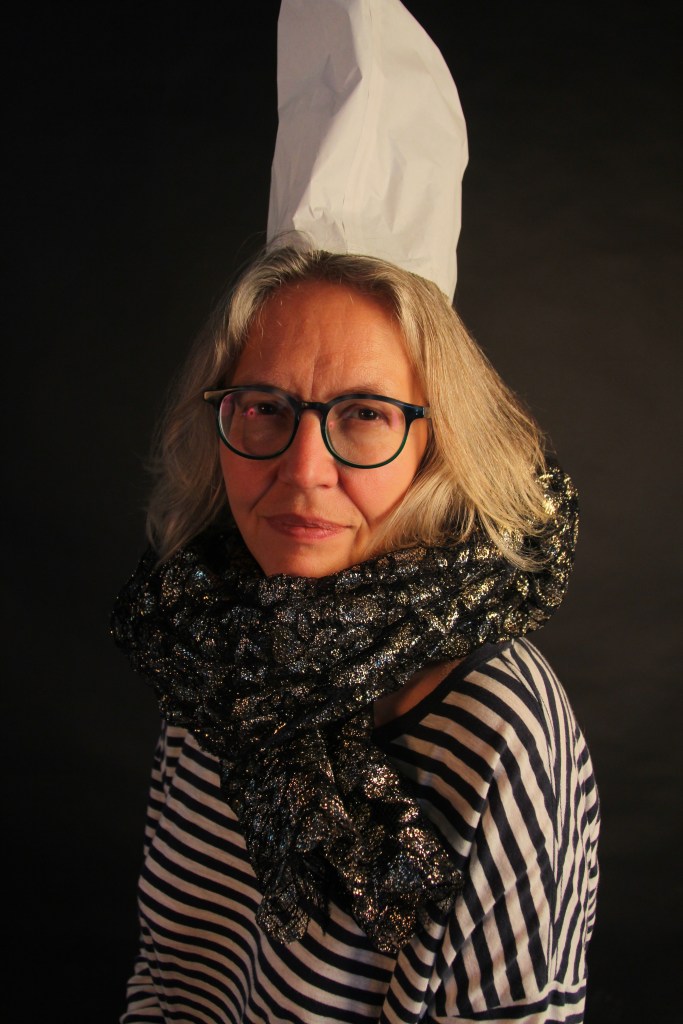
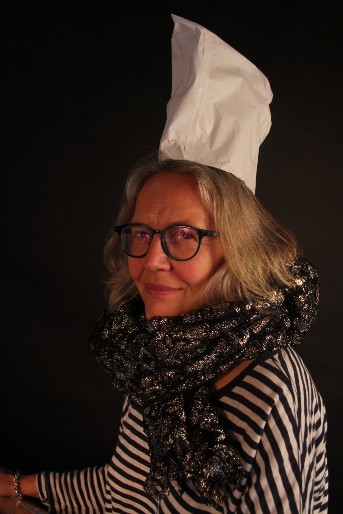
In the next three pictures I had a low apeture of F4, ISO was 400 and I moved the shutter speed slightly up to 1/15 for less blur. By the final picture I had moved the soft box light down and closer, as well as edging closer towards the model with the camera which created the lovely light reflection in the eye.

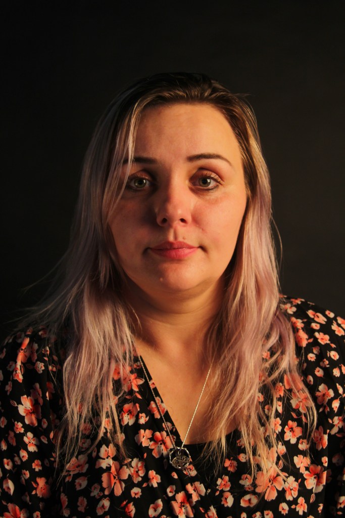
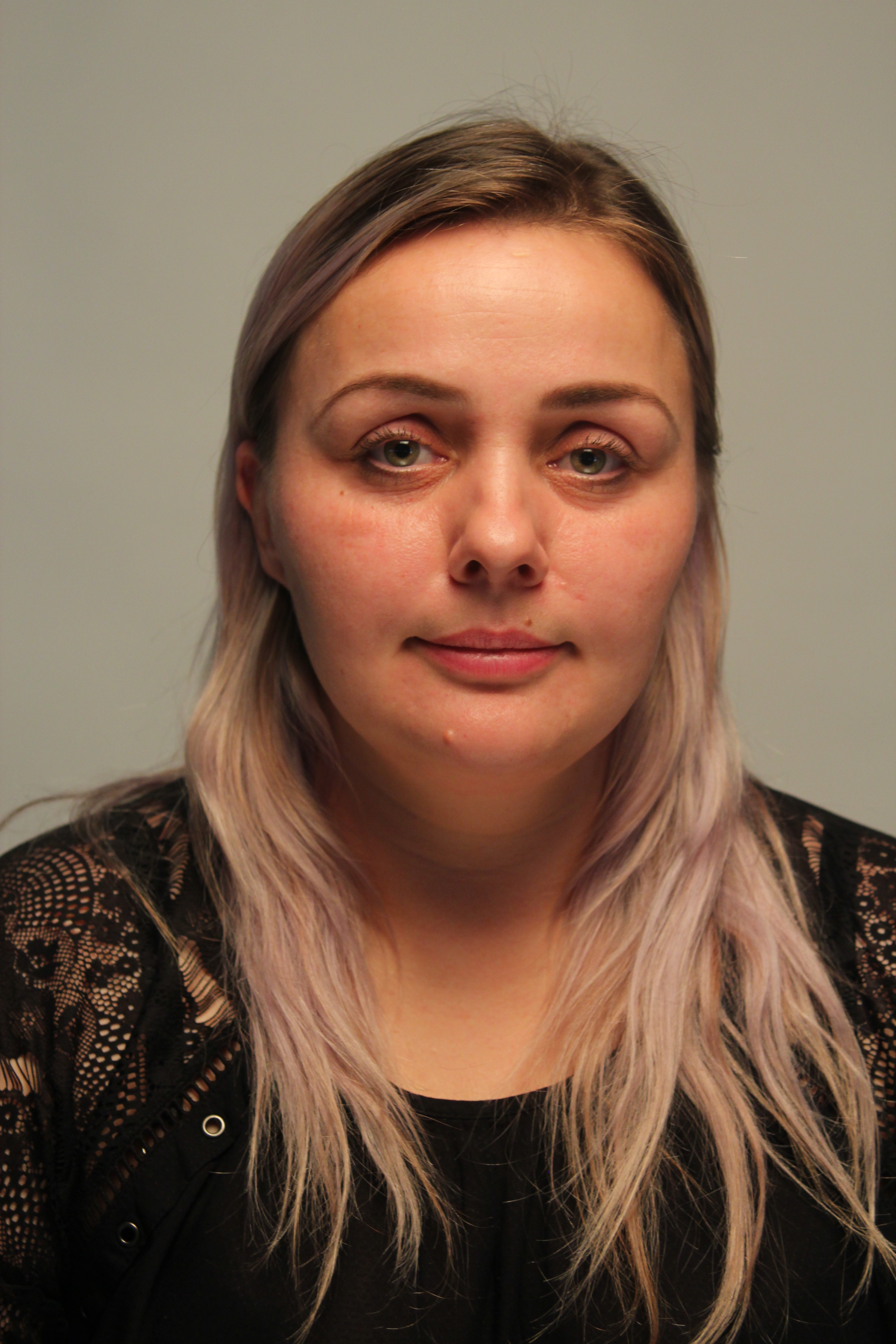
Portraiture Lighting – Week 4
This week I looked at the use of lighting in the studio for portrait pictures.
Rembrandt the light is in front of the model above at a slight angle to the right which creates the small triangle on the side of the face.
Split the light is moved to the side of the model which creates a split down he centre of the face adding a more dramatic look.
This week we practiced in the studio using Broad light, Short light and Butterfly light.
Broad Light -similar to the Rembrandt position the models face is slightly away from the light and one side of the face is lit up. Photographers tend to use broad lighting to show the good side of the face and emphasise features or they can help mask features. For example a slender nose can be created by the shadowed area or decrease wrinkles or defects on the face with the use of shadows. Like the Rembrandt, must make sure that the eyes are highlighted and not in shadow.
Studio equipment – reflector, soft box, tripod, flash adaptor and white backdrop (the further away the model is from the backdrop it will become more grey and closer the model is it will become white.)
Once the model was sitting down I asked her to twist to the right ever so slightly. The soft box was to the right of the camera and the reflector was opposite the light.
The photo process:
My camera settings was F stop 5.0 ISO 400 and I put it on auto aperture. In the first few pictures I felt that was a bit too much shadow so to create a more subtle shadow I moved the model more central and moved the reflector more opposite the soft box. On my camera I changed the settings to F4.5 from F5. This improved it with the final picture above there is a nice subtle shadow to the side of the face and the soft box light highlight the eyes with the lovely reflection in them.
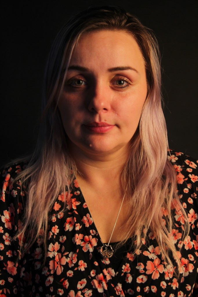
Short light – This is the opposite of broad light with a more subtle shadow. This is not the most flattering but the photographer can get very creative using it with interesting effects, primarily used in fine art.
Studio equipment – Using the main light and reflector again I angled the model facing the other way. As the photographer I’m facing straight on to the model again.
Photo process:
I started my photo settings on F stop 4.5 ISO 400 and auto aperture again. To begin with there was too much shadow so I moved the reflector opposite the soft box light. A bit of blur started to occur so I moved from auto aperture to manual and put the shutter speed to 1/25 and moved the aperture to 5.0. This helped get rid of the blur but the picture became darker. I increased the F stop on the main light soft box to brighten the picture up.
The final image created a nice subtle shadow to the main side of the face, this was done by the light bouncing off the reflector. I also achieved the square soft box reflection in the eyes.
Butterfly Light – A shadow is created below the nose on the chin and cheekbones. This gives a pretty light and attractive look as the cheeks and jaw are highlighted, photographers would use this in beauty shots.
Studio equipment – The main light is moved up high directly above the photographer and the camera. The model is moved close to the photographer and a reflector is placed on top of the model’s lap.
Photo process:
The camera was set to a shutter speed of 1/15 F stop 5.0 and ISO 400. I was directly under the main light, to create the shadow effect I moved closer to the model and asked her to angle the reflector slightly up on her lap. This then created the shadow under the nose, chin and cheekbones.
Researching the butterfly light, many of the beauty shots are also in black and white which can help emphasise the shadow to intensify it more.
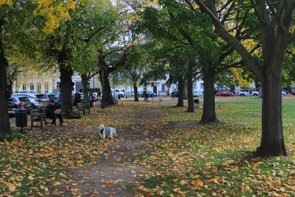
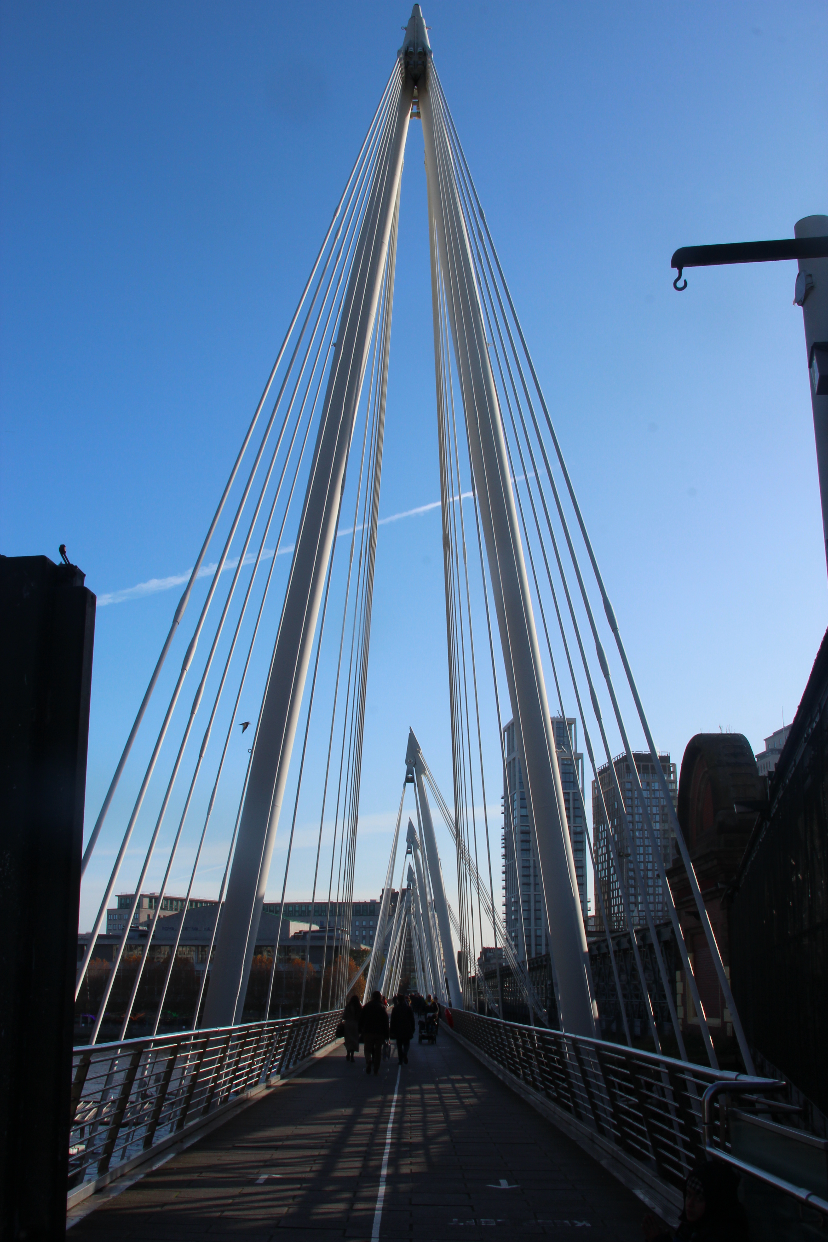
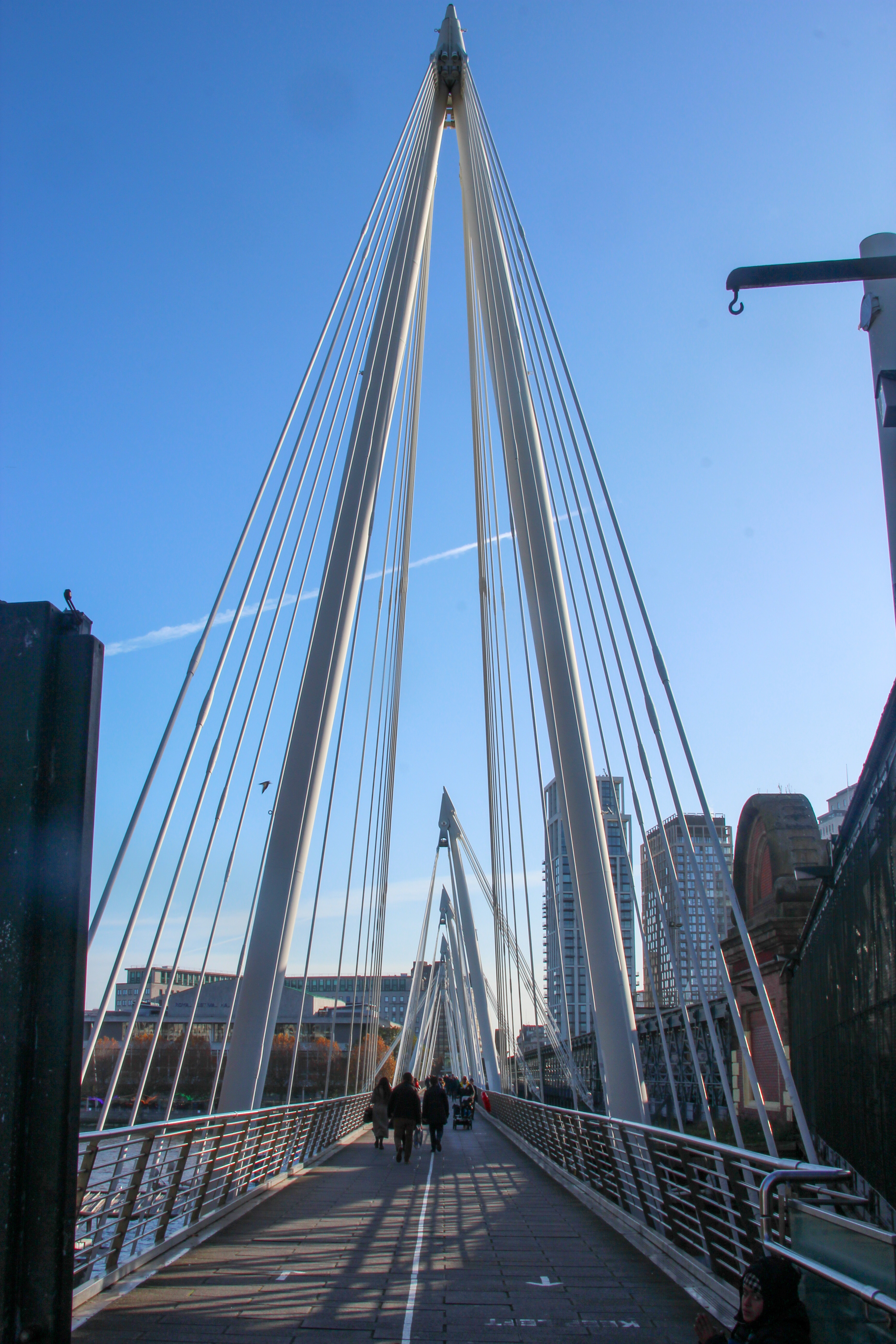
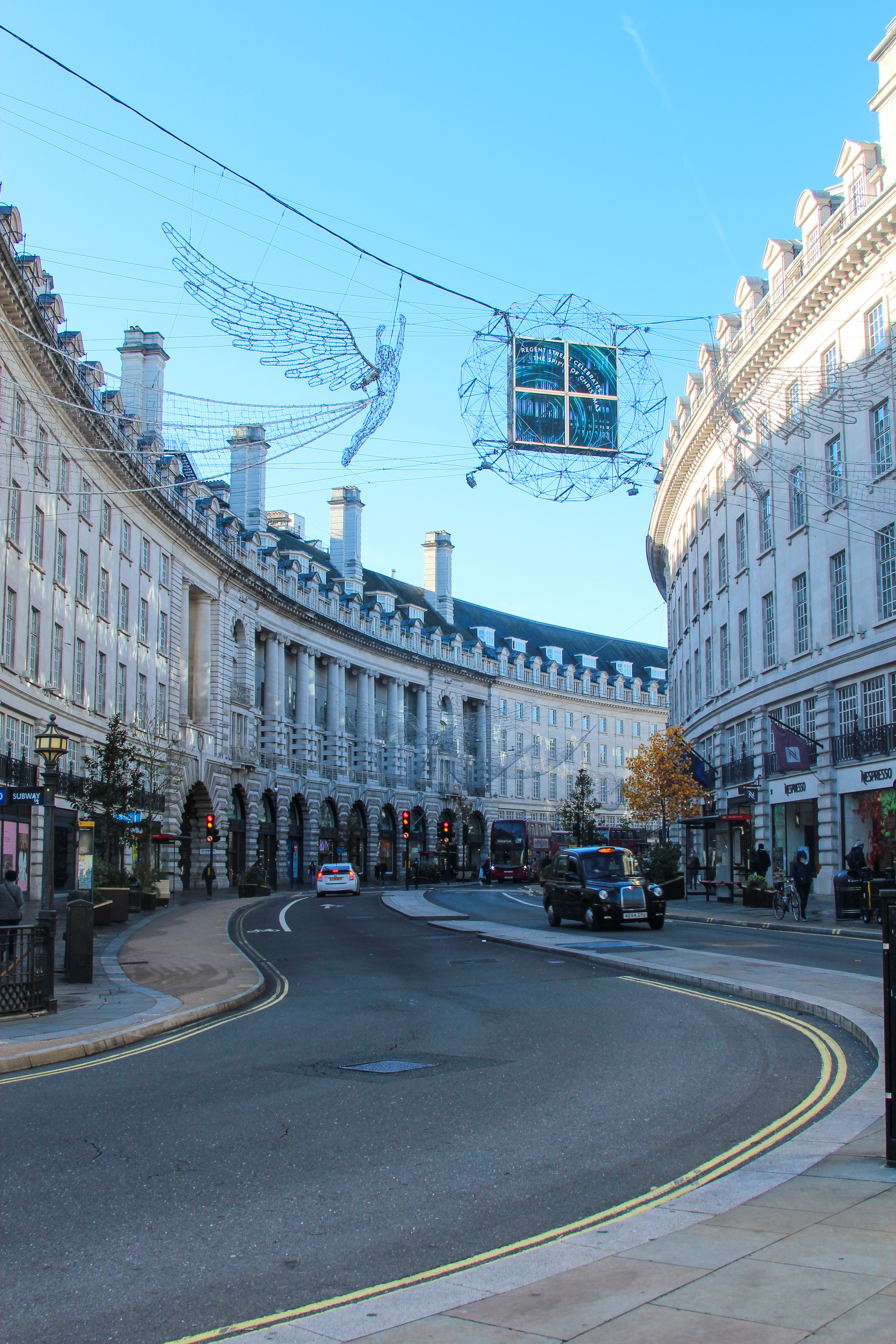
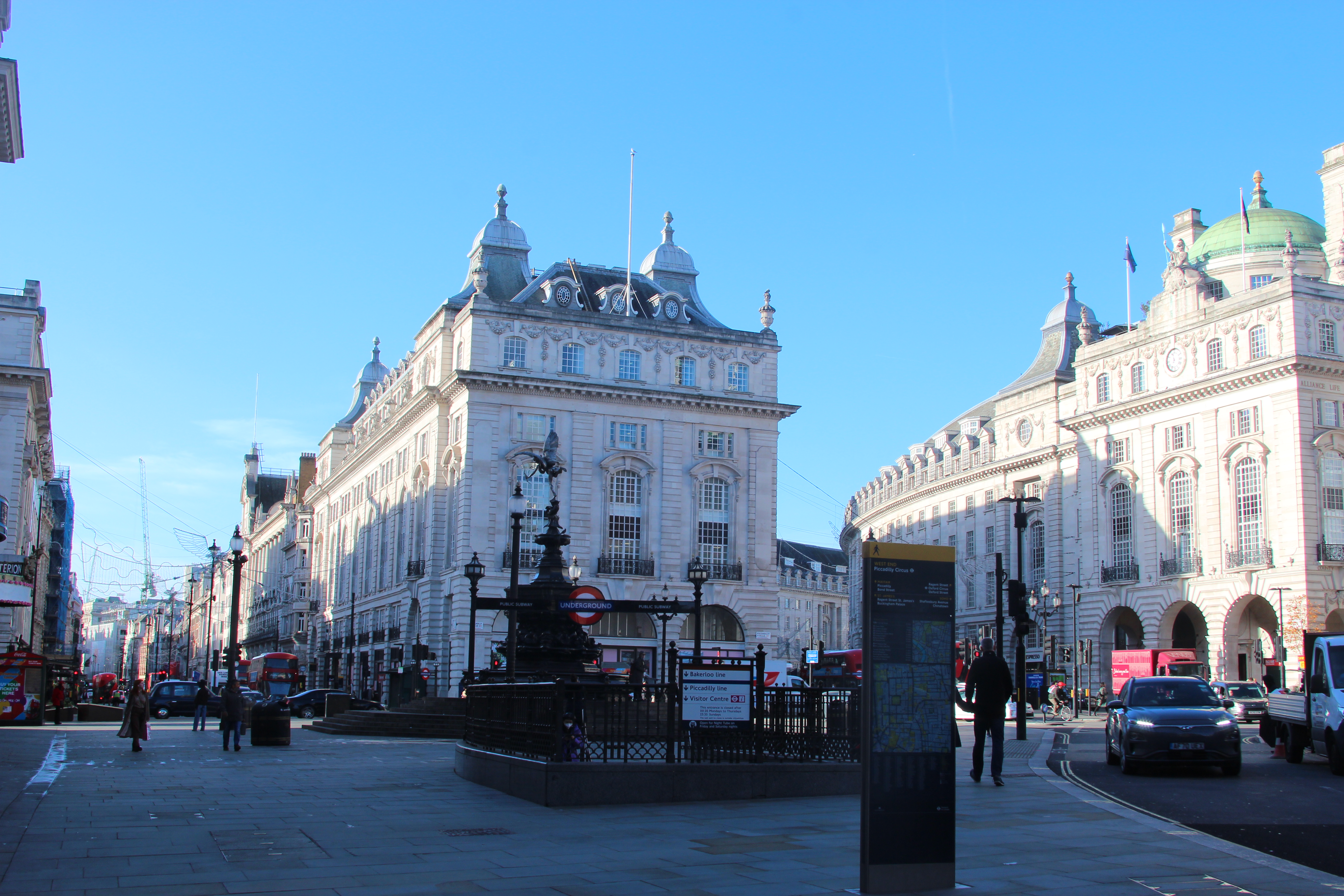
Week 5 – Landscape
Analyse the work of of historical landscape artists and photographers. Use these artists/photographers to inspire your creative development.
- composition
- shutter speed, ISO Aperture
- colour/monochrome
- DSLR
Composition in photography:
- Rule of thirds
- Framing
- Leading lines
- Diagonal lines
- Repetition
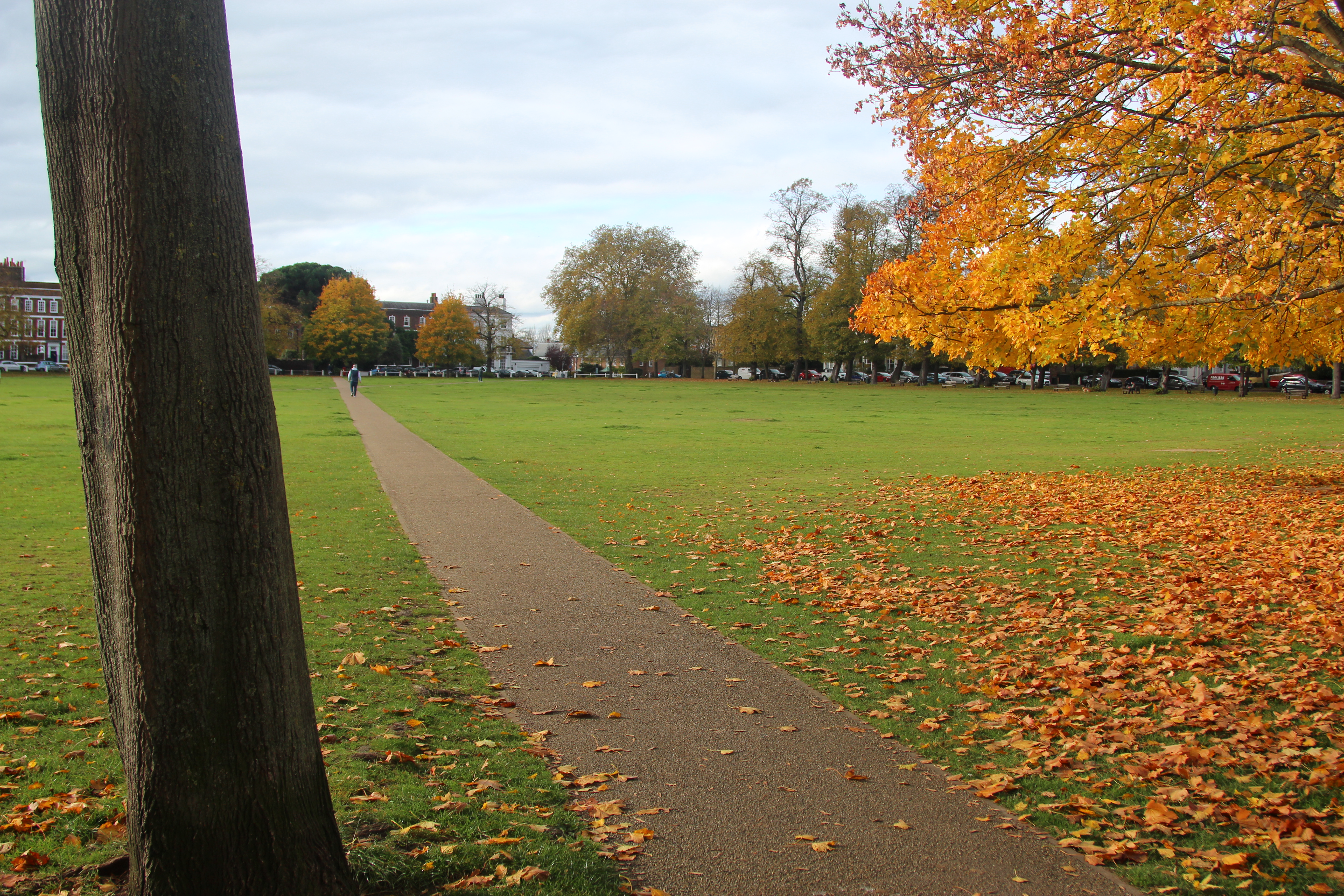
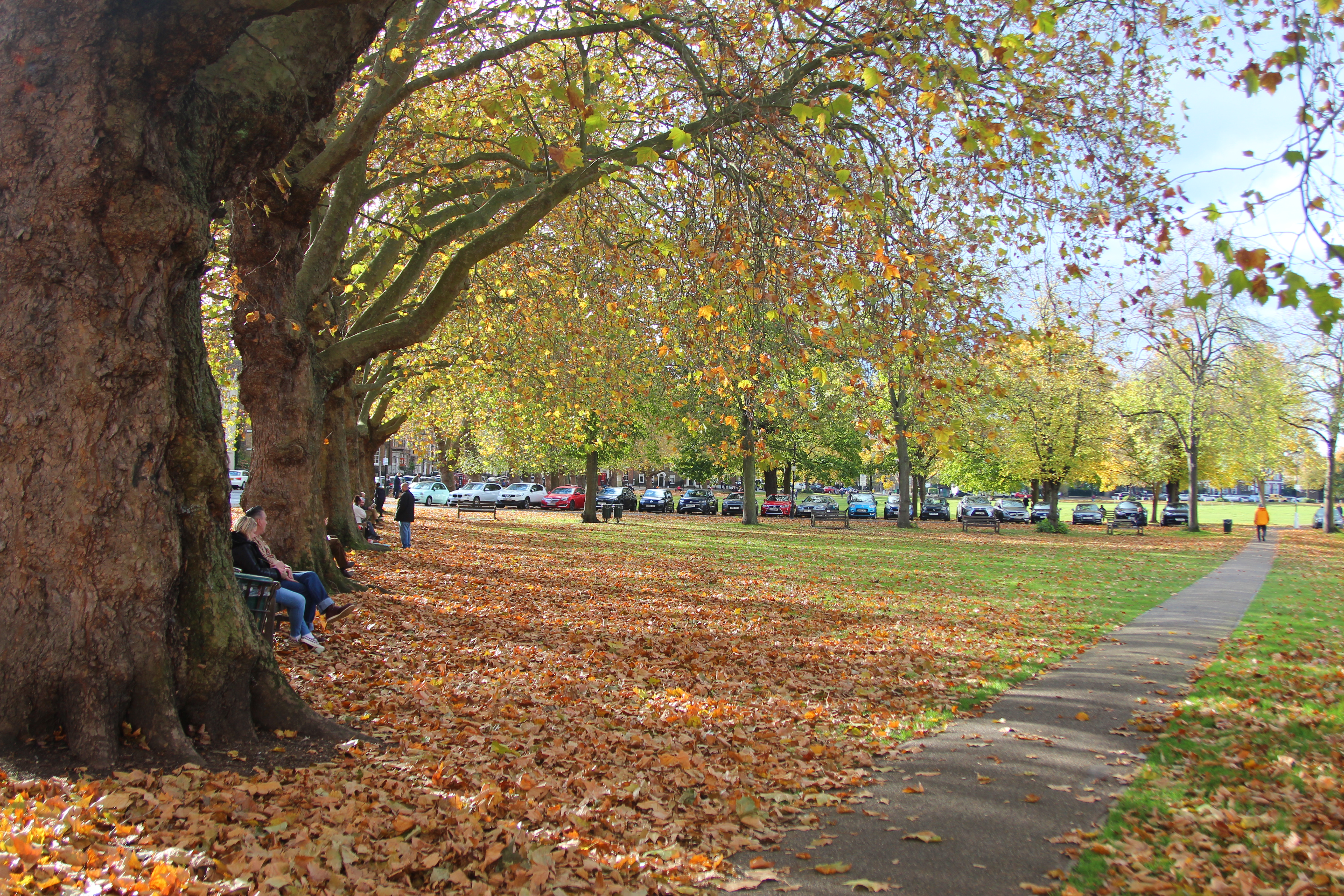
When taking the landscape picture outside I will be using the TV setting (Time Value) and the ISO at 100, as there should hopefully be lots of natural light.
Photographers use different composition like landscape artists, below there are some examples the photographer Steve Mccury talked about:
Rule of thirds – Dividing the screen into 3 parts (can select a grid on the DSLR camera to help this). This makes the key elements of the image on the lines vertically or horizontally in the picture.
Framing – Frame within frame. This can be done naturally by windows and doors.
Leading lines – This draws your eye to the attention of the main point of the image. The lines are natural lines such as paths and tracks.
Diagonal lines – This creates more movement in the photos.
Repetition – Pattern in a picture which is visually pleasing to the eye. The pattern can be disrupted with a different colour which can be interesting.
Panning effect – Freeze the subject with the blur in the background.
In class we looked at three historical artists we could take influence from and then explore different effects and processes in my photography to achieve a similar outcome.
Claude Monet
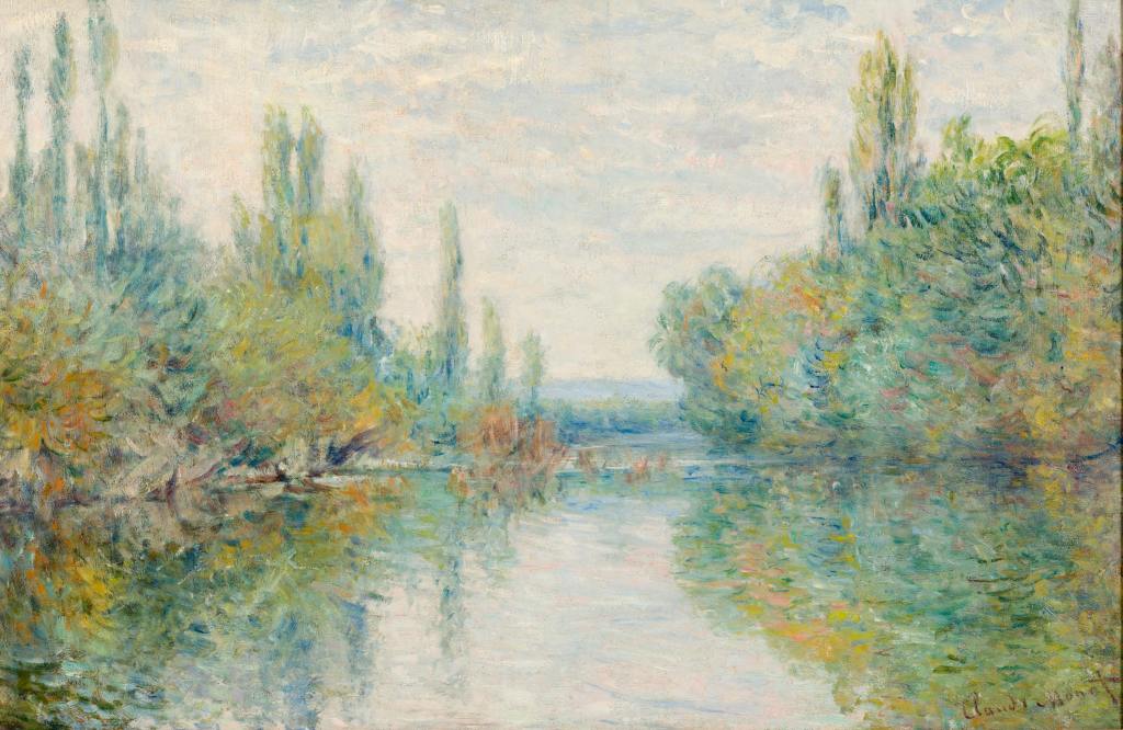
In Monet’s picture he uses leading lines to the centre of the horizon, with the use of symmetry and reflection in the water.
I love his use of colour and light and reflection in the water. To create the brush stroke effect I could play with the shutter speed, lower shutter speed could capture lots of movement or use of panning to show movement in trees.
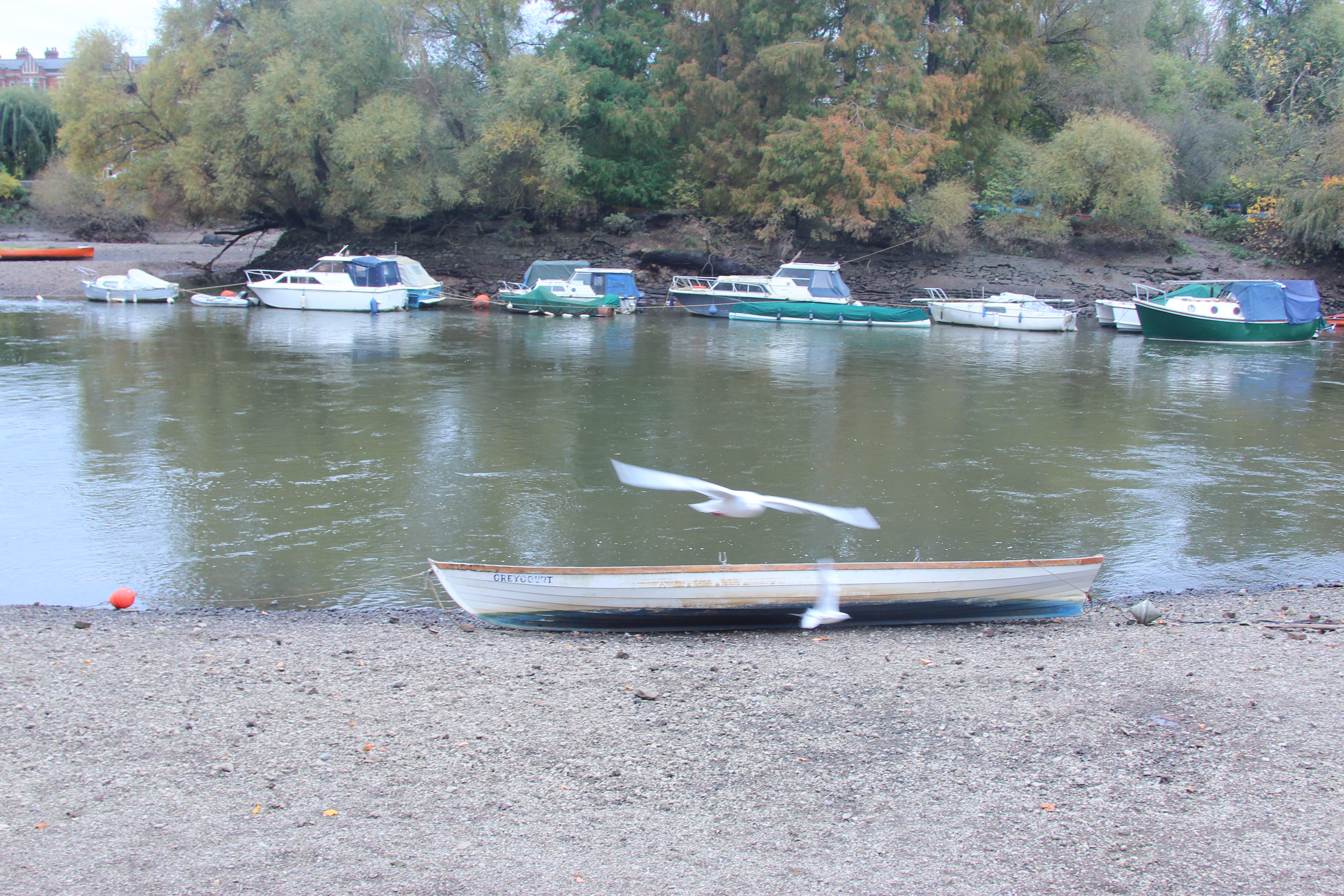
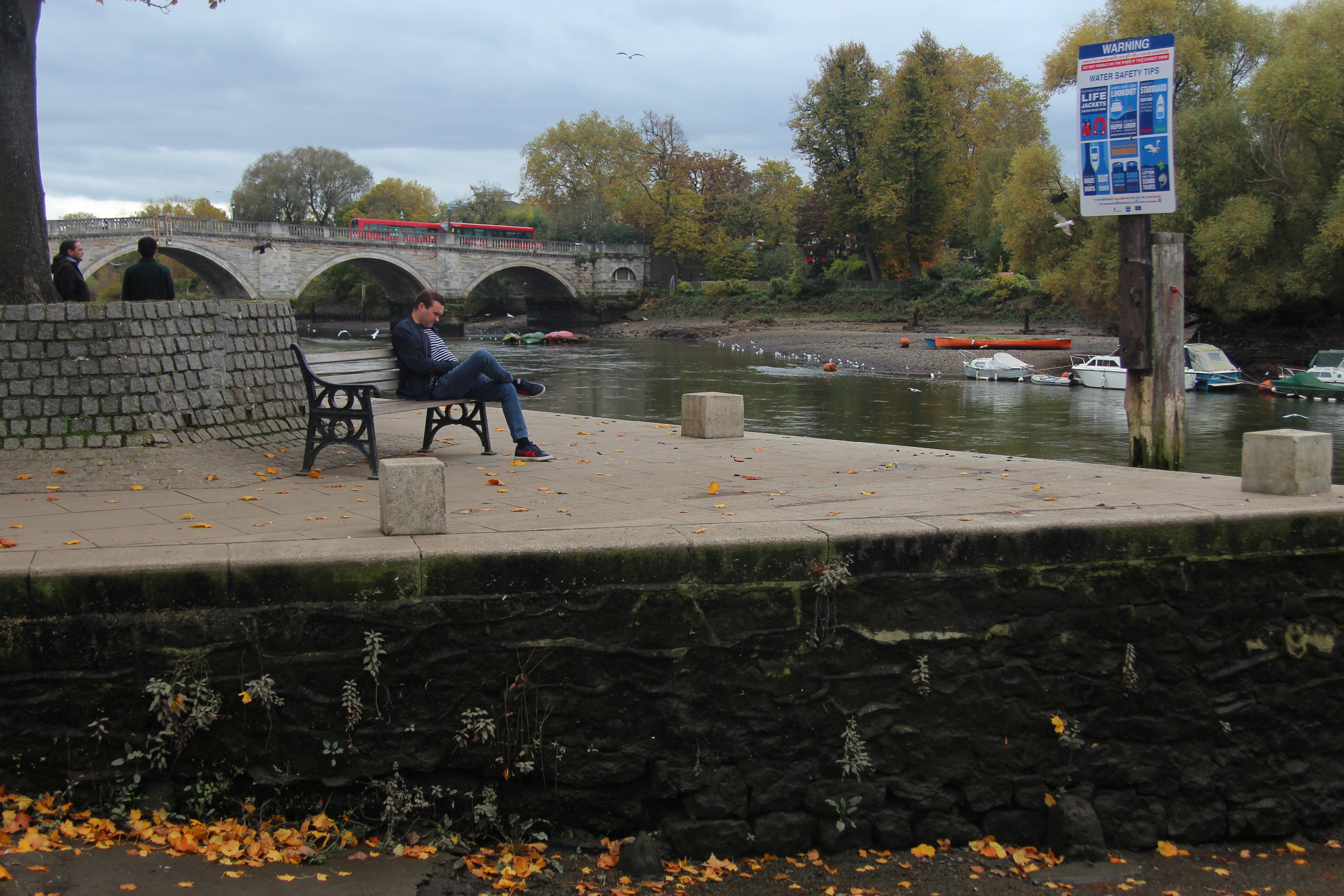
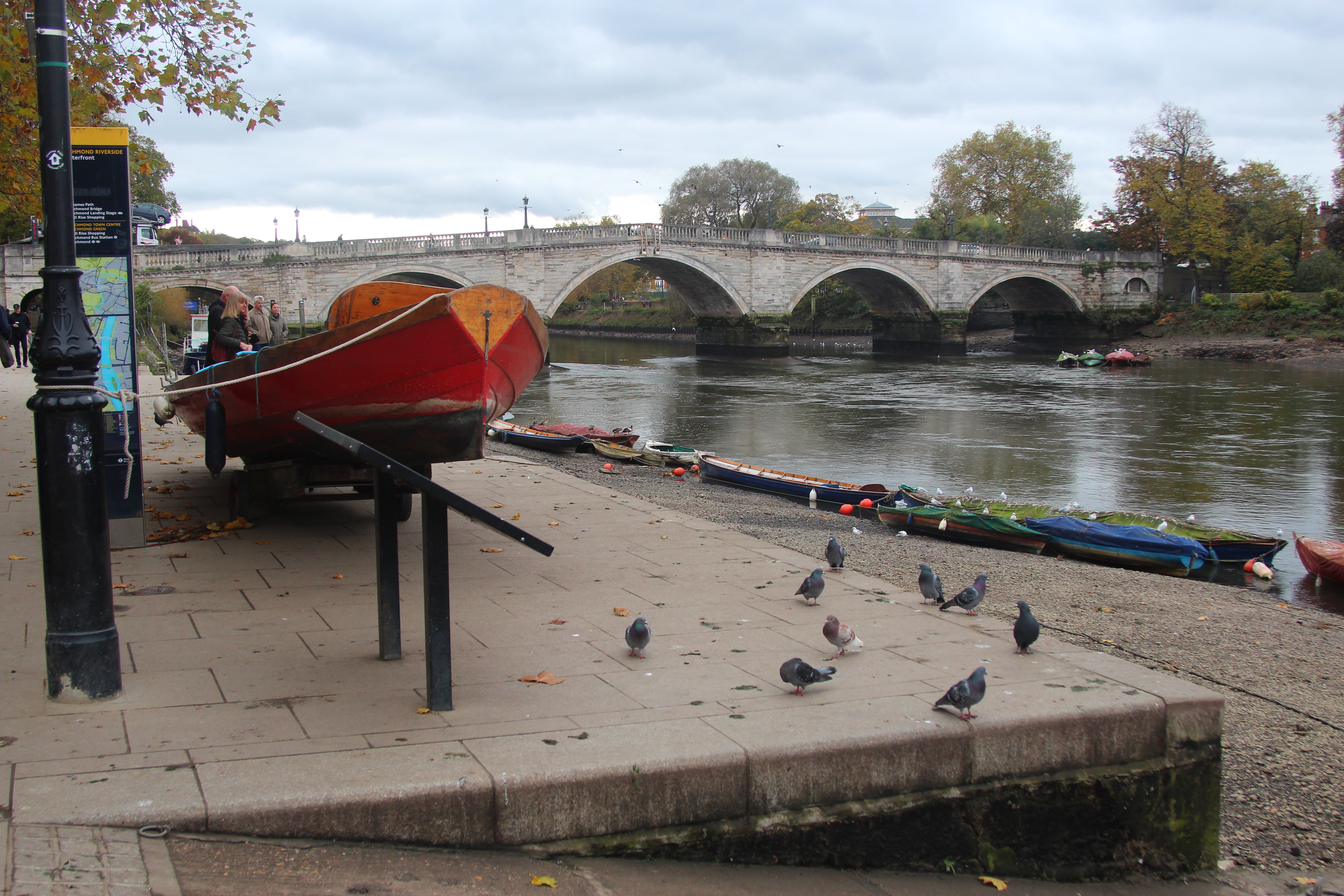
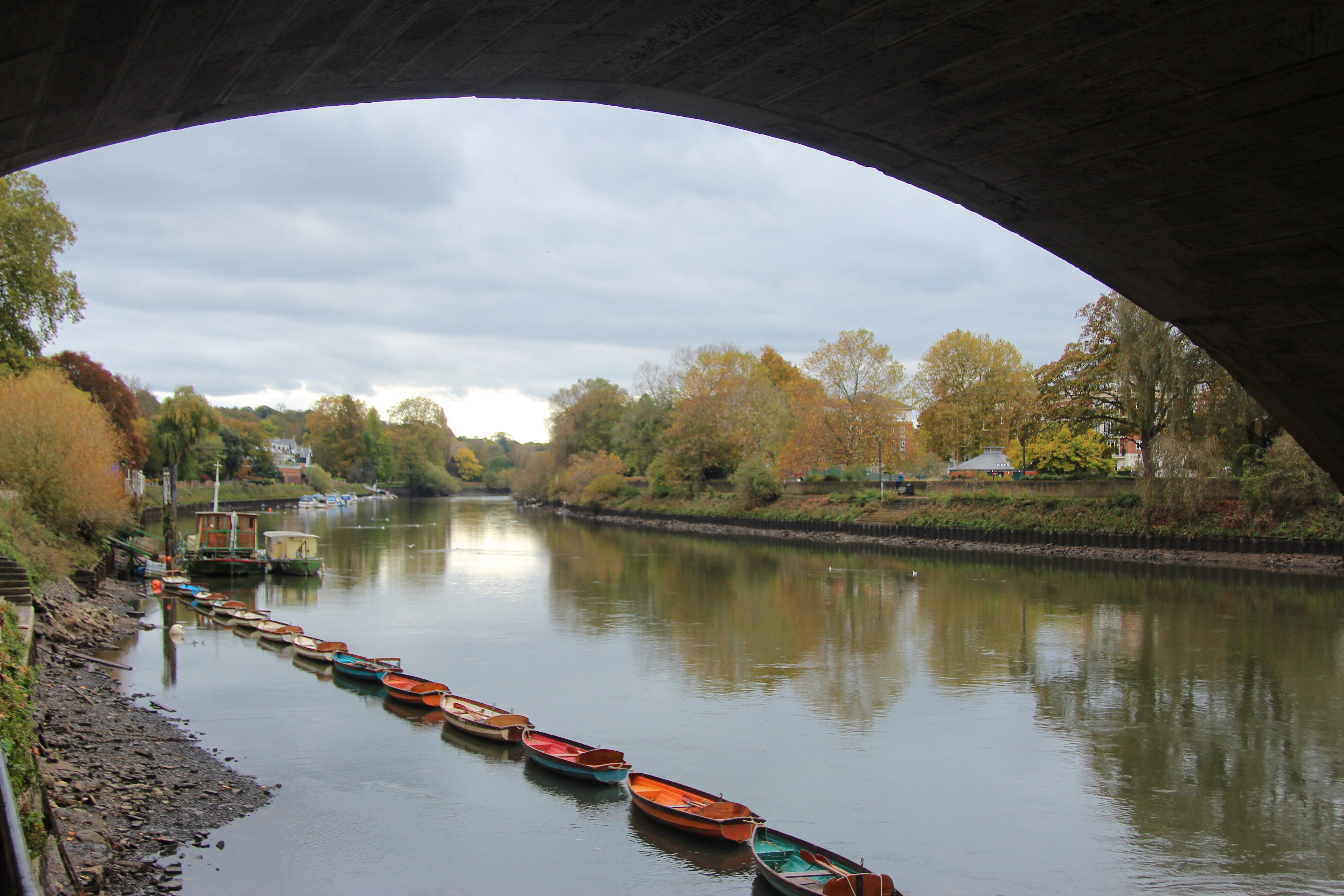
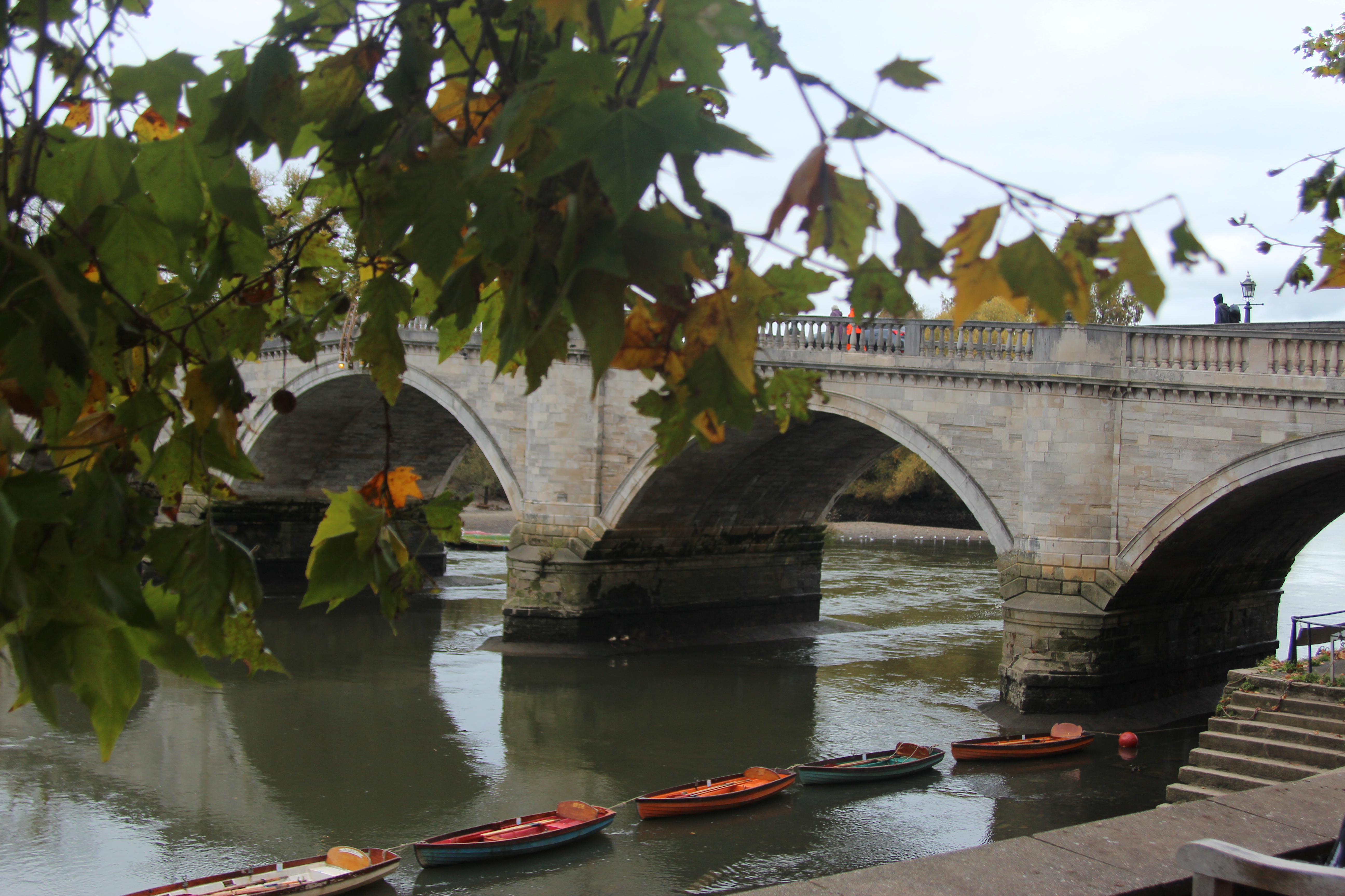
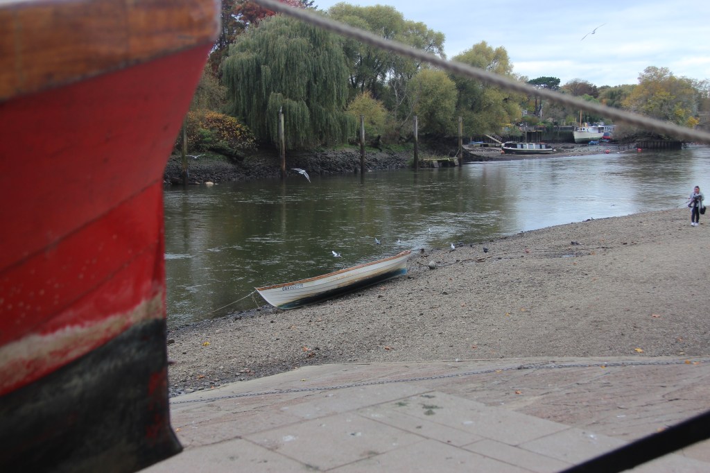
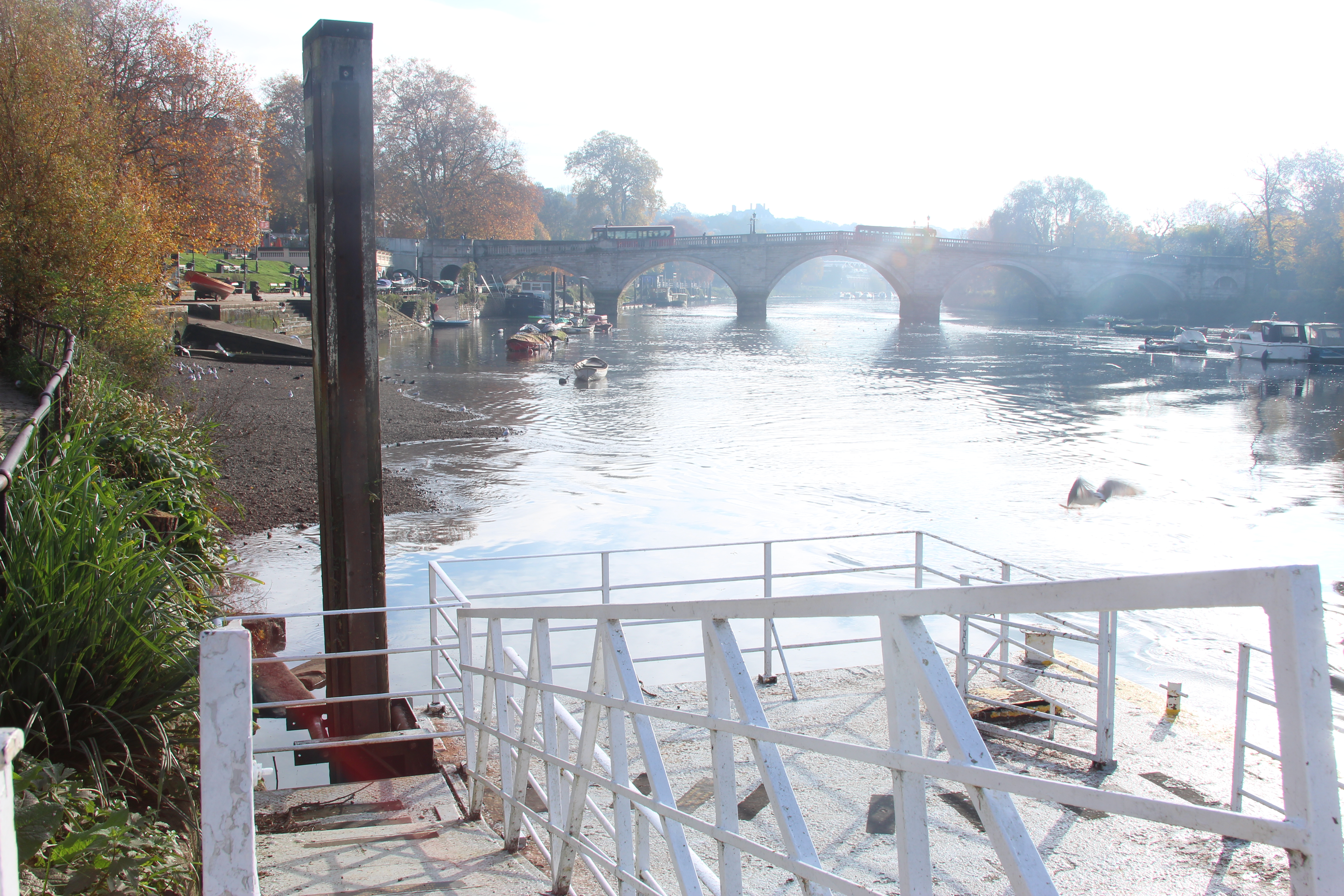
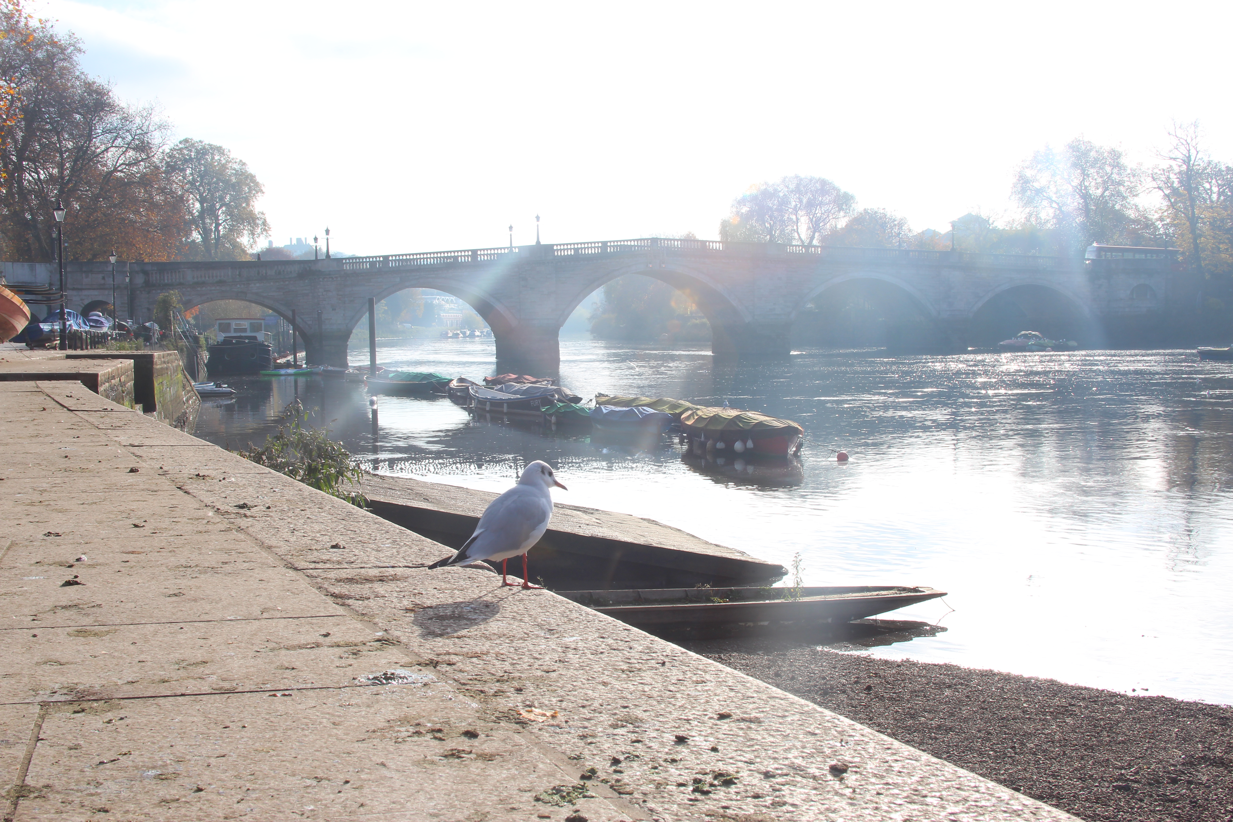
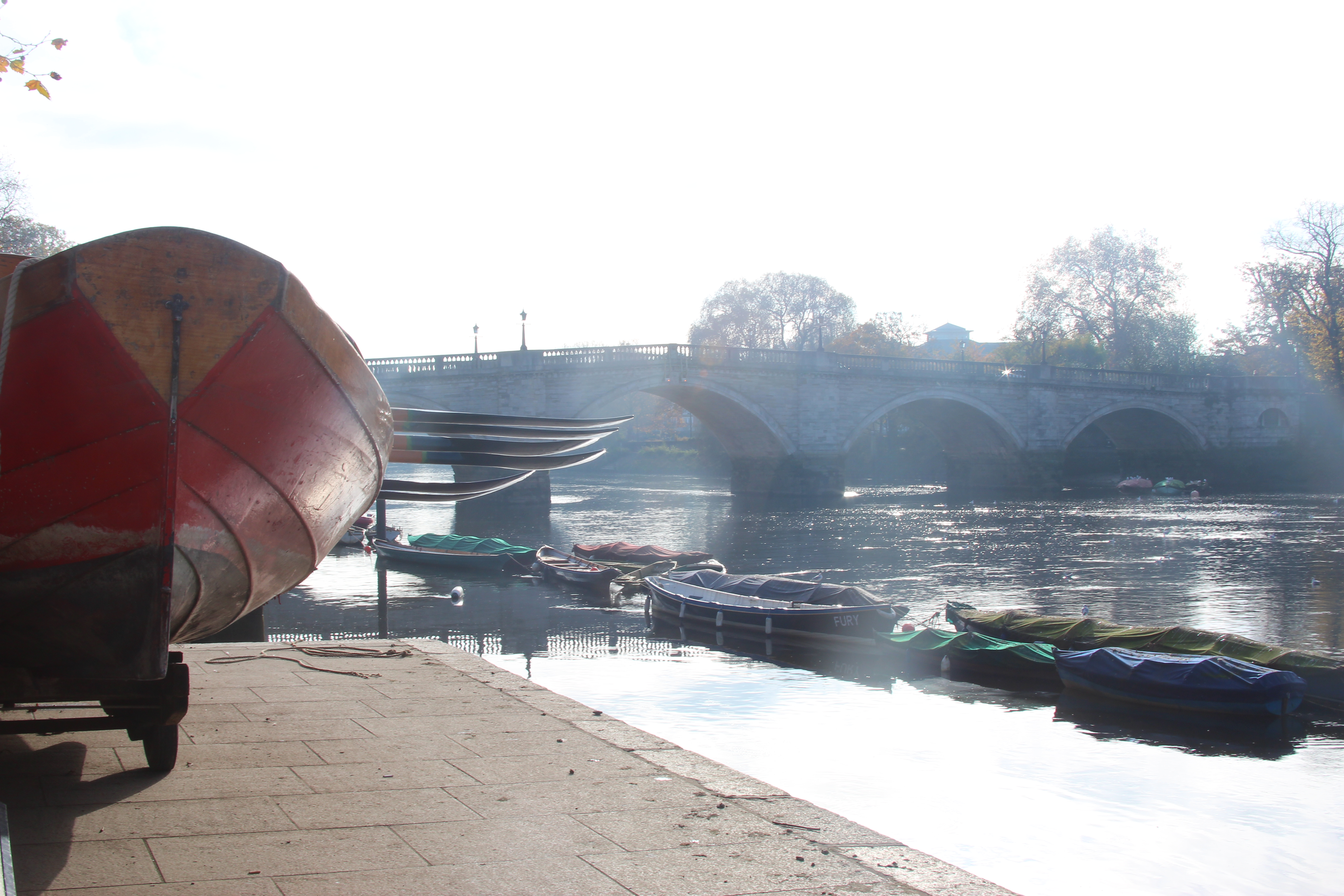
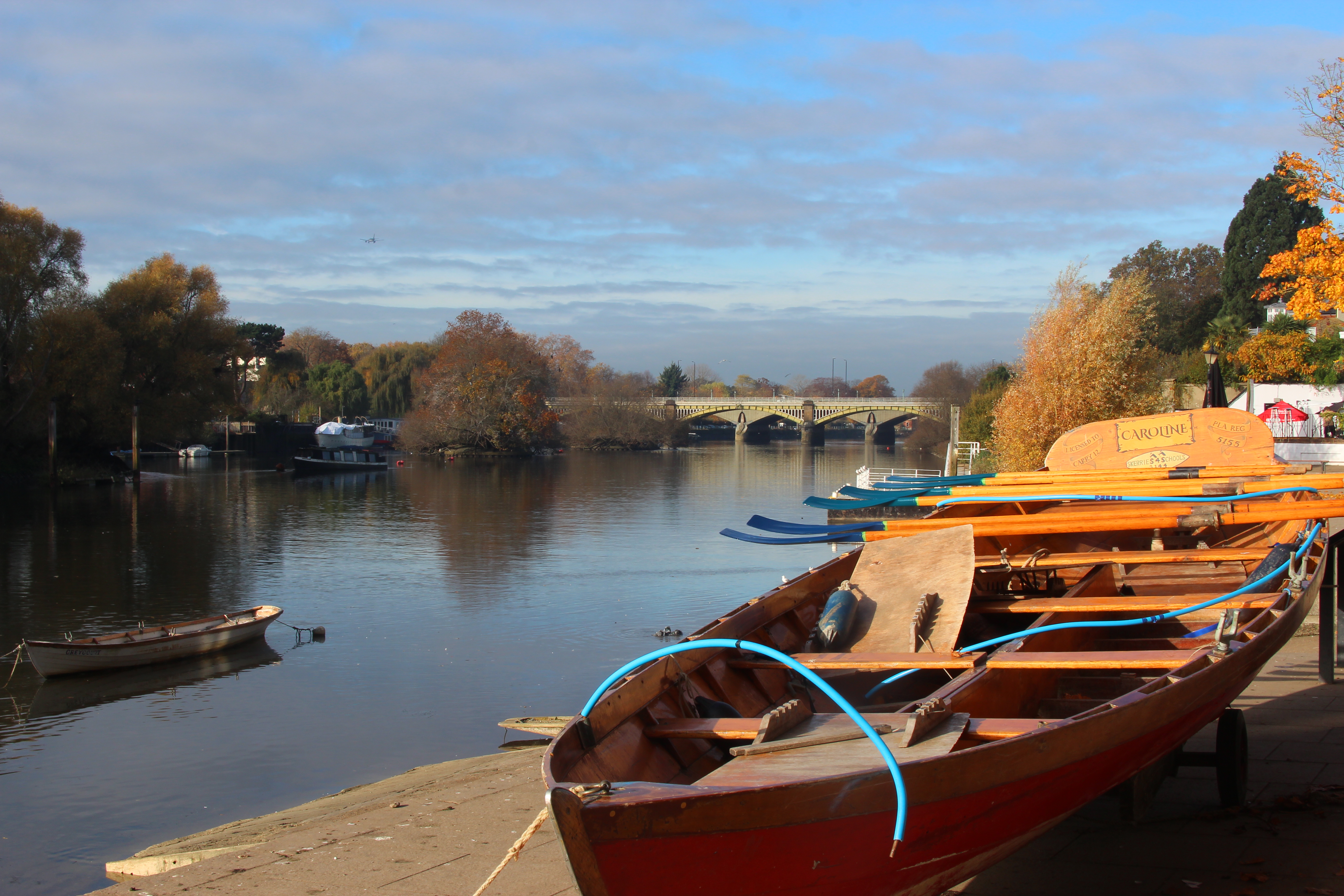
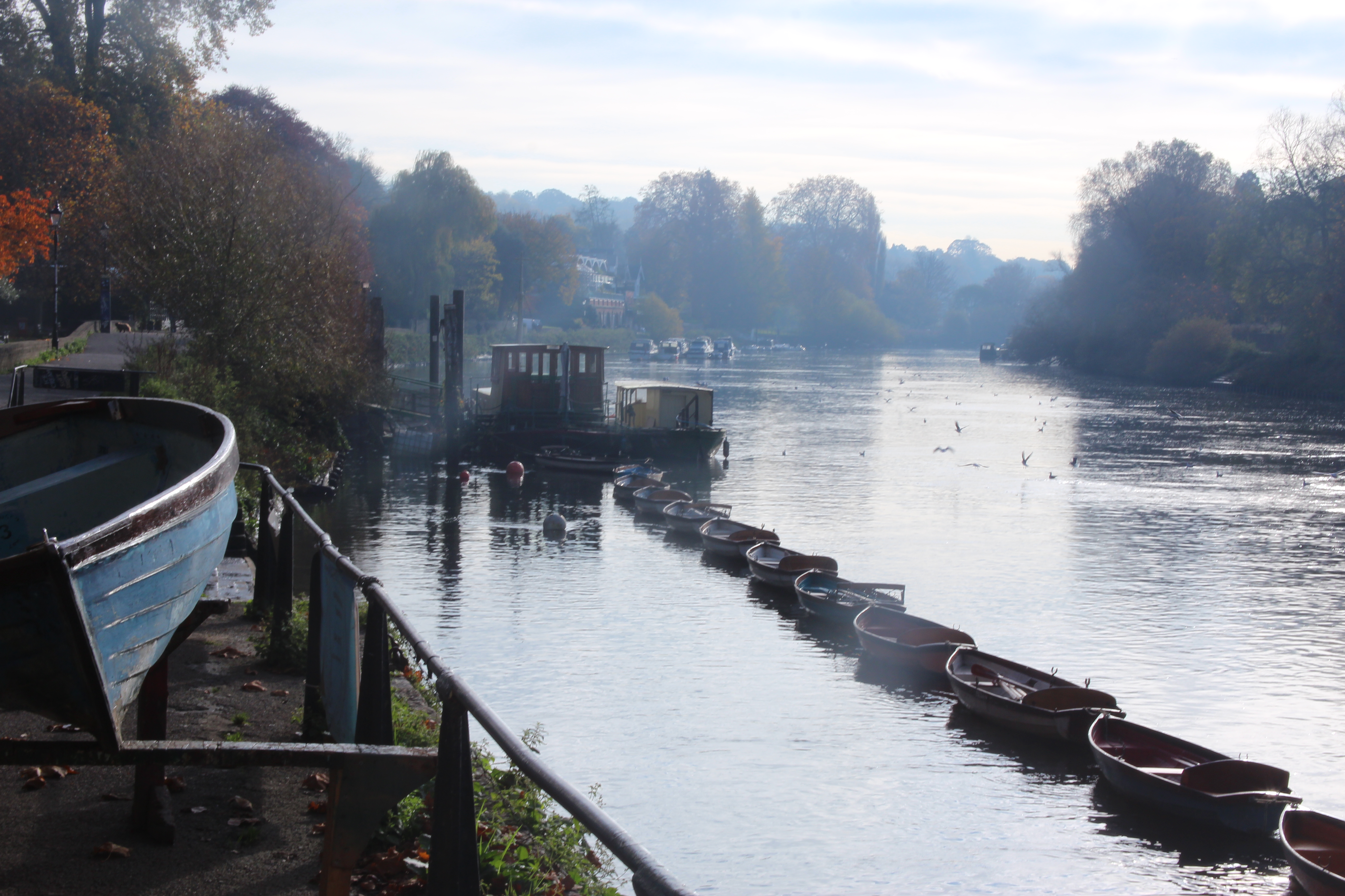
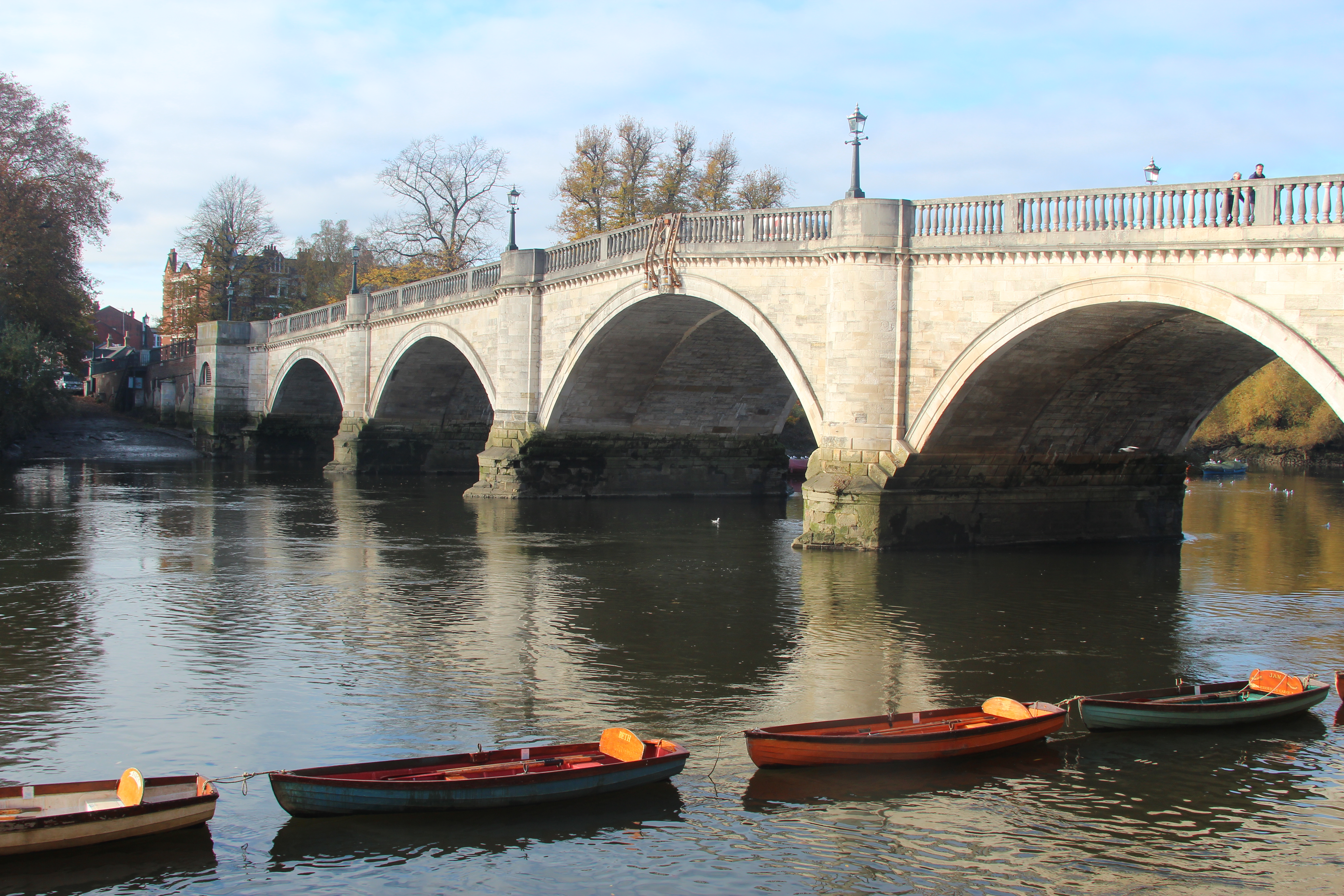
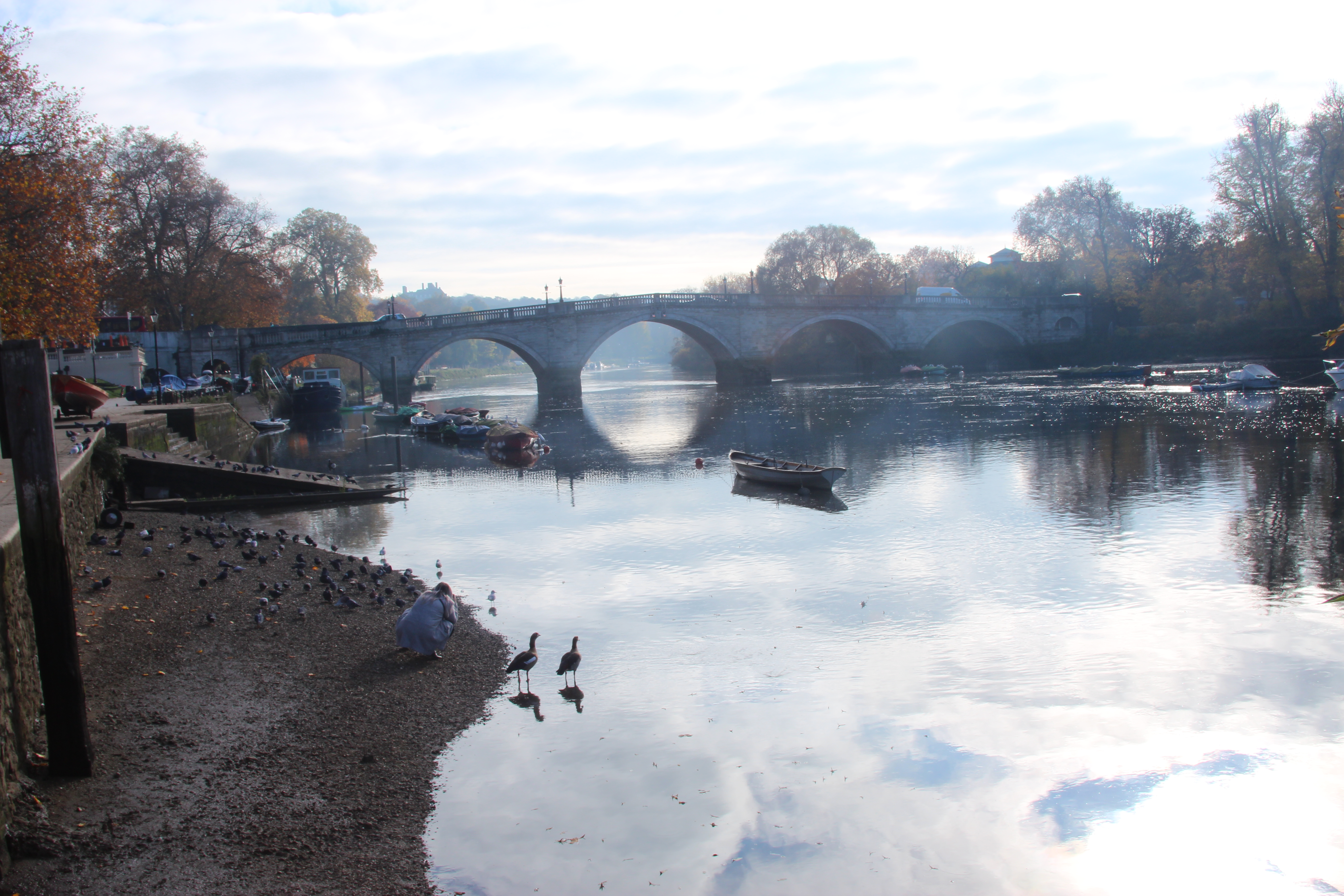
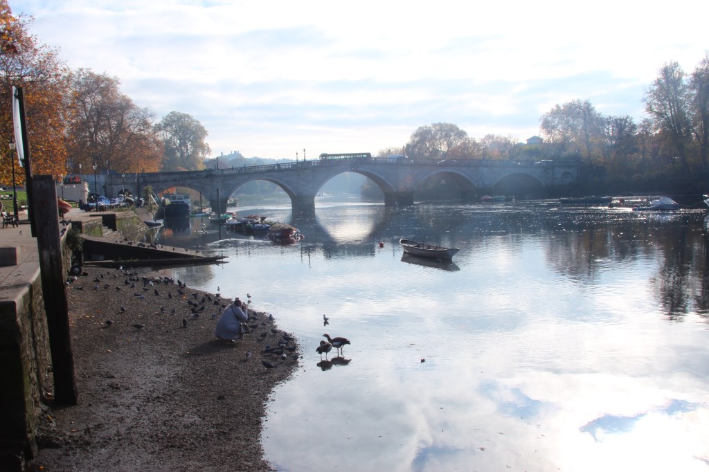
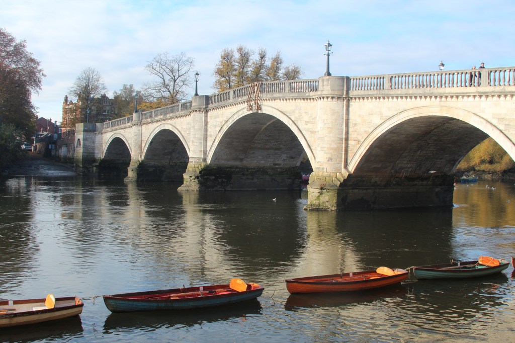
Exploring Monet in my photography –The use of colour, brush stroke and water reflection
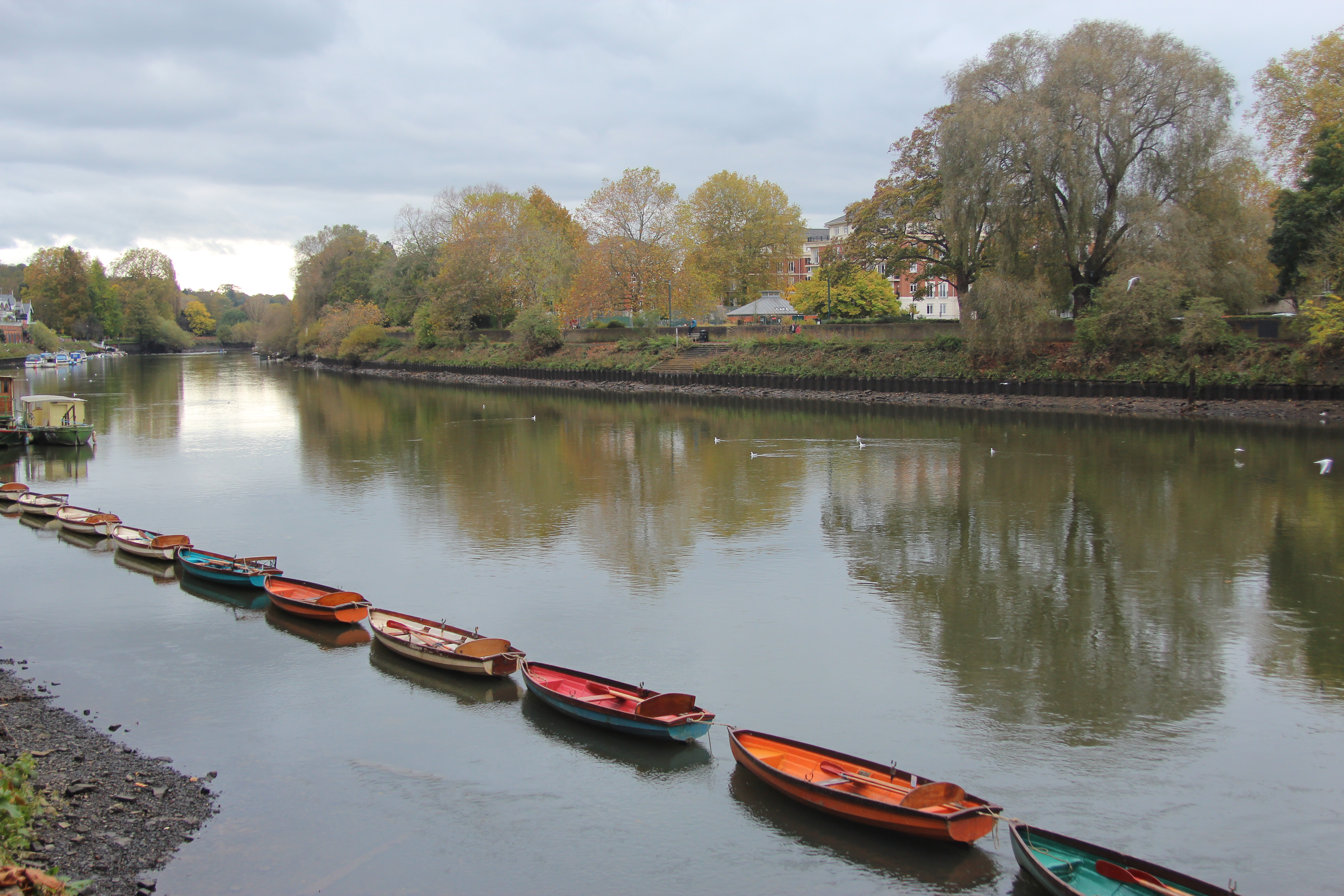
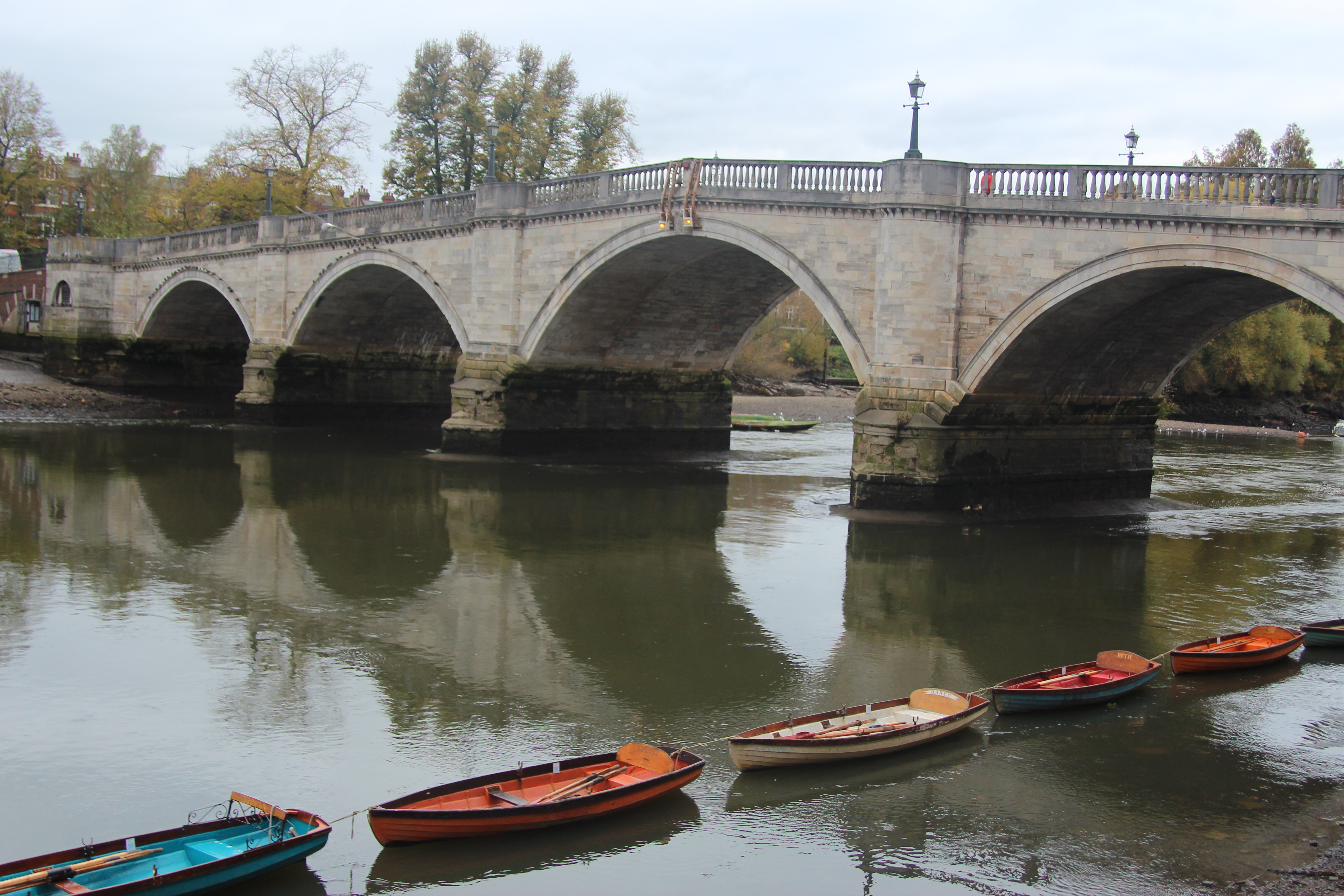
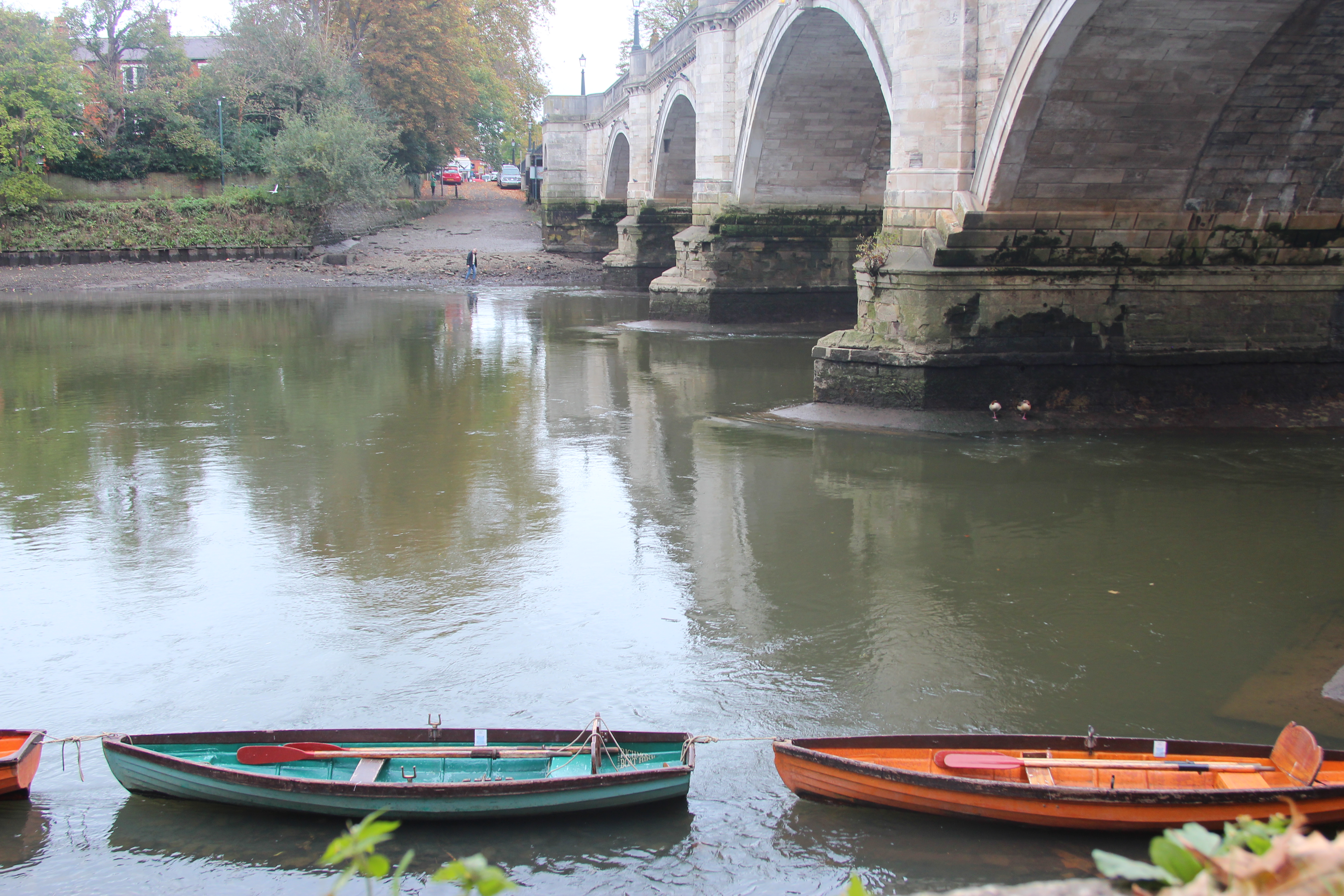
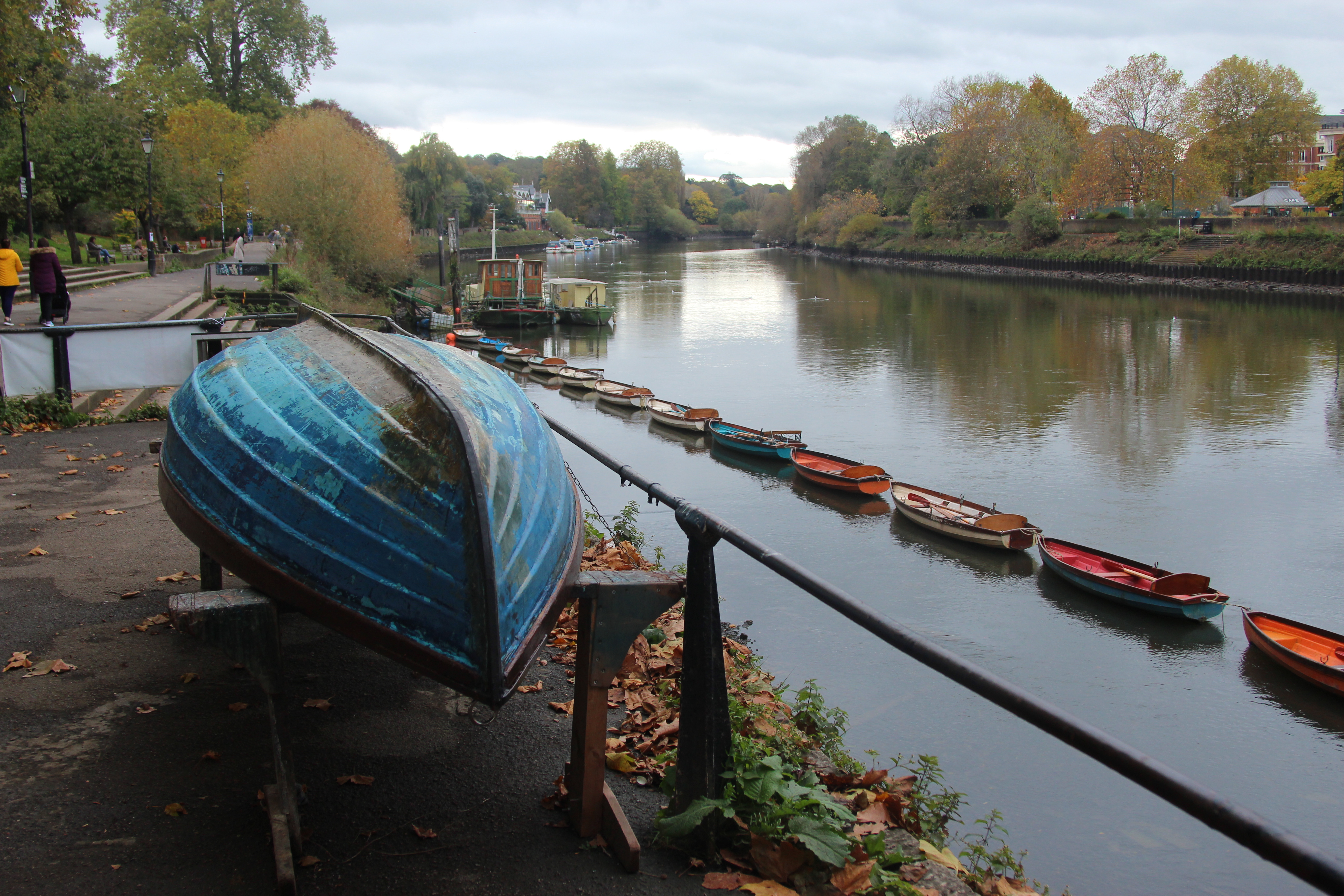
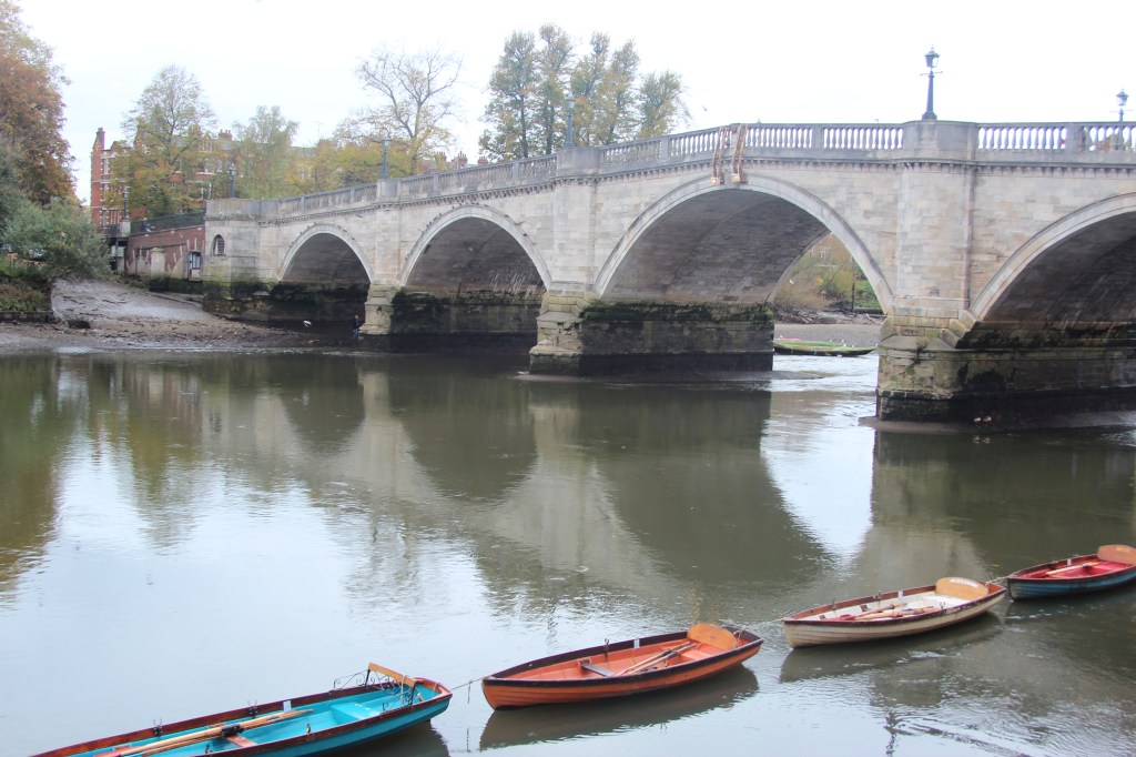
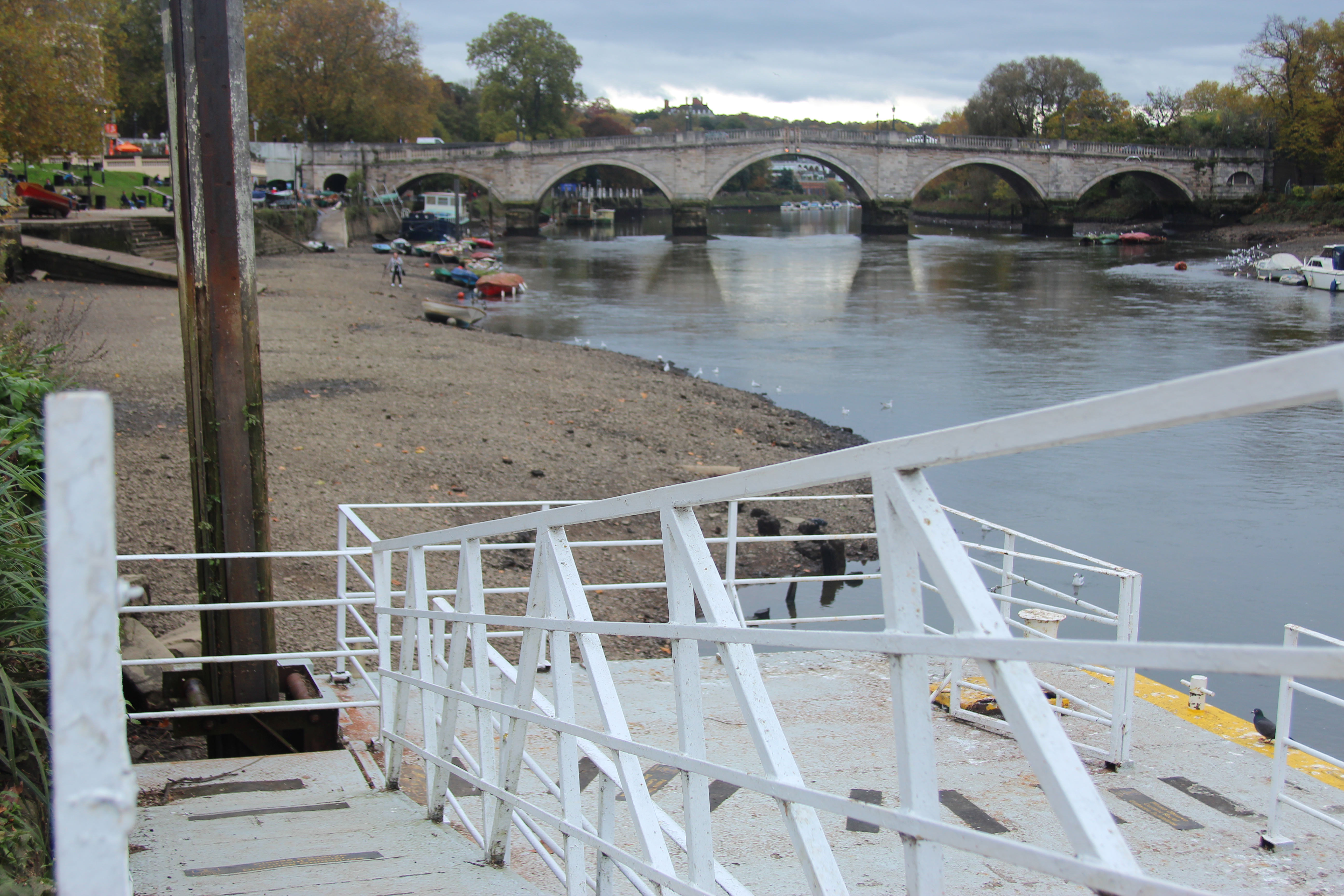
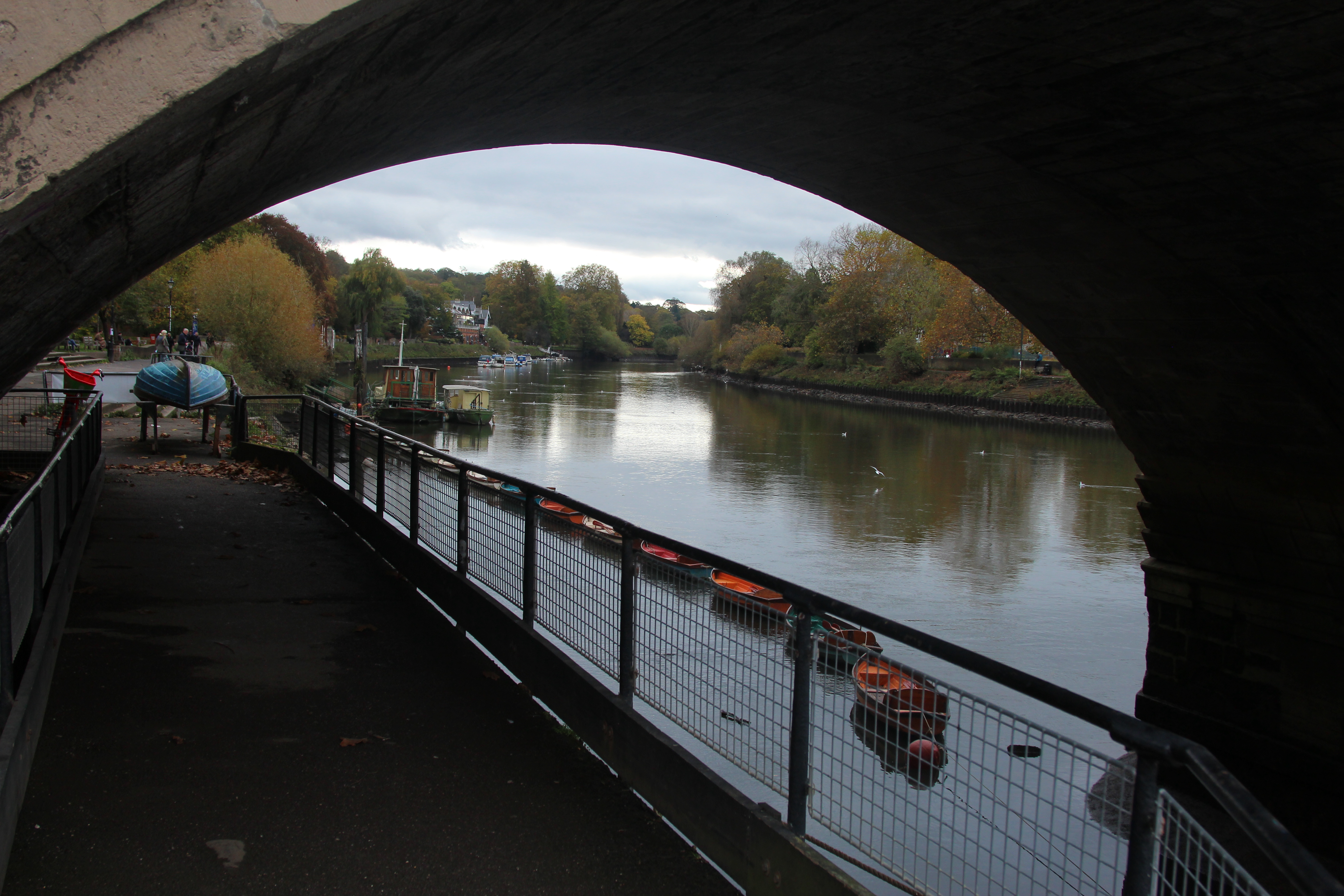
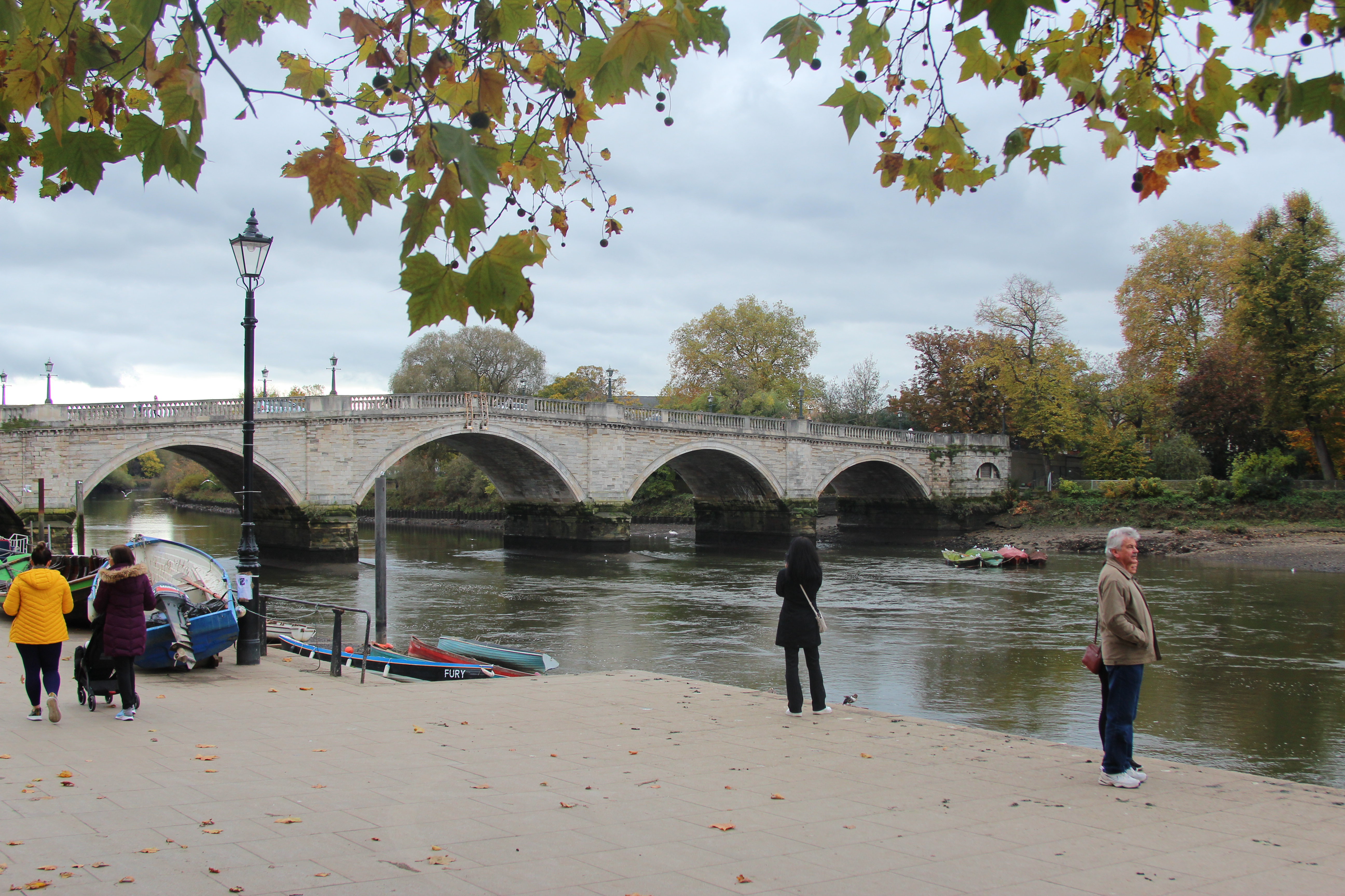
The river in Richmond was beautiful to photograph, the colour of the boats reminded me of the Monet’s use of colour in his painting and the reflection in the water I could capture was very pretty like a Monet painting. I even noticed a little shop in the bridge that had the lovely brush stroke effect on the wood! My camera settings were 1/200 shutter speed and my aperture ranged from F5 tp F11 depending on where I was facing the light.
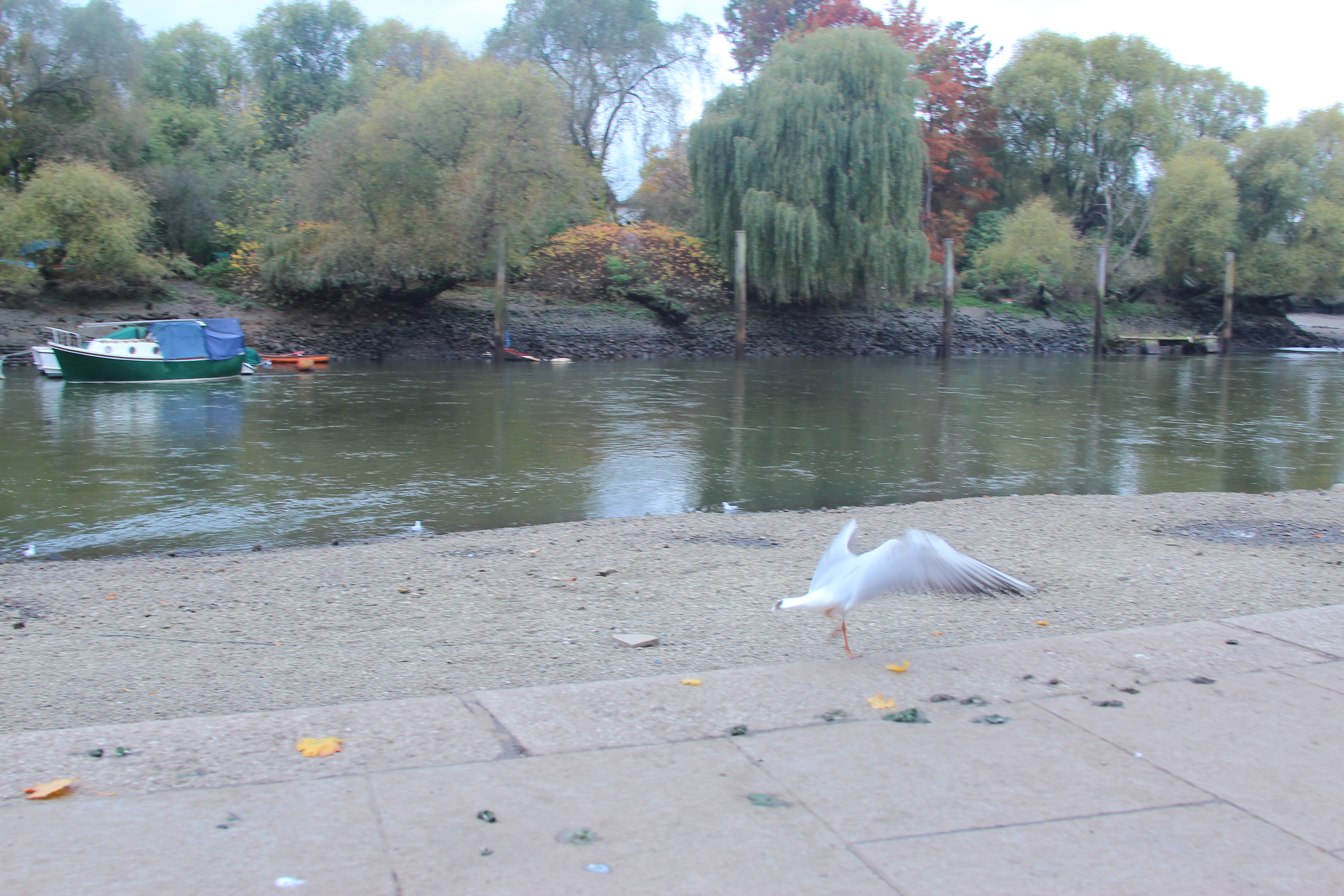
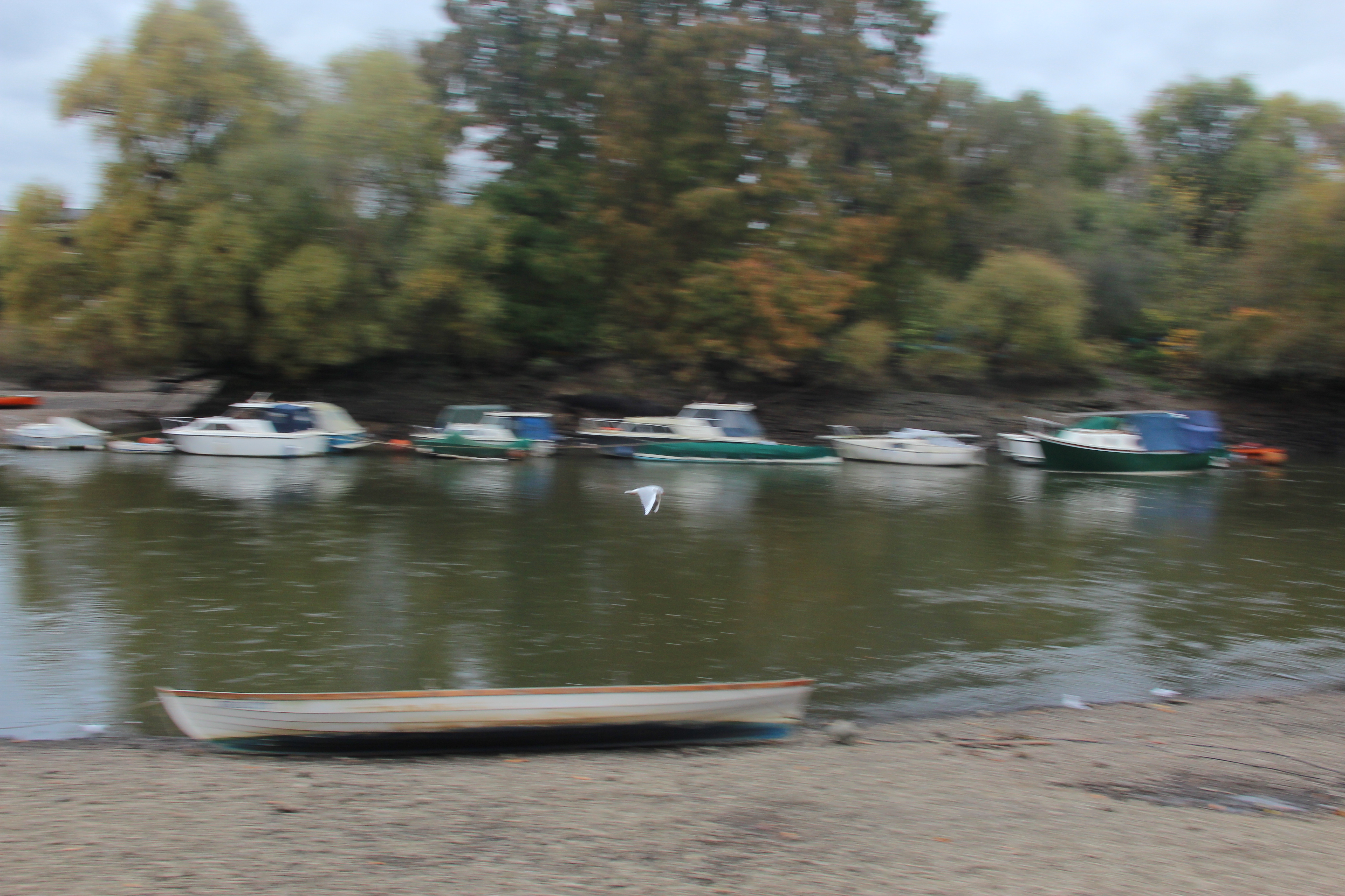
I also had a go at my panning effect by setting the camera to continuous mode and starting at 1/60 which I then reduced to 1/40. It didn’t quite a achieve what I wanted. The bird was too small really for the focal point and I needed to move with the movement of the bird more. I would love to try this again.
J.M.W Turner
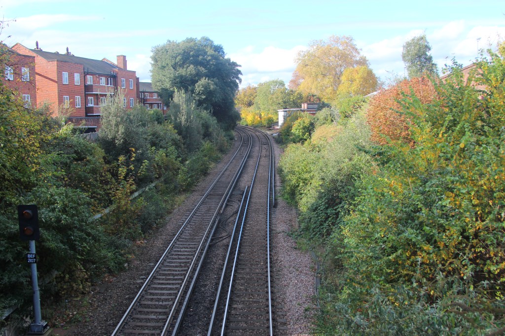
In Turner’s paintings they are very atmospheric with leading lines and rule of thirds. The train in the picture below is the focal point with the use of rule of thirds and there is a sense of urgency focusing on the train speeding on the bridge. A panning effect could also be used with the movement of the train and blur behind.
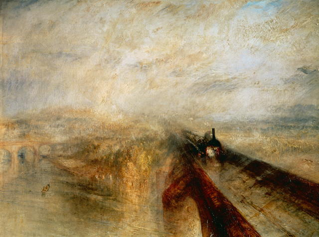
J.M.W Turner – Exploring Leading lines in my photography.
J.M.W Turner -Exploring Rule of three
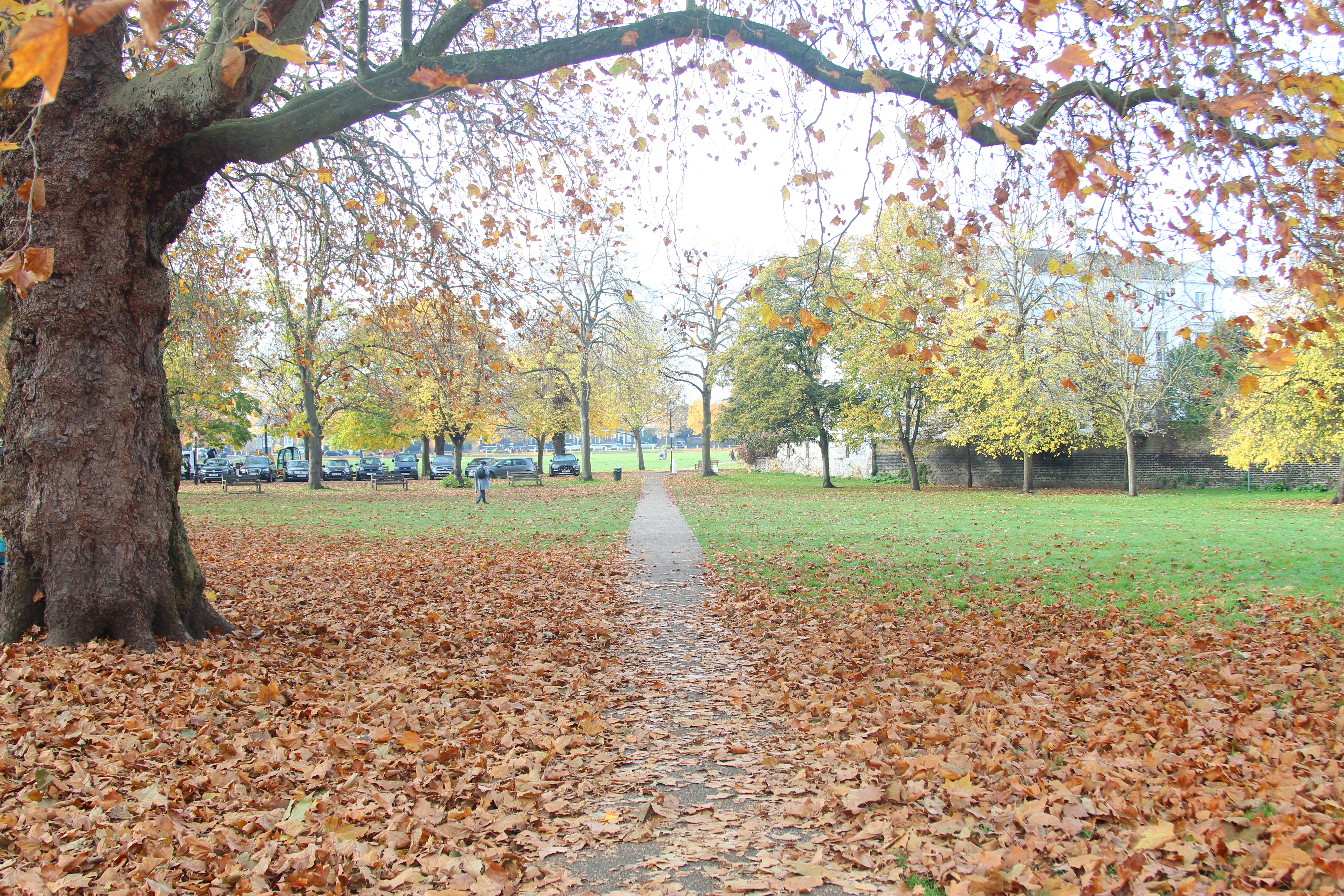
In the above photo by using the grid on my camera and rule of three the dog becomes the focal point as well as the trees framing the picture and path leading to the horizon.
Albert Bierdstadt
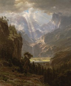
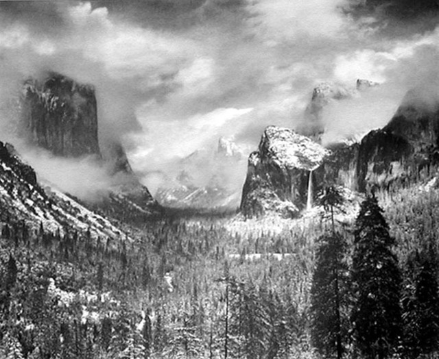
This painting is very dramatic and then also calming at the same time with the pretty light beaming down in the middle. There is great contrast between dark and light and a good sense of scale with both the calm and drama. Ansel Adams, the american photographer was inspired by this in his photographs.
Ansel Adams
Albert Bierdstadt – Exploring Light and Dark and use of natural light
In the above pictures there was such a lovely beam of light shining through the trees and the shadows from the branches created a lovely contrast of light and dark tones creating a warm happy effect when looking at the picture.
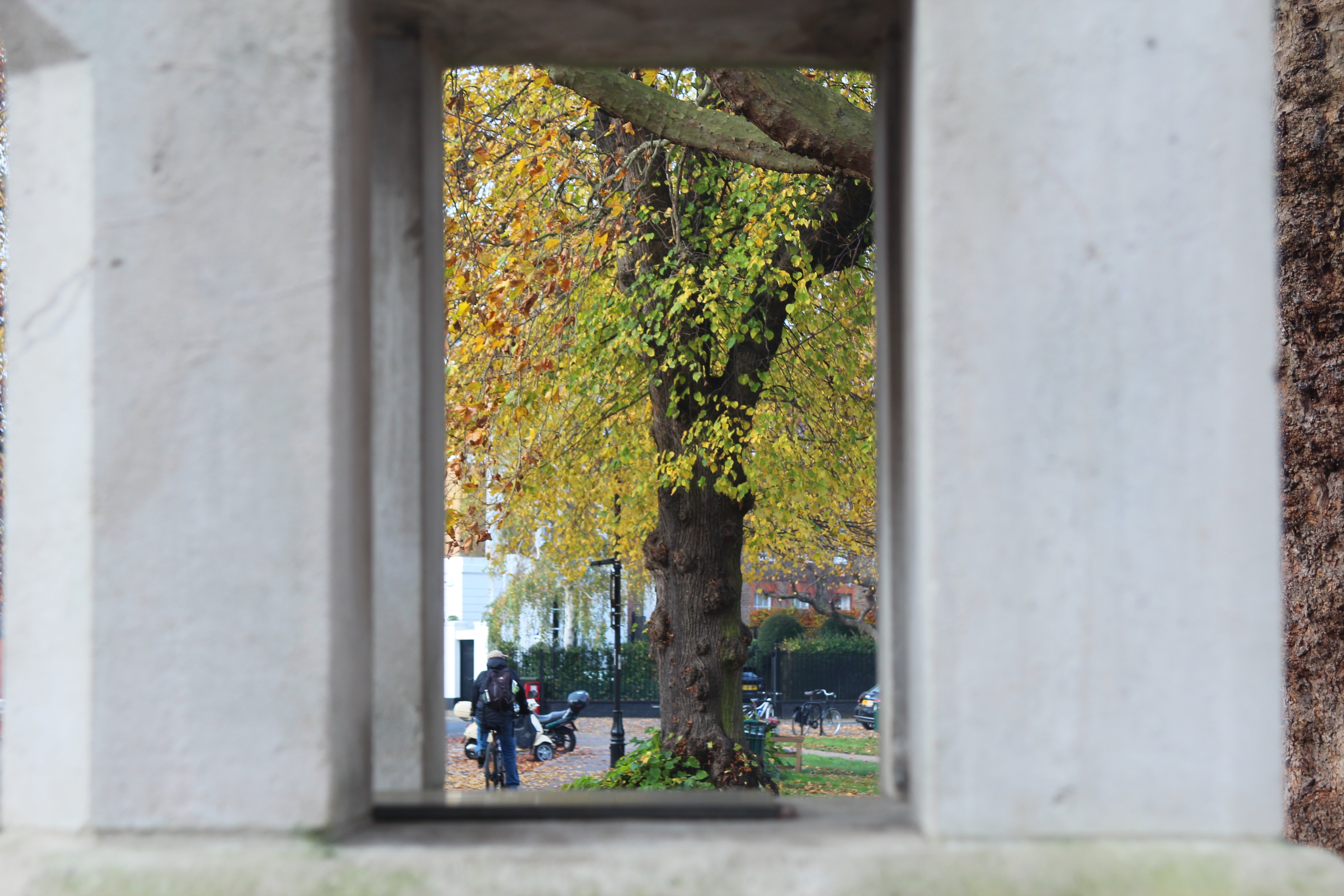
Framing – Frame within a frame
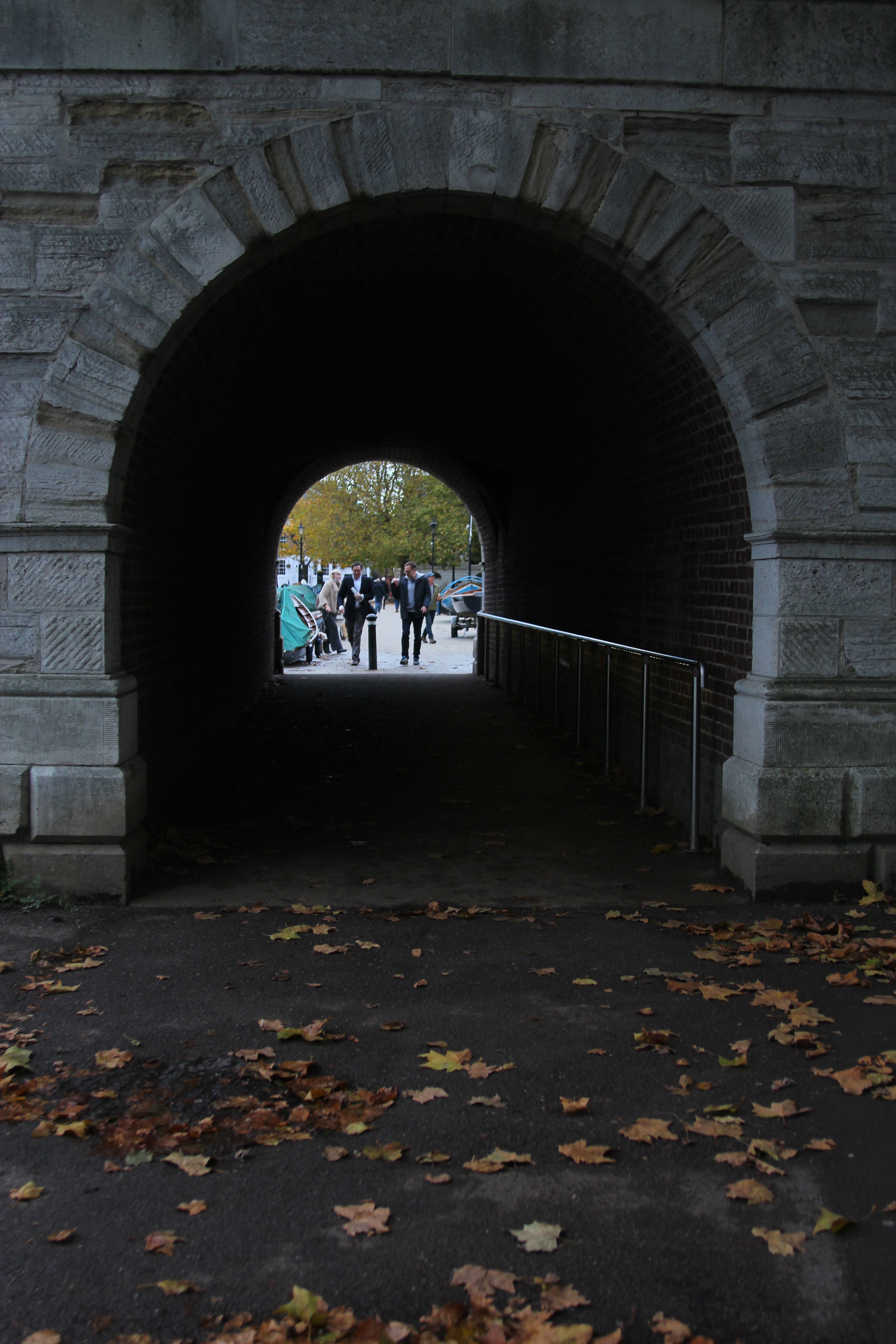
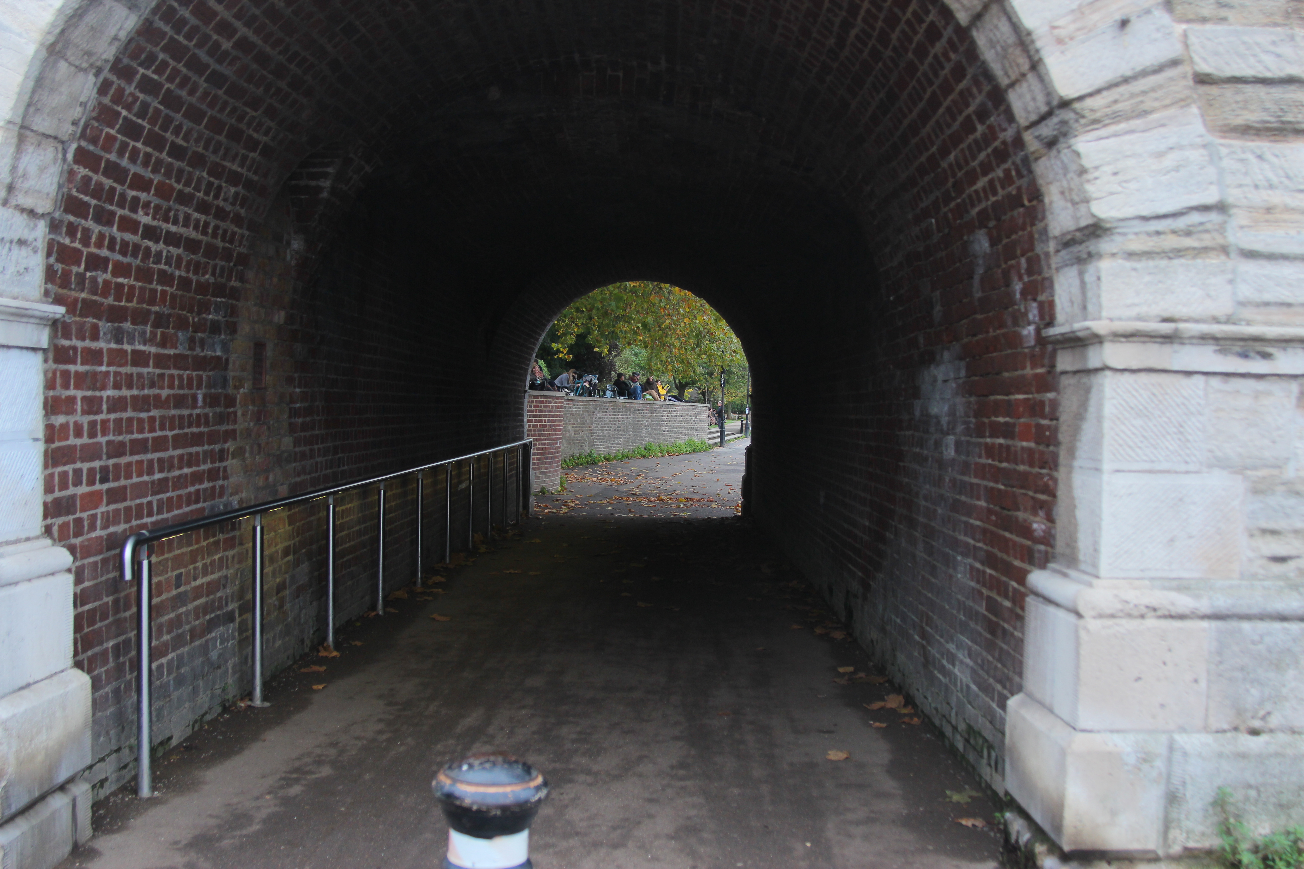
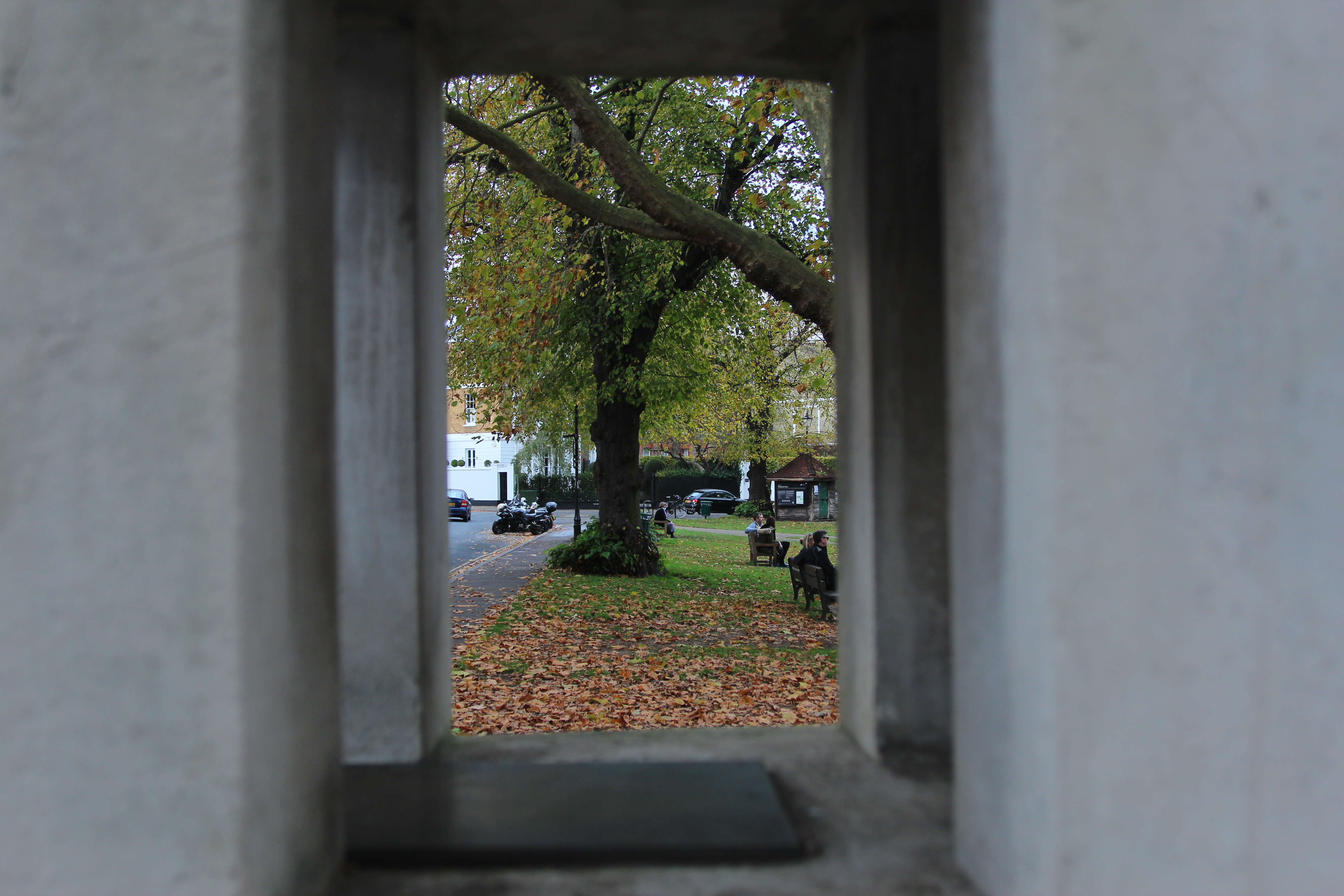
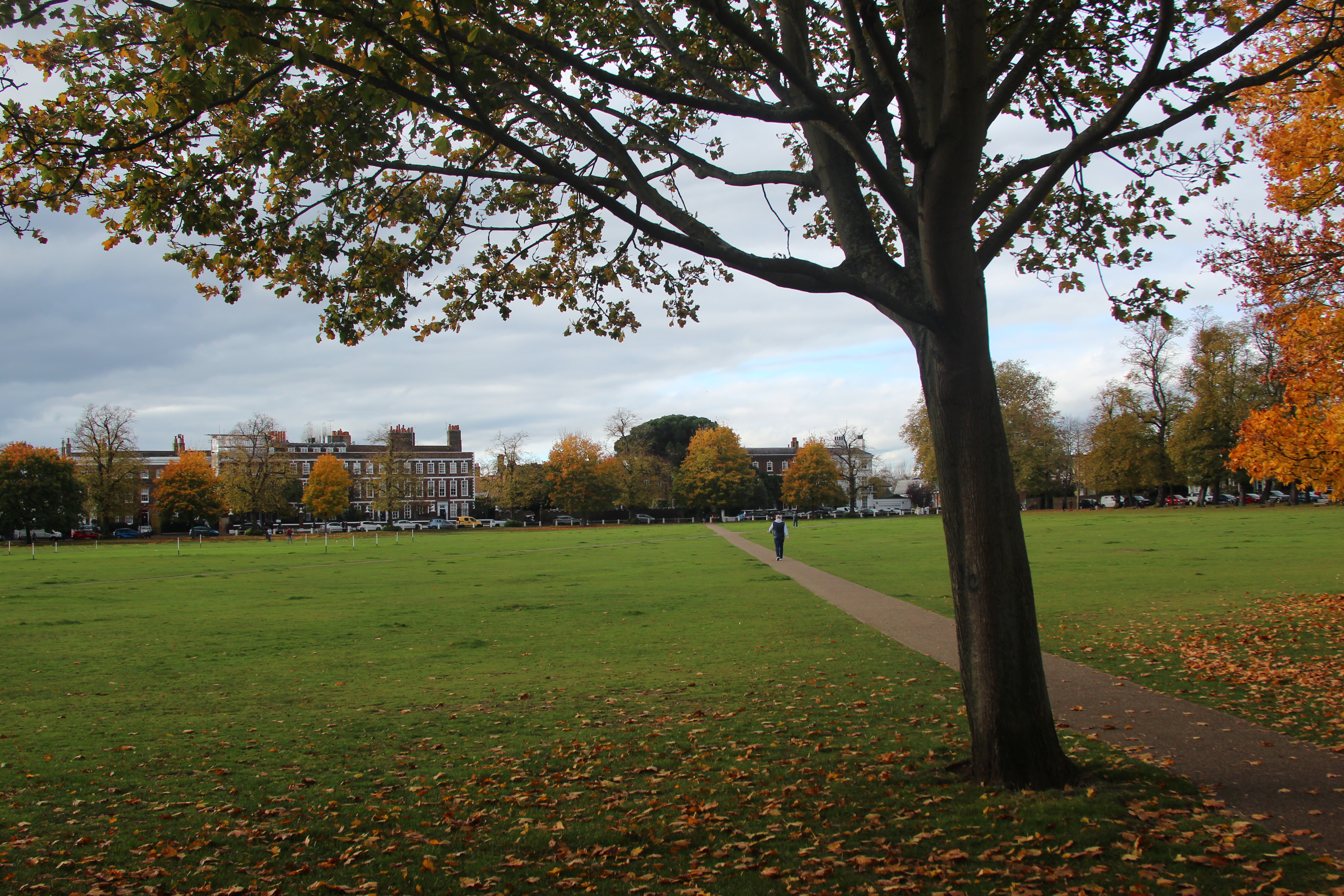
Instinctively I have always been drawn to photographing frames within frame as I love the effect and contrast of light that might happen too with a tunnel or arch.
Evaluation –
What was very clear to me after this process was the weather was very integral for a photo that I liked! I was particularly drawn to the sun beams coming through the trees that then created the beautiful colours, as well dramatic tones like in Albert Berdsteins picture, it creates a calm and serenity seeing the sunshine. I also loved the pretty reflections on the water like Monet would have painted. This could be explored further by enhancing with further image manipulation.
The rule of three really helped creating a focal point that you are drawn to. For instance the dog in the picture above with the trees framing. It instantly makes the picture more interesting.
I am drawn to the pictures with colour (the boats) like Monet would have as well as the frame with in a frame. The panning I need to practice more. This can look very effective and dramatic. However focusing on a small object such as bird made the picture too blurry with no focal point.
It was really interesting to look closely at composition artists and photographers use. They are things I would have sub consciously done within my own photography so it was great to investigate it further and see why it works well.
Week 6 – 7 Image manipulation
We took some more landscape photos this week which we could then use in photoshop to experiment with.
I looked at:
- Dodging and burning
- Brightness and contrast
Dodging and burning – Selecting areas to either enhance the highlights or creating shadows. At the tool bar, pick the dodge tool (lolipop), create a duplicate layer on top. This can then be removed without effecting the other. In layer, click duplicate layer and attach to the original so its applied. Create a clipping mask and in the layers panel change to luminosity from normal. Use the paint brush and dodge by clicking ctrl z.
Brightness and Contrast – In the layers panel, go to adjustments, brightness and levels. There are 3 different arrows, black arrow – more shadows, grey arrow – grey tones and curves which will enhance the brightness and contrast.
In the photos below on my camera settings I moved the ISO to 1/60 to 1/200 as there was not so much sun in some areas and some pictures were looking a little hazy. I also played with the aperture, keeping it pretty low between F stop 3 and 6.

The picture with the bridge below was edited in photoshop with dodging and burning and brightness and contrast. As there was a lot of streaming hazy light in the picture although it created a lovely reflection on the water, many details in the picture needed enhancing. By enhancing the contrast and using the dodging tool on the trees, the details in the picture could become clearer.
Edited with brightness and contrast on photoshop:

On a beautiful day in London I took my camera into the city and explored landscape photos using manual setting and TV setting. As it was a bright sunny day the shutter speed was set to 1/60 and an aperture F18 and ISO 100. I then edited the pictures afterwards using Light room. See below the pictures before and after editing in Lightroom. As it was such a bright sunny day in the edit I generally reduced the highlights and increased the shadows to make the image more vibrant and clearer details in the distance or the buildings.


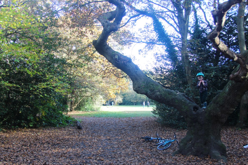
In Richmond Park I experimented with the mood of a landscape picture with dark and light and tones of the picture. I moved the aperture to create the dark dramatic trees in one picture against the light and gentle trees. In another picture I moved the aperture down from F8.0 to F5.0 to brighter the area up.
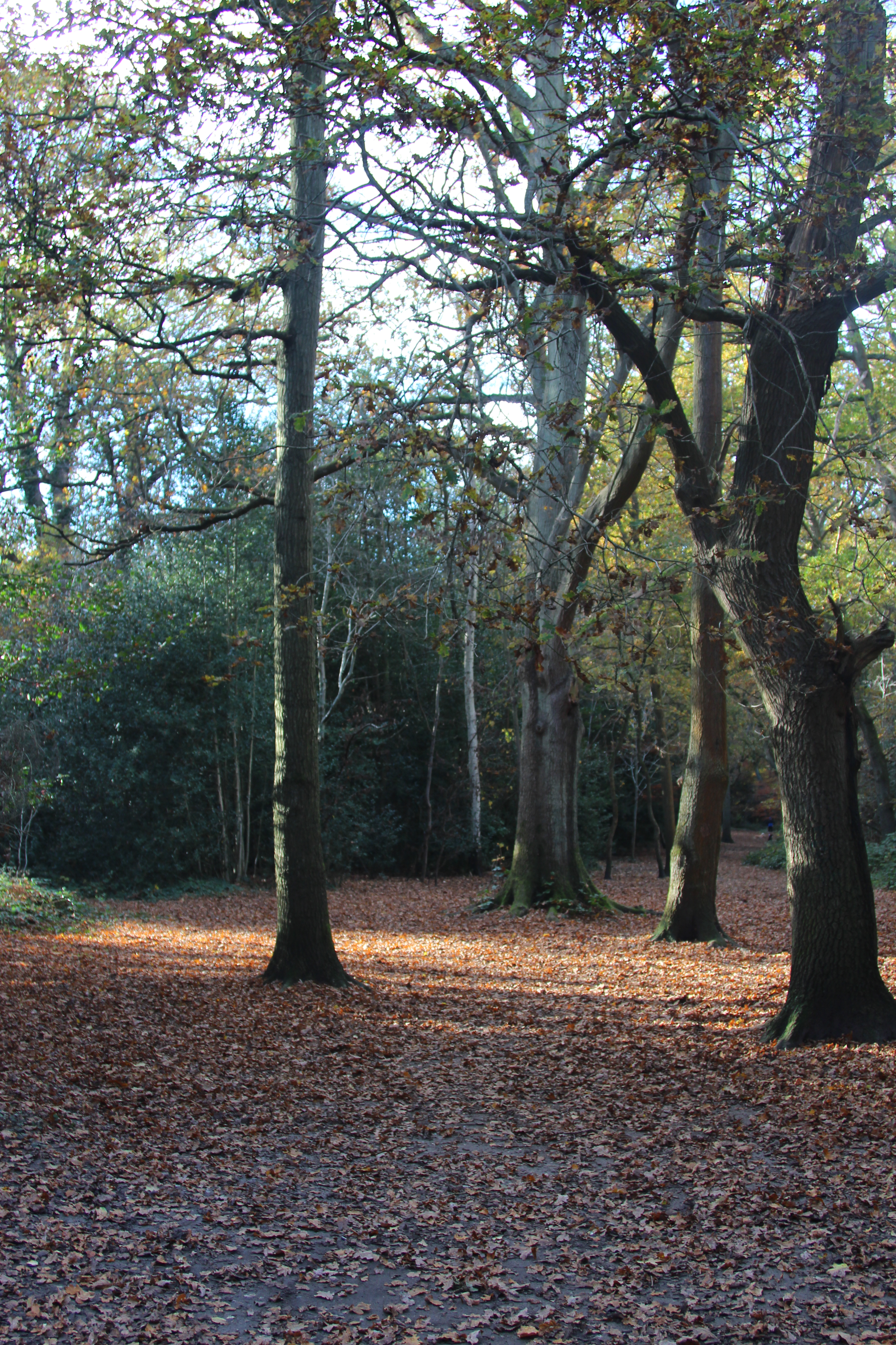
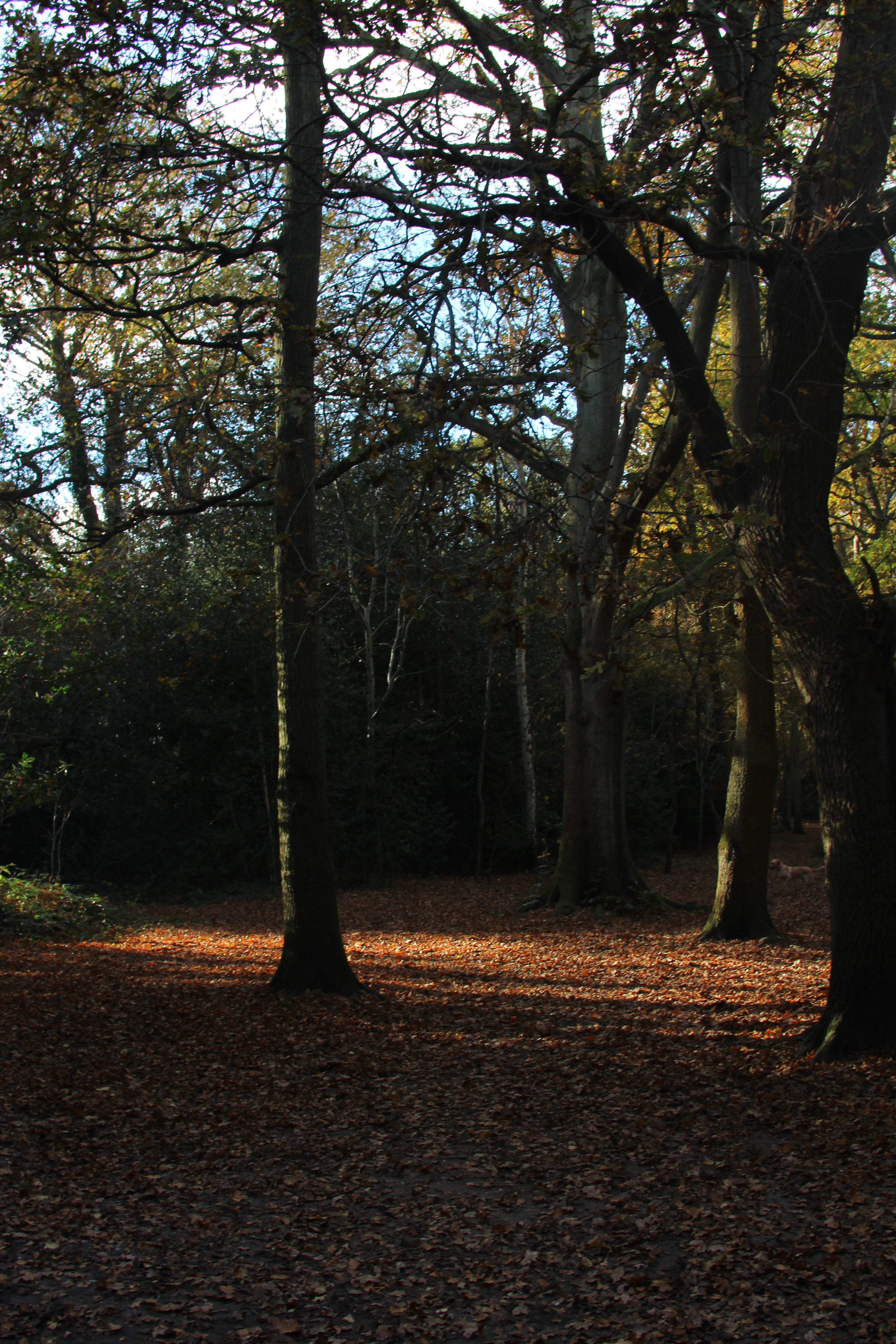
Below is another of example of light and dark together and the use of the rule of three, with the focus of my son in tree.
Week 7 – Image manipulation on photoshop
On Site we explored further techniques that can be used on Adobe photoshop, enhancements and retouching:
- Change Colour
- Hue Saturation
- Vibrancy
- Cover up or isolate – Using rectangular marquee tool or lasso tool
- Brightness and contrast
- Highlighting a person/object and changing to one colour
I explored 3 different techniques using photoshop below:
- Change Colour – This is useful in photoshop when you want to change the colour on either objects or clothes. To do this, in the layers panel pick the layer mask tool (half black, half white) then the selection tool (4th down on the tool bar) then the quick selection tool, hold and drag over the object you want to change the colour (left click to drag). Then create a layer mask and in the adjustment level a solid block colour. To see the finished creation click normal blending mode below.
In the picture below I changed the white hat to a lilac hat:
2. Hue Saturation – This creates different tones to the picture and concentrating on one colour theme within the picture. Firstly create a layer mask and then in the master settings set to master. A primary colour of your choice can then be picked to increase the saturation and intensify the colour. If you place the finger tool next to the master you can take a sample in the picture and the select a colour to intense.
In the picture below I intensified the green which gave it a movie or painting like feel:

3. Vibrancy – A vibrant layer mask can be added to the layer and the vibrance tools can either be increased or reduced.
In the picture below I reduced the vibrancy which made the picture more vintage and older in appearance.