1.1 – Identify the characteristics of digital imaging and printing for a range of situations.
AND
2.1/2.2 Produce digital images to achieve a range of solutions to identified goals/ Produce digital images from digital imaging sources to achieve a range of solutions to identified golas
The Digital Image:
When using my Sony a7 I shoot in Raw. Shooting in Raw means I have so much more scope to edit and improve my photo image in lightroom. Then using my SD memory card from the camera, I place it into my laptop in import the images to Adobe light room. Below you will see my two final images chosen for the photo exhibition:
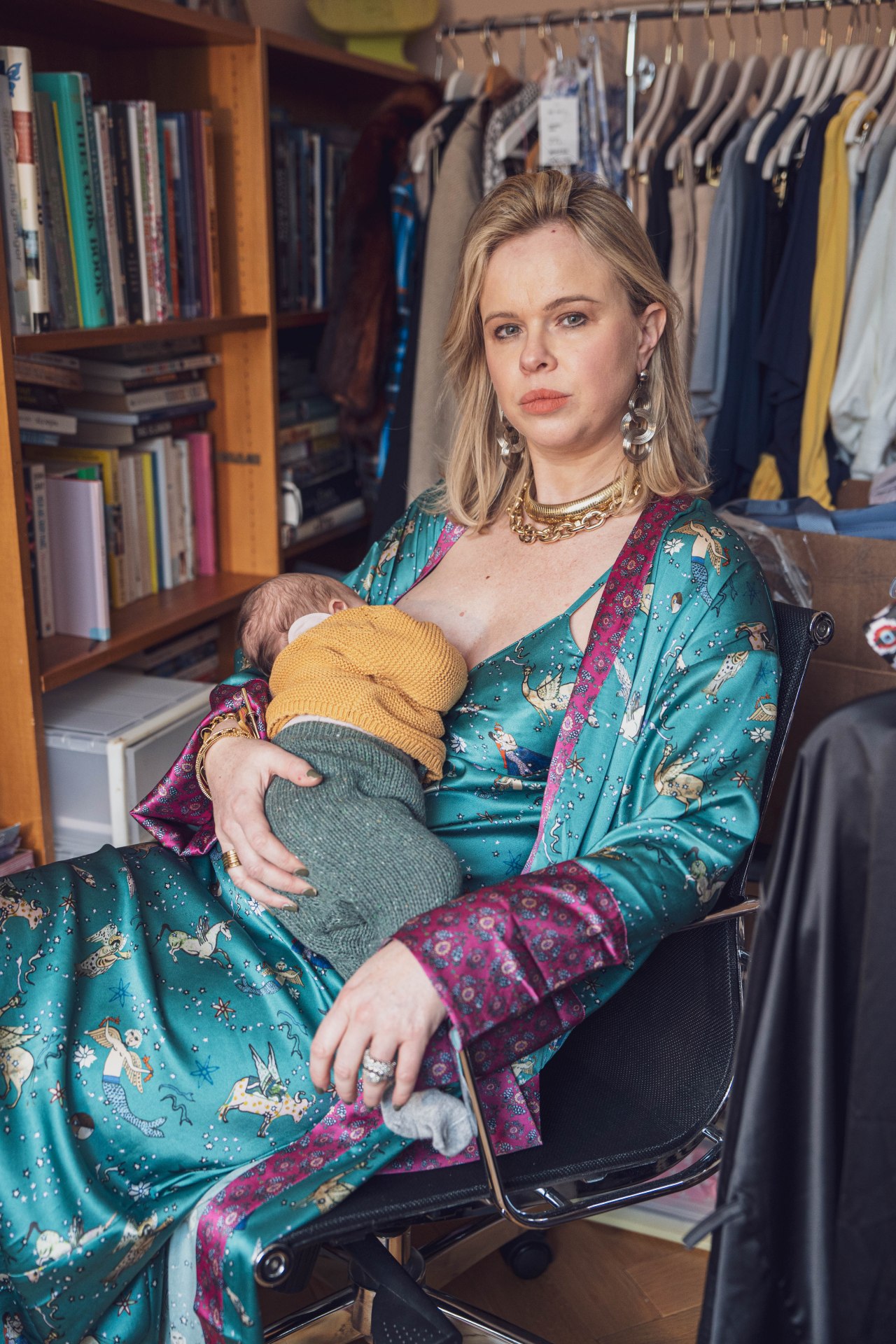
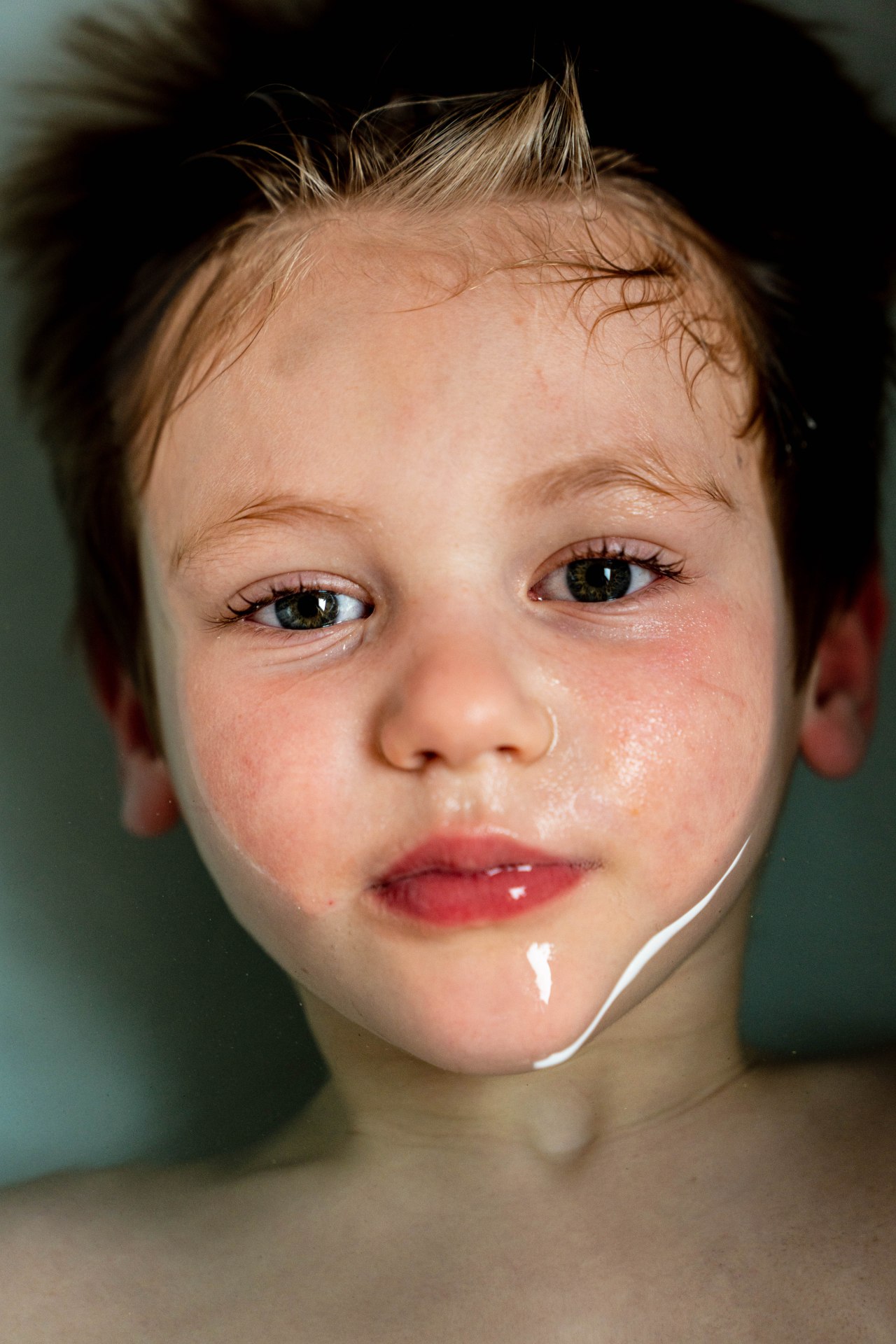
I have chosen the two images as I feel they represent an ‘Intimate Portrait’ which the exhibition is about. They are both powerful and intimate at the same time.
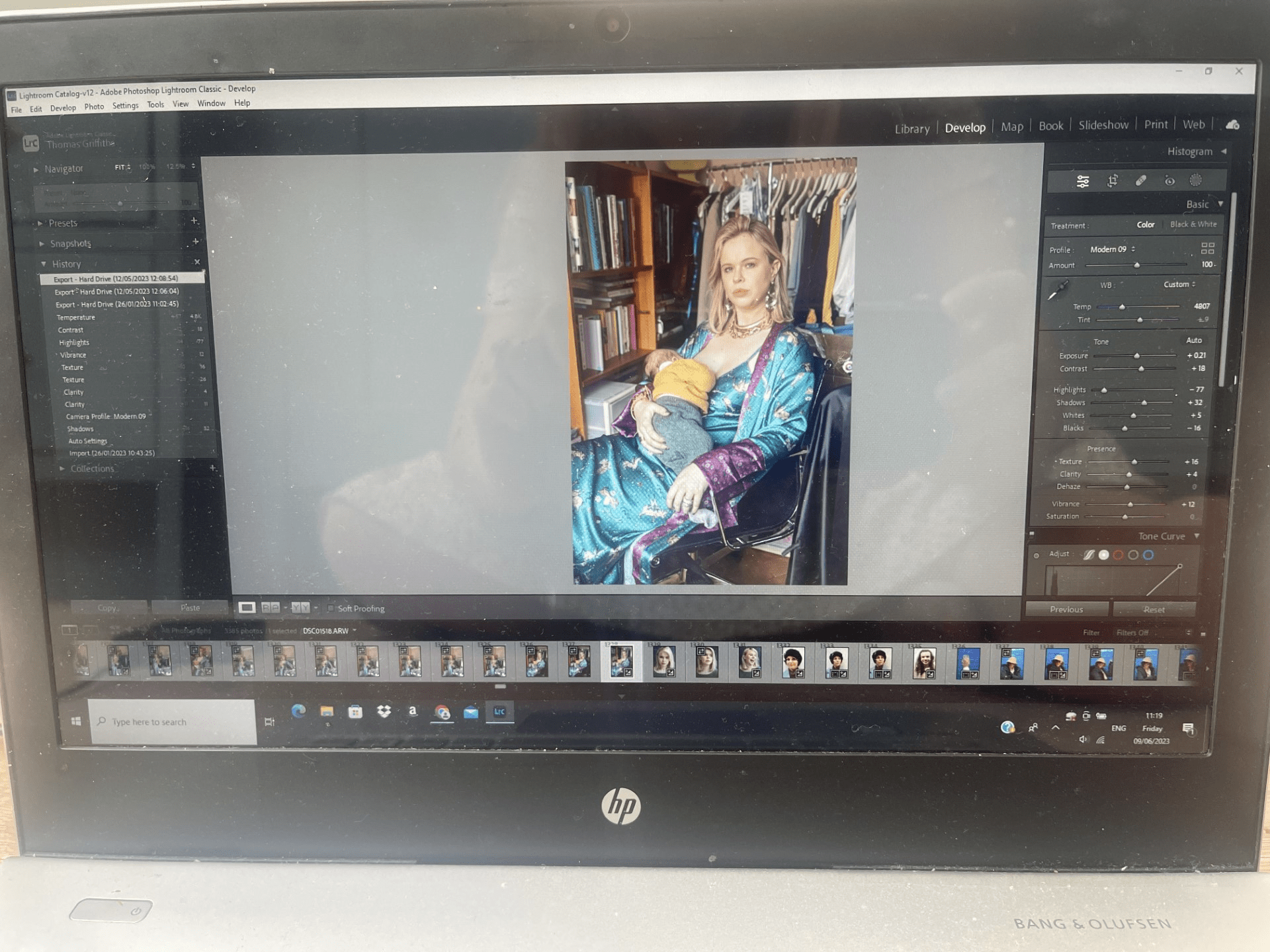
In the image below you will see a screenshot of how I edit the photo in the Lightroom, I adjust the exposure ever so slightly. Decrease the highlights quite significantly, as Lucy was facing a vey lit window, I then increse the shadows and slightly increase the texture and clarity to bring out the lovely colours and textures in what Lucy is wearing. I increase the vibrance and contrast slightly too so that it brings out all the colours in the room.
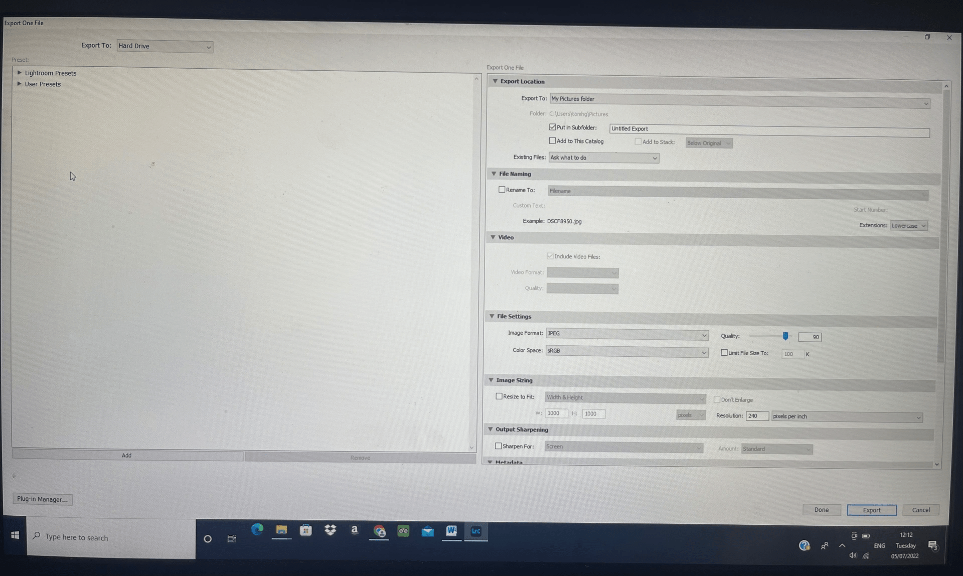
Once I was happy with the final image I then need to import the file as a jpeg to my desktop folder on the computer. As you can see from the screen shot below I make sure the quality of the image is a the top end, its now a Jpeg file. And the DPI resolution is 240 pixels per inch, Ideally you don’t want to go to 300 DPI and not below 200 DPI when printing.
What is a pixel and why it is important for quality?
A pixel is the smallest item of information in an image, pixels are arranged in a grid made up of squares. Each square has a colour and shade to it. The more squares there are the more detail there will be in the picture. If there are too few pixels then there will be a lack of detail in the image or it will even look pixilated. There is no value to having an enormous amount of pixels in a small print out as the detail will not be visible/the printer will have not have enough resolution to print the detail in any case. In addition the quality of the image is limited by the quality of the lens used, noise from high ISO, camera shake and other factors, the high pixel count will not make up for any lack of detail as a result of these factors.
My jpeg files are then saved on a folder on my desktop and all my original images I imported to Adobe lightroom are saved to a library there.
Printing:
Once my image is saved and ready to go I can then look at printing companies. Print Space is an online printing company and provides 11 A4 sample pack-
“We only print on the finest papers, with top brands names such as Hahnemuhle, Kodak & Fuji Film Professional. A sample pack is the best way to see how they look and feel. Only £6 inc. VAT “
When looking through the samples I decide the would be most suitable for my work:
“Hahnemüle Pearl has a smooth orange peel texture and a bright neutral white base, it creates really natural black and white images and offers vibrant colour reproduction and great detail too. The paper is resin coated with a fibrous feel. The satin finish of the resin coating gives depth to the image which combined with the texture and vibrant colour reproduction give the image the feel of an oil painting. This is one of the most suitable of the Giclée Art Paper range for mounting.”
“Fuji Flex, a.k.a. super-gloss, has a plastic feel to the paper with a warm base colour and an ultra-high gloss finish, giving luxurious rich colours. Very high – deep blacks & high visual contrast.”
I decide on a Giclee paper for the A2 portrait of the mother and the Pearl type. The Pearl I feel will bring out the colours with a slight sheen, as its between a gloss and a matt.
For the A3 portrait of my son Charlie emerging from the bath I decide on the C-type paper Fuji Flex. This will make it super glossy with the high contrast of colours. The super gloss I feel will really emphasise the texture and feel of the water.
I can then soft proof at home by downloading their papers ICC profile in Lightroom before sending the order.
Once happy with my decision I upload the jpegs to the website, making sure I have the correct measurements of an A2 and A3 size in inches, as there will be a border mounted in the frames I have a little bit of leg room for the size to be slightly bigger if it needs to be printed like that.
I am happy with the final prints that arrived the following day and look forward to seeing them in the exhibition.
2.2 Produce digital images and prints

Framing:
I wanted a border with both my prints in the white frame. Having the space around the image, gives the image space to breathe. It can isolate it from the rest of the scene and allows the image to speak.
Title and Caption:
A title and or caption is important to the image as it anchors the meaning to the image. For my image of Lucy in her office feeding her baby I wanted to originally call it the ‘The Juggle’, however this gave a negative tone and I actually wanted to empower Lucy as a modern mother and title it ‘Having it all’ . For the picture of Charlie coming out of the bath water I titled it ‘Breaking the surface.’
The Exhibition:


2.3 Analyse and evaluate digital images and prints
The two pictures I chose were from my intimate portrait project I did this year. I felt the image of my friend Lucy was very intimate, as I spent time at her house documenting her with powerful images. It was a mutual collaboration where she chose what to wear and with some help and direction from me. It was her decision to feed her baby in her environment of her home office. We both wanted to express modern day motherhood and working and all the juggle and pressures that comes with it. At the same time we wanted to show the empowerment of being a mother in today’s society. The colours she chose to wear were strong so I focused on the lighting and exposure of this with further production in Lightroom. For the print I felt an A2 size was needed to show the empowerment and colours in the picture. Then the image would be placed in an A1 frame with a border, to allow the image to speak.
For my second image I chose the intimate portrait of my son Charlie in the bath. This was a very intimate moment of him coming out of the water. I chose an A3 size again in a boarded A2 frame. The high gloss worked really well here as it really emphasised the feel of the water and the high visual contrasts.
My only drawback was in the exhibition space there was a great deal of sunlight coming through from windows. Lots of reflections were bouncing back off the glass frame. Maybe it would have been better on this occasion to not have the glass. Or perhaps I could have tried a different paper, maybe more matt for Charlie and photorag for the mother Lucy. But it would be a compromise, as would have lost the sheen that the images both needed.
The title to the pictures were very important. Some didn’t have a title in the exhibition and it lost its meaning or narrative. Its interesting that I originally wanted to call the motherhood portrait ‘The Juggle’ ,as now looking back I think it would have lost it’s empowerment to the mother Lucy, so I’m glad I decided to call it ‘Having It All’.
I was very happy using Print Space, as I have used them before. Always very high quality and efficient on time delivery.
3.1 Health and Safety:
I have to be careful with my eyes and screen time when using my computer. In my kitchen it is very bright so I make sure all the shades are on the skylight windows above. I make sure my posture is upright and stretch out my neck in intervals. I keep hydrated with water to avoid headaches from looking at the screen too much. When using my camera I can also set my diopter so its at the same clear focus as my eye.
